Showing posts with label prediction interval. Show all posts

Monday, March 21, 2011

Assessing Premier League Club and Manager Performance Against Their Starting XI Transfer Cost

Note: This is the third and final post in a series examining the effects of the of the transfer cost of a club’s starting XI on finish position in the English Premier League.

In the first two posts in this series, I was able to demonstrate the following:
  • Utilization rate, as measured by a team’s average cost of their starting XI divided by the average cost of their squad, is declining by about 1% every three years.
  • A regression model can be used to correlate a team’s average finish within the league with their average multiple of the league average starting XI cost.
  • The prediction intervals (PI) from such a model can be used to predict the odds of finishing in a certain table position based upon a team’s costs (both squad and starting XI).
In this final post in the series, the 50% prediction interval will be used to identify teams that have over and under performed versus their financial expenditures (similar to this post on squad costs).

Under and Over Performance of Clubs

Recall the graph below from my most recent post on teams' M£XI.


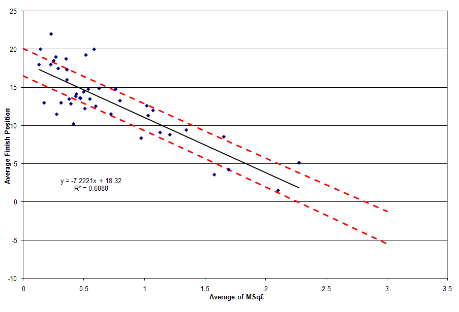
Note that the upper and lower bounds of the 50% PI are denoted by dashed red and green lines, respectively. Teams that fall above the red line represent a team that has, on average, finished in the lower 25% in terms of table position of teams that would have had similar expenditures. This represents under performance. On the other end, teams that finish below the green line have, on average, finished in the upper 25% in terms of table position of teams that would have had similar expenditures. This represents over performance. The teams that fall on or between these lines represent the expected 50% of teams that scatter around but close to the regression line. They are considered pushes.

Just like the similar MSq£ analysis, it’s not just good enough to have an above average finish. Consistency is what matters – in this case, consistency is measured via the team’s standard deviation of their residual to the regression model.

The table below represents just such a ranking (click on the table to enlarge). It is sorted first in order of performance against the model (over performance, push, under performance), then by standard deviation of residuals in decreasing order within each group, and then by the average residual. The table also shows the change in each team’s position (a negative score indicates improvement, while a positive score indicates degradation) from a similar table that looked at performance versus the MSq£ model. Just like the similar MSq£ analysis, only the 33 teams that have played three or more seasons in the Premier League have been included in this analysis.


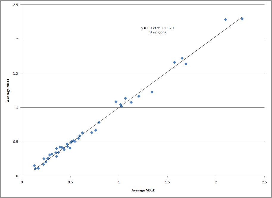
It turns out the average absolute movement in the table is 1.76 positions, and the median value is 1. Nearly 85% of the teams moved two or fewer positions between the MSq£ and the M£XI tables. This should come as no surprise given the correlation between the MSq£ and M£XI metrics that was noted in an earlier post. Of the three teams who moved four or more positions, here is an explanation why each of them moved.

Liverpool’s movement into the top spot is due to their eking out a position in the over performance group that they just missed when looking at their performance vs. the MSq£ model. In the MSq£ model, Liverpool actually finished in the top spot of teams in the push category which consigned them to 8th position in that table. They have a nearly identical M£XI (1.64) as MSq£ (1.69), but because of the difference in slope terms in the two models (noted here) we know that multiples of the league average don’t go as far in the starting XI as they do in the squad. Thus, Liverpool ends up moving from a push to an outperform when looking at the cost of talent that made it on to the pitch and their second lowest standard deviation of residuals to the M£XI model (only the top under performer, West Bromwich Albion, “outperforms” them) carries them to the top spot in the rankings. Clearly no one gets more consistent over performance versus the financial expectations on the pitch than Liverpool. Supporters’ expectations are another matter…

The overall biggest improvement over their MSq£ performance is West Ham United. West Ham’s utilization rate has been extremely low – an average of 45.7% to rank them in the bottom sixth of all 43 teams that had competed in the Premier League through the 2009-2010 season. The teams that have ranked lower than them – Bradford, Derby, Hull, Reading, Southampton, Stoke, and Watford – spent an average of four seasons in the league. The fact that West Ham has spent 14 seasons in the league – missing only the inaugural campaign and two seasons of relegation from 2003 to 2005 – is a testament to their ability to squeeze a good bit out of a meager transfer budget that has a lower than normal utilization rate. West Ham has averaged a 5% lower utilization rate than the league average each season, with only three of their fourteen seasons seeing above league average utilization. See the graph below for the details of West Ham’s utilization rate each season versus the league average. Such a low utilization rate translates into an M£XI that is 12.5% lower than their MSq£, thus leading West Ham to move out of the push category and into the over performance category with a nearly identical standard deviation in residuals to the two models.


With the addition of West Ham and Liverpool to the over perform category, and none of the seven teams that fell into the same category in the MSq£ category falling out in the M£XI analysis, the overall number of teams over performing on an M£XI basis has increased to nine.

At the other end of the table we find the team with the next largest movement – Nottingham Forest. During their five seasons in the league between the 1992/93 and 1998/99 seasons they averaged a 15th place finish when their M£XI costs would indicate an expectation of averaging a 14th place finish. This places them within the 50% prediction interval for their starting XI costs, which moves them from the bottom of the under performance category to the bottom of the push category. Like West Ham, this is due to the fact that their average difference to the league average utilization rate was -5.9%. This led to a 12% lower M£XI compared to their MSq£. Ironically, the club had its second best performance in terms of utilization their last year in the league, but it wasn’t enough to save the club from relegation.

Under and Over Performance of Managers

If movement amongst the clubs in the M£XI is minimal, what about the managers? How much do they move when one takes into account the talent they can get on the pitch and not just the players they can buy and sell for their squad, and which managers over and under perform the most when compared to the financial expectations of the players on the pitch? The table below summarizes just such managerial performance versus the M£XI for the 40 managers who have presided over at least three full seasons of Premier League play (click on table to enlarge). As in the similar table for team performance versus the M£XI model, the column on the far right shows a manager’s change in ranking from the MSq£ table, with a positive change indicating a backwards slide while a negative rating means the manager ranks higher in this table than the MSq£ table.


Unlike the club table, there is a fair bit more movement on the managerial side. The average absolute movement in the managerial table is 3.2 positions, while the median movement is two positions. Nearly 77% of the managers experienced a movement of three positions or less versus their MSq£ rankings. Let's dig into the details of a few of the managers that sit atop the table, and a few others that experienced some of the biggest movement.

Similar to the MSq£ rankings, Chris Coleman sits atop the M£XI table benefiting from an M£XI that is 4% lower than his MSq£. However, John Gregory has fallen seven positions to the ninth spot in the table. A comparison of MSq£ and M£XI explains why - Gregory spent an average of 1.11 times the league average on squad transfer cost, but his starting XI average cost was 1.24. This was due to an above average utilization cost the three years he was at Aston Villa, while his third year at the club saw a phenomenal 70.3% utilization rate (M£XI = 1.57, CTTP = £75.5M). In fact, no one put a greater proportion of their talent on the pitch that year. What’s more telling is the fact that six teams (Manchester United, Arsenal, Liverpool, Chelsea, Aston Villa, and Newcastle United) fielded average starting XI’s that we more costly that season. Aston Villa’s eighth place finish was behind all but one of those clubs (Newcastle finished eleventh), and finished behind Leeds United, Ipswich Town, and Sunderland sides that fielded average starting XI’s that cost less to various degrees - £73.9M, £21.9M, and £31.9M respectively. While Gregory still outperformed the model on average, it could be said that his last full season at Villa was one where he had the most tools at his disposal on the pitch. It should be noted that the model only predicts a marginally better seventh place finish for the squad in that season, indicating that perhaps Aston Villa management’s expectations were still a bit too high given the financial resources they were willing to commit. No matter the reason, Gregory’s steadily increasing utilization rates over his three year term – 48.4%, 52%, 70.3% - contributes to an increasing M£XI and increased variability versus the model that shows up in Gregory’s standard deviation of residuals. This is ultimately what lowers his ranking by seven positions – putting more talent cost-wise on the pitch each passing season and seeing a relatively consistent sixth to eight place finish.

Rafael Benitez and Martin O’Neill leapfrog Evans and Houllier in the M£XI rankings for one main reason – extremely consistent M£XI, utilization, and table position statistics.

In fact, if Benitez hadn’t had such a poor last season at Liverpool he would have outranked Chris Coleman in terms of standard deviation of the residual to the M£XI model. Then again, if he hadn't had such a poor 2009/10 he might also still be managing there this year. Recall from the first post in this series that Liverpool has hovered around 50% utilization from the 2005/06 to 2009/10 seasons – indeed, Benitez’s lowest utilization was his first year (2004/05) at 41.8%. He consistently beat his squad’s M£XI expectations by at least two table positions, and twice nearly beat it by four table positions. Only in his final year did he fail to meet M£XI expectations, finishing 0.6 positions off the expected pace. Say what you like about Rafa, but he made the most of the talent he had on the pitch.

Along with being one of the most consistent over performers, Martin O’Neill also has one of the highest average over performances versus the M£XI model – only Sam Allardyce (-5.9) and Gerry Francis (-4.6) outperformed him (but with much less consistency). O'Neill's first stint in the Premier League was with Leicester City, where he averaged six places better than his meager transfer budget would have predicted (average MSq£ = 0.44, average M£XI = 0.46) and guided them to three League Cup finals (winning two of them) over a four year period. After departing for Celtic for several years, O'Neill returned to the Premier League via Aston Villa before the 2006/07 season. Over his four seasons at Villa, he guided them from an initial 11th place finish to a sixth place finish each of the following three years. He averaged nearly three places better than his M£XI suggested. While his cup success at Leicester didn't translate to similar success at Aston Villa, O'Neill did put Villa back in the top third of the table and was consistently threating for European play. Ironically, it is widely understood that O'Neill left Aston Villa after the 2009/10 season because of his disagreement with Villa's ownership over his desire to spend more money to improve their chances of finishing higher in the table. Perhaps Martin O'Neill and John Gregory should have a discussion about how such Villa transfer budget limitations, and the unrealistic expectations that are attached to them, can wreck an over performing team.

Further down the list we find the two managers who fell the most from their MSq£ rankings - Peter Reid (13 positions from low overperform to low push) and Claudio Ranieri (14 positions from high push to under perform).

Reid spent one year at Manchester City in the league's inaugural year, and then spent over four years at Sunderland - one full year in 1996/97 and three straight from 1999/00 to 2001/02. Sunderland's MSq£ and M£XI numbers were relatively consistent during Reid's tenure, but their finishes were not as the first and last years saw 18th place finishes that led to relegation while the middle two saw them finish 7th. That variability produced huge swings in his residuals, meaning that Reid's standard deviation in residuals is only surpassed by 10% of the managers in the table. Combine this with Reid's high utilization rates that boosted his M£XI by 15% versus his MSq£, and it is clear why he shifted from over performance to a push.

Ranieri's three years in the league saw him average a fourth place finish when club expenditures indicated that he should have averaged a second place finish. Even before Abramovich bought the team, Ranieri was seeing huge advantages in terms of the cost of the talent he could put on the pitch (2001/02 M£XI = 1.89, 2002/03 M£XI = 2.02). With Abramovich's purchase of the team and infusion of transfers in 2003/04 Chelsea became the fist team to break the 3.0 barrier on the M£XI metric, but were unable to win the Premiership due to Arsenal's Invincibles' run of perfection. Ranieri's three year run put his average M£XI nearly 10% higher than the average MSq£, and has happened so frequently in the table this greatly lowered Ranieri's ranking from one category (push) to the next lowest (under perform). Regardless of the metric, Roman Abramovich felt Renieri was under performing and replaced him with Jose Mourinho who brought them two Premier League Championships in three years.

Conclusions

A clear connection can be drawn between the cost of the talent a club can put on the pitch in the English Premier League and the likely table position that team can expect. The model doesn't explain every team's position, but it does explain nearly 70% of the variation in average team finish position and average transfer expenditure on the pitch. The other 30% is random noise due to factors that aren't quantified in the model. The model doesn't also explain match-to-match variation, where squad and starting XI transfer cost is likely far less deterministic.

What the model does do is set clear expectations for long-term success and failure. While a number of the concepts in this series are a bit advanced, they illustrate a key point for supporters and management: set your expectations for a manager's long-term average table position based upon how much they're allowed to spend in the transfer market.

While no hard and fast rules can be drawn, here are a few concepts one could apply based upon the MSq£ and M£XI analyses:
  • If a club wants to know how much money it must spend to avoid relegation year-in and year-out, they must spend at least the league average in terms of squad transfer costs. For 2010/11, this was nearly £116M.
  • Managers who can't achieve at least a 50% or better utilization are likely going to under perform. Managers lower in the table in terms of squad transfer costs need to coax a larger utilization percentage out of their playing staff to remain competitive.
  • Don't judge a manager on less than three years performance, and certainly don't sack him unless it's an emergency move to avoid relegation. Managers need time and money to succeed, and at least three years are needed to build a team that reflects the priorities and tactics of the current manager and not the last one.
  • Along those lines, don't expect a single, expensive transfer to move a team out of mid-table mediocrity into European qualification in one season. Soccer relies on eleven starters, several substitutes, and a number of back up players for a team to be successful. Those players require a system to play within, and the manager needs time to get players to instinctively play within the system. Soccernomics was right in one regard - transfer purchases made in one window show little correlation to success or failure in the current or next season. Building a team via transfers is a long-term investment that requires patience - on the part of supporters and management.
  • Pay attention to why a manager's utilization rate may be under 50%. If it's due to poor investments that didn't work out on the pitch, clearly the only option is to move on. But if it's one year of bad luck with key injuries to costly players, the manager should be given the benefit of the doubt.
  • If the goal is a Premier League championship, be prepared to spend big. Recall this table from my last post on the M£XI topic, which shows a club must be willing to spend at least 2.40 times the league average in squad and starting XI transfer cost to have even odds at winning the Premier League title. Such certainty will likely decrease in coming years, as the Big Six and a few other teams continue to flood the transfer market with pounds. This will drive the cost of a championship higher, while at the same time dilute the power of a single team being able to "buy a championship".
  • Recognizing the reality of the spending required of a championship, perhaps management and supporters should set more realistic expectations and aspire for European qualification as their ultimate goal. Some are already advocating this approach for at least one of the more financially limited clubs amongst the Big Six. More clubs should adopt this approach to keep finances manageable and expectations achievable.
  • Finally, if Liverpool are in the market for a new manager after Kenny Dalglish's care taker term runs out, I would think they would seriously consider Marin O'Neill for the job. Clearly the previous ownership group made a massive mistake in going with Roy Hodgson over O'Neill last summer. I don't pretend to know the thoughts of senior Fenway Sports Group managers, but I do know they're smart and use analytics to help guide their decisions. If O'Neill's tactics and transfer strategies are right for the club, I could think of few managers who would likely over achieve to a greater degree given Liverpool's storied history yet somewhat limited financial means.
With that I will be taking a break from posting about Premier League economic matters. The two series on the MSq£ and M£XI have built upon the excellent foundation laid by Pay As You Play, and they now provide a direct method for evaluating club and manager performance versus financial expenditures. I am deeply grateful that Paul Tomkins and Graeme Riley shared the data with me, and served as regular editors and sounding boards for ideas I had. I hope that readers have derived as much insight and enjoyment from the two series as I have.

I already know what my next financial posts will focus on once the current Premier League season wraps up and the mood to write about transfer markets strikes me again - a detailed dissection of Arsene Wenger's moves in the transfer market. Yes, I am a bit biased, but the data clearly shows that Wenger is the longest serving over achiever in the English Premier League. For Gooners like me, reconciling this over performance with the lack of trophies the last six seasons is the ultimate test of what I preach: setting realistic table position expectations based upon transfer expenditures. In doing such a detailed study, I hope to provide a better understanding of his successes, failures, and what types of expenditures might put him over the top yet allow Arsenal to win a much less expensive trophy. As they say in the investment industry, "can I eat my own home cooking?"

Thursday, March 10, 2011

Using M£XI To Predict Premier League Table Position Odds

Note: This is the second post in a series examining the effects of the transfer cost of a squad's starting XI in the English Premier League.

In the first post in this series on the rising cost of a squad's starting XI was quantified, the decreasing utilization rate amongst teams was explored, and the behavior of the Big Six clubs when it came to starting XI transfer costs was presented.  But what about a more general model, one that uses linear regression and prediction intervals to quantify expected table position based upon a squad's starting XI cost?  How could such a model be translated into predictions for the odds of finishing in various positions in the Premier League table based upon starting XI cost?  Those topics are explored in this post, with special attention paid to the clubs that represent outliers.

A Regression Model for Table Position vs. Starting XI Cost

Similar to this post on squad transfer cost, a linear regression model with various prediction intervals can be constructed for average table position and average starting XI cost.  Such a regression provides a good indication of how much the talent on the pitch should cost over the long-term to provide long-term success in table position.

There is a slight difference in the M£XI graph below compared to the one in the MSq£ post: the regression line, 50th percentile, and 95th percentile prediction interval lines all appear on one graph.  This consolidates what was multiple graphs into a single graph where the full range of under and over performance can be viewed.

The dashed black lines - representing the bounds of the 95th percentile prediction intervals - indicate the bounds of reasonably expected individual values.  Data points that fall outside of these lines indicate gross under performance (above the upper line) or outstanding over performance (below the lower line) versus the expected finish position given the average cost of the starting XI the team put on the pitch.

The dashed red line represents the upper limit of the 50th percentile prediction interval.  Falling above this line indicates under performance versus the model.  Conversely, the dashed green line represents the lower limit of the the 50th percentile prediction interval.  Falling below this line indicates over performance versus the model.

Click on the graph to enlarge it.


It's interesting to note the similarities and differences between the graph above and a similar regression plot for MSq£ from this post.

  • The constant term in each regression equation - M£XI = 18.04 while MSq£ = 18.32 - indicates teams with relatively low multiples of the league average starting XI and squad transfer costs will be at similar risk for relegation.
  • The difference in the slope terms - M£XI = -6.9195 while MSq£ = -7.2221 - indicates an advantage in finishing position for increased multiples of squad expenditures of 0.30 versus their multiple of the league average starting XI cost.
  • However, the reality is that paying for talent that actually makes it on to the pitch is still the best way to improve one's chances of finishing top of the table (quite intuitive, isn't it?).  Even though the slope of the MSq£ regression equation indicates a 4.4% advantage in table position improvement vs. the M£XI equation when increasing multiples of the league averages are utilized, the fact remains that the average squad cost is more than double the average starting XI cost (2.12:1 to be exact).  Thus, signing talent and making sure they play all 38 games in a Premier League season is nearly twice as effective at increasing one's multiple to the league average £XI compared to simply breaking the bank and trying to increase one's squad transfer cost versus the league average Sq£.
  • The bounds on the 95th percentile and 50th percentile lines in both regressions are relatively close.  What has changed is several individual team's proximity to those lines.

A detailed discussion of over and under performance vs. the M£XI model will come in the next post, but a few words should be spent on the data points outside of, or close to, the 95th percentile lines.

The two teams outside of the upper 95th percentile line - Swindown Town and Odham Athletic - were previously discussed in this post.  The only other team close to the line is Crystal Palace, who spent three campaigns in the EPL between the 1992-93 and 1997-98 seasons and was relegated after each single season they spent in the league.  Since that last season in the Premier League the club has gone through several owners and has bounced between The Championship and League One.

On the other end of the 95th percentile distribution stands three teams that have out performed all other teams when adjusting for their financial resources - Queens Park Rangers, Reading, and Stoke City - although two of the three are likely not examples other Premier League teams would ultimately like to follow.

QPR, as an inaugural member of the Premier League, finished fifth their first season in the league.  Mid-table finishes the next two seasons were followed up with a 19th place finish in 1995-96 that saw them relegated to the Championship.  Their average M£XI of 0.42 was simply too small to avoid such a fate.  They eventually were relegated further to League One, and subsequently saw them pass into administration.  A reconstituted QPR has found itself a mid-level team in the Championship in recent years.

Reading made a brief two season appearance in the Premier League from 2006 to 2008, and their average M£XI of 0.11 ranks as the second lowest in the history of the Premier League (Watford's 0.10 barely beats them).  Good form in the 2006-07 season, which saw them finish eighth, was followed by a season with a disastrous second half and relegation back the Championship.  The team nearly regained their spot in the Premier League the following season, but lost in the Championship's promotion playoff.

Stoke City's one and only year in the league (2009-10) saw them finish twelfth with an M£XI of 0.25.  As of this writing, Stoke is on track for another 12th place finish, but is at risk for relegation with only three points separating them from the drop at 18th position in the table .  Surviving for a third year would mark a milestone few teams with such a meager transfer budget on the pitch attain. Only one other club (Birmingham) has spent as little on transfers and remained in the Premier League more than two years.

Ultimately, that's what this analysis and the one related to MSq£ prove - gross under and over performance is only found at very low multiples of the league starting XI and squad transfer costs.  In both cases, such under and over performing teams don't seem to last long in the Premier League as their meager transfer budgets are no match for the teams spending more than them.  There are only six teams in the Premier League who can spend the money to compete for a Champions League position each year, and only twelve teams in the history of the Premier League have managed to spend the league average or better (seven of which are the teams never relegated).  The interplay with the teams in the Championship looking for promotion the subsequent season can't be underestimated either.  While these lower spending teams certainly outperformed expectations in the Premier League, they often occupy the middling of teams that could just as easily find their transfer expenditures (and subsequent place) in the upper half of the Championship.

The Impact of M£XI On The Odds of Various Table Positions in Premier League

If the odds seemed to be stacked against such spendthrift teams, what about those who choose to spend more?  How are their odds impacted by greater expenditures, and how do they know they've spent enough to  have a good chance at their goal - a spot in UEFA competitions or the Premier League title?  Luckily, ever expending prediction intervals can quantify such odds.  The following series of tables do just that, quantifying the squad and starting XI transfer costs and multiples required to achieve such odds per the regression model.

A reference point for average values must first be defined before translating the predicted multiples into absolute values.  The average Sq£ at the beginning of the 2010-11 season was £115.7M, while the projected £XI for 2010-11 is £54.7M (based upon the average from 2009-10 and projected growth of £585.5k per year via the regression model) .

The table below shows the squad and starting XI expenditures required to realize various odds of finishing top of the table in the Premier League.  The regression model is pretty accurate for the lower odds based upon the expenditures witnessed over the years.  Of the thirteen teams who had an M£XI of 2.46 or more six have won the Premiership, and a similar outcome is seen for teams with an MSq£ of 2.40 or greater.  The accuracy of the model starts to break down just a bit the higher one goes in the odds - history shows that four of the ten teams who have had an M£XI of 3.05 or more four winning the Premiership.


Arsenal fans should take special note: Arsene Wenger is trying to do what appears to be impossible.  All but three of the Premier League's champions have had an M£XI of 1.85 or more (corresponding MSq£ of 1.72 or more), and the Premier League champion with the lowest transfer expenditures ever (Manchester United's 1996-97 squad) still had an M£XI of 1.26 (MSq£ of 1.34).  After letting their M£XI drop to 1.05 in the 2008-09 season, Arsenal saw a slight rebound last year to 1.20.  However, as of this writing they had regressed to a 2010-11 M£XI of 0.96.  Arsenal being in second place in the Premier League table may be a testament to Arsene Wenger's ability to get more out his meager transfer expenditures than any other manager could, but it may be too much to ask of him to expect perennial championship contention with such a historically low transfer multiple.

What about the required expenditures to improve a club's odds for making the Champions League given the Premier League's four spots?  The table below summarizes those odds.


This is really where the model's effects of over predicting the financial resources required of clubs comes into play.  Of the 25 teams who have had an M£XI of 2.03 or more, only 3 have failed to finish fourth or better.  Manchester City's 2009-10 and Newcastle United's 2003-04 campaigns saw both finish fifth, while Newcastle set a new standard for under achievement with a 11th place finish with an M£XI of 2.41 in 1999-2000.  Ninety-five percent of teams that finished fourth or better have had an M£XI of 1.05 or better, with Arsenal's annual over achievement versus their transfer expenditures adding to the low M£XI totals.

Conclusions


A regression model that predicts table position based upon a club's multiple of the league average starting XI transfer cost has been constructed, and its resultant prediction intervals have been used to identify gross under and over performers.  Those under and over performers seem to be concentrated at the low end of the M£XI distribution.  Additionally, odds of finishing in the upper 20% of the league have been identified, with various accuracies to historical data being realized.

An analysis of team and club under and overperformance versus the 50th percentile prediction interval, similar to the one conducted for MSq£, can now be conducted.  That topic will be the subject of the third-and-final post in this series.

Thursday, May 6, 2010

What does it take to make the 2010 MLS playoffs?

In the last few posts I have explained how regression equations based upon 2005 through 2009 MLS data can be used to judge how well teams are performing in the 2010 season. Those posts culminated in this table, which I will update on a weekly basis with commentary throughout the season. I have done some further studies, mainly of the goal differential and points required to finish in the eighth spot in the table and make the 2010 playoffs.

Statistical Background

There are three ways to answer the question of what goal differential or points are required to finish 8th in the table. They revolve around the three statistical concepts below.
  • Linear regression: A best fit line that represents the mean value of y for a given value of x.
  • Confidence interval (CI): A range of values based upon the statistical spread within the data set and regression, often representing a range of values that are the likely distribution of the mean.
  • Prediction interval (PI): A prediction of the range of future, individual observations based upon the data observed to date that is used to construct the regression.
In general, one can think of the regression as the single point mean of y for a given x value, the CI is the likely range of means for that same x, and the PI is the range of individual observations one would expect to see for the specific value of x. Those ranges, the CI and PI, are represented by the narrow and wider dashed lines, respectively, in the Figure 1.

Figure 1: Relationship of finish position and points from this earlier post.

Knowing the ranges of values expected for any value of x allows us to construct which values of x allow us greater certainty in finishing in the 8th position. In the case of my regression data, I have used the common 95th percentile distribution for constructing CI's and PI's. That means that for any value of x that I study, I will account for 95% of the expected values in the CI and PI when setting the bounds of any test.

Because the CI and PI involve distributions and not nominal values, the x-value that ensures the 8th place finishing position is below the range of potential finishing positions will be higher than that predicted by the regression equation.

Applying statistics to the League Table

In the case of my 2010 league table, I have constructed the following rules:
  • Values are red if they fall lower than critical x-value from the regression. This means that they have less than a 50% chance of making the playoffs.
  • Values are yellow if they fall between the critical x-value from the regression and the lower value of the 95% PI. This means that their chances of making the playoffs are between 50% and 95%.
  • Values are green when they are greater than or equal to the lower end of the 95% PI. This means a team has less than a 5% chance of missing the playoffs.
Values for the goal differential and points that correspond to the CI and PI are shown in Figure 2 below. It shows that a team needs between a 3 and 16 goal differential and between 44 and 51 points to make sure they qualify for the playoffs.

Figure 2: x-values where lowest values in 95th% CI and PI are greater y-value that corresponds to 8th place in the table

The Modified League Table

Figure 3 shows the updated league table with the associated color codings. It gives a more complete picture of where teams are consistently performing at playoff form (LA, Columbus, and NY), the bulk in the middle that are showing mixed results, and those at the bottom who are already in danger of not making the playoffs. I have kept the average predicted finish from the three regressions shown in my earlier post, while collapsing the three constituent columns for those regressions to make the table easier to read.

Figure 3: League table as of May 3, 2010.

I will continue to update this table on a weekly basis, along with each of the columns and their colors. Hopefully it will shed some light on shifts in table position that will occur on a weekly basis - whether its goals or points.

Saturday, April 17, 2010

Explaining regression through an enhanced Soccernomics analysis


The full results of the Soccernomics pay-for-play regression, including the actual equation and the distribution that accompanies it.

In this post I will attempt to tackle the much-abused and little understood topic of regression theory by using one of the more famous models in the soccer community: Soccernomics' infamous Figure 3.1 showing the pay-to-win regression of the top two English soccer leagues. This post will focus on the technical aspects of regression theory, walking through the step-by-step process likely used by the authors of the book. Occasionally I will go beyond what the authors showed, just to provide something more than a regurgitation of their study and hopefully provide greater insight into the general theory behind the analysis.

Before beginning, I would like to point out that the original inspiration behind this post was one via a request from one of my first tweeps. It just goes to show you that if you reach out to me on Twitter or via the open thread on the blog, I will respond with the requested analysis. I hope you enjoy this post, jblock49!

Background

In their seminal work Soccernomics, authors Simon Kuper and Stefan Szymanski lay out a very intuitive yet startling correlation: to finish higher in the tables of the top two English soccer leagues, one must spend more money than their opponents. Their analysis of the data, the results of which are shown in the graph below, shows that the team payroll as a function of a multiple of the leagues' average payroll explains a whopping 88.7% of the variation in finishing position within the tables.

Figure 1: Regression analysis from Soccernomics

The authors' use of transformed data (see "log" denotations on each axis), and their lack of discussion around the uncertainty inherent to any regression analysis, provides fertile ground for a case study in regression theory. Too often we equate regression analysis with dropping two data sets into Excel, plotting them with a fitted line, and hoping that the R-squared value comes out good enough to justify a relationship. What many people don't realize is that there are many more requirements of a good regression study whose conclusions can be accepted. I will explain those assumptions here.

The prerequisite: a normally distributed response variable

In the regression world, there are two types of variables. If we can imagine an equation in the form of y= mx+b, the following variables are named:
  • y = response variables
  • m = regressor coefficient
  • x = regressor variables
  • b = regression constant
In this case, y and x are data sets used to develop m and b and provide the regression equation we are used to seeing. Before beginning any regression analysis, we'd like to see a normal distribution to the data set y. In the case of the Soccernomics study, the regressor was the multiple of league average pay while the response was finishing position.

The trick with any analysis of league finishes is that the variable of interest is not the actual finish position, but rather how you finish relative to everyone else. The logic is similar to that used for wages - you don't need to spend a certain amount to win, just more than your opponents. That's where the first transform of the original data found in Soccernomics comes in. Instead of looking at the raw finish position, the authors looked at a relative finish position that provided a rough indication of how frequently another team would finish ahead of another. They did this by using the transformed data set of:

p/(45-p)

It appears they used 45 as a normalizing value due to the combined number of positions available to the teams in the top two leagues including relegation and promotion. This transform meant teams at the top of the table would have low values, while those at the bottom would have high values. However, this transform presented some challenges you can see in Figure 2 - the transformed data wasn't normal as indicated by p-value <>

Figure 2: Graphical Summary of p/(45-p)

The authors were on the right track, but they needed to perform an additional transform of the data to make it normal. This is when they would have turned to their commercial statistics program and asked it to run several simulations of common transforms (logarithmic, natural log, etc) to help identify a transform that provided a normal distribution. They settled on the natural log transform, and used a -1 coefficient in front of it. This is because a natural log transform would have taken the teams with high finish positions that now had low numbers in the p/(45-p) transform and given them a larger negative number after the natural log transformation. Using a -1 coefficient to invert the data set makes sense - high pay scales might lead to higher finish position, but not the other way around - and it doesn't affect the normality of the data set. The authors' suspicions were correct, and they were rewarded with a normal data set. See Figure 3 below, where the p-value is > 0.05 and thus we accept the assumption that the data is normally distributed.

Figure 3: Graphical Summary of -ln[p/(45-p)]

Transforming the Regressor

To preserve any chance of a linear relationship between the response variable and the regressor, the authors then likely set out transform the wage data by the similar method. A transformation using a natural log function produces a normal data set shown in Figure 4.

Figure 4: Graphical Summary of ln(wage multiple)

Prior to regression: determining if correlation exists

Prior to beginning regression modeling, the authors would have performed a correlation study and this is where we start getting into the claims of the book. Completing a correlation study is the first step because it helps understand the total amount of variation explained by the relationship of the data, and it provides a good statistical test as to whether the value is high enough to justify a regression analysis and equation. No more guessing at Excel-based R-squared values!

Correlation is measured via a correlation coefficient. This coefficient is calculated per the formula below, and it is essentially trying to measure the scatter around the mean of the two data sets (i.e. x(i) - x(bar), etc.) in relation to the overall scatter of the data (s(x), representing the sample standard deviation).

A graphical representation of this equation can be found in Figure 5.

Figure 5: Graphical representation of correlation measurement

Once a correlation coefficient has been calculated, it can be compared to values assigned to different risk levels based upon the number of samples in the data set. In the case of the English league data set of 58 samples, the authors would need a correlation coefficient of between 0.2948 to 0.3218 or greater to conclude there was less than a 1% risk of incorrectly concluding that a significant enough relationship exists between the two variables to proceed with a regression study. Instead of using the lookup tables, I used a statistical software package. Using the author's data and running it through a correlation study yields the results in Figure 6.

Figure 6: Correlation study of -ln[p/(45-p)] and ln (wage multiple)

The results of the study clearly indicate a low risk of assuming a correlation exists (p-value = 0.00), and that the relationship between the two variables explains 94% of the variation in their behavior. Now, this is a little bit different than the claim in Soccernomics, which was 92% of the variation in league position being explained by team expenditure. I triple checked the data that I copied from Figure 3.2 in the book, and could find no errors. I don't know if it is a typographical error in the book, or the result of some other analysis. Nonetheless, there seems to be a strong relationship between the two variables that warrants a regression analysis.

Checking the Regression Results

The step of making the regression equation and plot at this point is a formality for most of us. It should be noted that most regression algorithms are based upon the least squares method, which means that it uses multiple equations to describe the behavior of the system and finds the one regression equation that minimizes the sum of the squares of the errors made between the regression equation and the original data.

The trick isn't in the regression equation itself, but in the results that it produces. In general, regression analyses must have:
  • A normally distributed response variable data set
  • A statistically significant correlation coefficient
  • Have their residuals meet five basic requirements
Residuals are the difference between each response variable data point and the corresponding predicted response value from the regression equation. Residuals represent the error in the statistical model. For a regression equation to be accepted as statistically valid, the following five requirements must be met:
  • Residuals are normally distributed with a mean of zero
  • Residuals are random and show no pattern
  • Residuals have constant variance
  • Residuals are independent of the values of the regressor variables
  • Residuals are independent of each other
Meeting these requirements ensures that the relationship between the two data sets is real, and not the effect of an unseen factor, confounding variable, or test procedure.

When a regression analysis is carried out on the transformed finishing position and wage data, Figure 7 is produced. The two plots on the left suggest that the data is normal, and the normality test in Figure 8 confirms they are (barely) normally distributed with a p-value of 0.063. The two figures on the right measure the other four characteristics. There does seem to be some trouble at either end of the data sets. The upper right graph shows some increasing spread (non-constant variance) as one goes to either end of the data set. The graph in the lower right indicates a consistent under or over prediction in the model when looking at the ends of the data sets. I don't know if it would have been enough to conclude that the regression analysis was invalid, but it would definitely have caused me to look at the reasons why the ends are so skewed.

Figure 7: Four-in-one plot for regression residuals

Figure 8: Graphical summary of residuals

The Model's Results

Now that all of the assumptions have been checked, it is time to move on to analyzing the model's results. We are often used to seeing regression simply as a line and an R-squared value, but there is much more going on behind the scenes. As we are all aware of regression graph in Figure 3.1 in Soccernomics, I have instead focused on the the statistical analysis found in Figure 9 below.

Figure 9: Output from regression analysis

The first set of data to focus on is the R-Sq and R-Sq(adj). Notice that the R-Sq value is different that the correlation coefficient we calculated earlier. The R-Sq value is measuring the proportion of variation that is explained by the regression model that has been generated, and not the overall variation explained between the two data sets. R-sq is simply the SS (sum of squares) value from the "Regression" row in the Analysis of Variance subsection divided by the SS value from the "Total" row. Hence, 88.3% of the variation being explained by the regression model.

The R-Sq(adj) term is a modified form of R-Sq, which takes into account the number of terms in the model. In this case, the linear regression performed only has one term. If one were to try and predict the behavior by a cubic regression (i.e. an equation of y=ax^3+bx^2+cx+d), the equation would have three terms. The R-Sq adjusted is a way of telling whether or not the terms you are adding by going to more complex regression equations are actually improving the fit - higher R-Sq(adj) values means better regression bang-for-the-buck. In the case of the Soccernomics study no other regressions were run beyond the linear one.

With such a high R-Sq value, we can also look at the statistical tests of the predictors. Both the constant and the regressor have p-values <>

Finally, we can move on to the equation itself which was not included in the book. The equation relating average finish position to wages is:

-ln[p/(45-p] = 0.5465 +1.487*ln(wage multiplier)

For all you EPL fans out there, this is the equation that matters. If you ever were able to get you hands on a list of team payrolls at the beginning of a season, you would be able to project the average outcome of the season if it were played repeatedly at those price ratios for several years in a row.

Statistics are always about distributions

Finally, I'd like to close the discussion around regression by extending the author's analysis a bit further. For simplicity's sake, they presented what I would call a simplified model of regression. It works, and it gets the point across. But to statisticians, it's all a bit too simple. Statistics are always about distributions - nearly every test involves calculating means and variances or standard distributions. Sometimes these quantities are used as checks and pre-requisites to beginning tests, other times they are critical elements within the tests. More importantly, the output of the tests always has a distribution associated with it.

In the case of regression, the equation the line represents is associated with the mean values for the relationship. In reality, the likely distribution of the response data set at any one regressor can be calculated. The distribution of the predicted response will vary along the length of the regression line and across the data set, and is dependent upon the underlying data sets used in the regression. Thus, what we're really calculating when using the regression is the likely average of individual outcomes that could occur over time at that regressor test point that has been selected. In reality, there are a range of outcomes. This range of outcomes is called a prediction interval (PI), and the tighter band inside of it is the confidence interval (CI) for the predicted mean value.

Figure 10 is the same as the figure at the beginning of this blog post. It is the same regression analysis performed throughout this study, but I have turned on the 95% CI and PI lines. These lines represent the range of values of where we are 95% certain individual occurences of future observed data and its means will fall for each of the regressor values on the x-axis.

Figure 10: Regression analysis with PI and CI included.

As one can see, much of the observed variation from the data sets falls within the CI lines. This graph gives a much more complete picture of the expected behavior given the data, and becomes far more useful than the standard single regression equation line when one wants to understand whether or not a single season's finish in the English leagues is expected or an anomoly.

Conclusion

This was, believe it or not, a brief treatment of regression theory. I hope it has provided you a much better understanding of all the calculations and checks that must go on when performing regression studies. The next time someone shows you an Excel graph with a line and an R-squared value on it, ask them if they have checked their residuals and the p-values associated with the terms in the regression equation. Ask them if they know what the correlation coefficient for they data is, or if they are sure the response variable data is normally distributed. Until they can show you the data confirming all the critical checks of a regression analysis, it's just a pretty picture.

LinkWithin

Related Posts Plugin for WordPress, Blogger...