Showing posts with label MSq£. Show all posts
Showing posts with label MSq£. Show all posts
Thursday, August 11, 2011
The 2011 Update to the MSq£ Model
My latest post using the TPI data is up at their blog. Utilizing the 2010-11 table and transfer data, the MSq£ model is updated to reflect the continually increasing correlation between transfer expenditures and table position. The fit of the regression model increased again, where the MSq£ of a club predicts 71% of the team's table position. A few clubs moved in to the over performance category, and the biggest over performer all time rejoins a very different Premier League than the last time they were in it. Head on over to the TPI blog and check it out, especially since it serves as the foundation for our forthcoming 2011-12 season predictions.

Thursday, March 10, 2011
Using M£XI To Predict Premier League Table Position Odds
Note: This is the second post in a series examining the effects of the transfer cost of a squad's starting XI in the English Premier League.
In the first post in this series on the rising cost of a squad's starting XI was quantified, the decreasing utilization rate amongst teams was explored, and the behavior of the Big Six clubs when it came to starting XI transfer costs was presented. But what about a more general model, one that uses linear regression and prediction intervals to quantify expected table position based upon a squad's starting XI cost? How could such a model be translated into predictions for the odds of finishing in various positions in the Premier League table based upon starting XI cost? Those topics are explored in this post, with special attention paid to the clubs that represent outliers.
A Regression Model for Table Position vs. Starting XI Cost
Similar to this post on squad transfer cost, a linear regression model with various prediction intervals can be constructed for average table position and average starting XI cost. Such a regression provides a good indication of how much the talent on the pitch should cost over the long-term to provide long-term success in table position.
There is a slight difference in the M£XI graph below compared to the one in the MSq£ post: the regression line, 50th percentile, and 95th percentile prediction interval lines all appear on one graph. This consolidates what was multiple graphs into a single graph where the full range of under and over performance can be viewed.
The dashed black lines - representing the bounds of the 95th percentile prediction intervals - indicate the bounds of reasonably expected individual values. Data points that fall outside of these lines indicate gross under performance (above the upper line) or outstanding over performance (below the lower line) versus the expected finish position given the average cost of the starting XI the team put on the pitch.
The dashed red line represents the upper limit of the 50th percentile prediction interval. Falling above this line indicates under performance versus the model. Conversely, the dashed green line represents the lower limit of the the 50th percentile prediction interval. Falling below this line indicates over performance versus the model.
Click on the graph to enlarge it.

It's interesting to note the similarities and differences between the graph above and a similar regression plot for MSq£ from this post.
A detailed discussion of over and under performance vs. the M£XI model will come in the next post, but a few words should be spent on the data points outside of, or close to, the 95th percentile lines.
The two teams outside of the upper 95th percentile line - Swindown Town and Odham Athletic - were previously discussed in this post. The only other team close to the line is Crystal Palace, who spent three campaigns in the EPL between the 1992-93 and 1997-98 seasons and was relegated after each single season they spent in the league. Since that last season in the Premier League the club has gone through several owners and has bounced between The Championship and League One.
On the other end of the 95th percentile distribution stands three teams that have out performed all other teams when adjusting for their financial resources - Queens Park Rangers, Reading, and Stoke City - although two of the three are likely not examples other Premier League teams would ultimately like to follow.
QPR, as an inaugural member of the Premier League, finished fifth their first season in the league. Mid-table finishes the next two seasons were followed up with a 19th place finish in 1995-96 that saw them relegated to the Championship. Their average M£XI of 0.42 was simply too small to avoid such a fate. They eventually were relegated further to League One, and subsequently saw them pass into administration. A reconstituted QPR has found itself a mid-level team in the Championship in recent years.
Reading made a brief two season appearance in the Premier League from 2006 to 2008, and their average M£XI of 0.11 ranks as the second lowest in the history of the Premier League (Watford's 0.10 barely beats them). Good form in the 2006-07 season, which saw them finish eighth, was followed by a season with a disastrous second half and relegation back the Championship. The team nearly regained their spot in the Premier League the following season, but lost in the Championship's promotion playoff.
Stoke City's one and only year in the league (2009-10) saw them finish twelfth with an M£XI of 0.25. As of this writing, Stoke is on track for another 12th place finish, but is at risk for relegation with only three points separating them from the drop at 18th position in the table . Surviving for a third year would mark a milestone few teams with such a meager transfer budget on the pitch attain. Only one other club (Birmingham) has spent as little on transfers and remained in the Premier League more than two years.
Ultimately, that's what this analysis and the one related to MSq£ prove - gross under and over performance is only found at very low multiples of the league starting XI and squad transfer costs. In both cases, such under and over performing teams don't seem to last long in the Premier League as their meager transfer budgets are no match for the teams spending more than them. There are only six teams in the Premier League who can spend the money to compete for a Champions League position each year, and only twelve teams in the history of the Premier League have managed to spend the league average or better (seven of which are the teams never relegated). The interplay with the teams in the Championship looking for promotion the subsequent season can't be underestimated either. While these lower spending teams certainly outperformed expectations in the Premier League, they often occupy the middling of teams that could just as easily find their transfer expenditures (and subsequent place) in the upper half of the Championship.
The Impact of M£XI On The Odds of Various Table Positions in Premier League
If the odds seemed to be stacked against such spendthrift teams, what about those who choose to spend more? How are their odds impacted by greater expenditures, and how do they know they've spent enough to have a good chance at their goal - a spot in UEFA competitions or the Premier League title? Luckily, ever expending prediction intervals can quantify such odds. The following series of tables do just that, quantifying the squad and starting XI transfer costs and multiples required to achieve such odds per the regression model.
A reference point for average values must first be defined before translating the predicted multiples into absolute values. The average Sq£ at the beginning of the 2010-11 season was £115.7M, while the projected £XI for 2010-11 is £54.7M (based upon the average from 2009-10 and projected growth of £585.5k per year via the regression model) .
The table below shows the squad and starting XI expenditures required to realize various odds of finishing top of the table in the Premier League. The regression model is pretty accurate for the lower odds based upon the expenditures witnessed over the years. Of the thirteen teams who had an M£XI of 2.46 or more six have won the Premiership, and a similar outcome is seen for teams with an MSq£ of 2.40 or greater. The accuracy of the model starts to break down just a bit the higher one goes in the odds - history shows that four of the ten teams who have had an M£XI of 3.05 or more four winning the Premiership.

Arsenal fans should take special note: Arsene Wenger is trying to do what appears to be impossible. All but three of the Premier League's champions have had an M£XI of 1.85 or more (corresponding MSq£ of 1.72 or more), and the Premier League champion with the lowest transfer expenditures ever (Manchester United's 1996-97 squad) still had an M£XI of 1.26 (MSq£ of 1.34). After letting their M£XI drop to 1.05 in the 2008-09 season, Arsenal saw a slight rebound last year to 1.20. However, as of this writing they had regressed to a 2010-11 M£XI of 0.96. Arsenal being in second place in the Premier League table may be a testament to Arsene Wenger's ability to get more out his meager transfer expenditures than any other manager could, but it may be too much to ask of him to expect perennial championship contention with such a historically low transfer multiple.
What about the required expenditures to improve a club's odds for making the Champions League given the Premier League's four spots? The table below summarizes those odds.

This is really where the model's effects of over predicting the financial resources required of clubs comes into play. Of the 25 teams who have had an M£XI of 2.03 or more, only 3 have failed to finish fourth or better. Manchester City's 2009-10 and Newcastle United's 2003-04 campaigns saw both finish fifth, while Newcastle set a new standard for under achievement with a 11th place finish with an M£XI of 2.41 in 1999-2000. Ninety-five percent of teams that finished fourth or better have had an M£XI of 1.05 or better, with Arsenal's annual over achievement versus their transfer expenditures adding to the low M£XI totals.
Conclusions
A regression model that predicts table position based upon a club's multiple of the league average starting XI transfer cost has been constructed, and its resultant prediction intervals have been used to identify gross under and over performers. Those under and over performers seem to be concentrated at the low end of the M£XI distribution. Additionally, odds of finishing in the upper 20% of the league have been identified, with various accuracies to historical data being realized.
An analysis of team and club under and overperformance versus the 50th percentile prediction interval, similar to the one conducted for MSq£, can now be conducted. That topic will be the subject of the third-and-final post in this series.
In the first post in this series on the rising cost of a squad's starting XI was quantified, the decreasing utilization rate amongst teams was explored, and the behavior of the Big Six clubs when it came to starting XI transfer costs was presented. But what about a more general model, one that uses linear regression and prediction intervals to quantify expected table position based upon a squad's starting XI cost? How could such a model be translated into predictions for the odds of finishing in various positions in the Premier League table based upon starting XI cost? Those topics are explored in this post, with special attention paid to the clubs that represent outliers.
A Regression Model for Table Position vs. Starting XI Cost
Similar to this post on squad transfer cost, a linear regression model with various prediction intervals can be constructed for average table position and average starting XI cost. Such a regression provides a good indication of how much the talent on the pitch should cost over the long-term to provide long-term success in table position.
There is a slight difference in the M£XI graph below compared to the one in the MSq£ post: the regression line, 50th percentile, and 95th percentile prediction interval lines all appear on one graph. This consolidates what was multiple graphs into a single graph where the full range of under and over performance can be viewed.
The dashed black lines - representing the bounds of the 95th percentile prediction intervals - indicate the bounds of reasonably expected individual values. Data points that fall outside of these lines indicate gross under performance (above the upper line) or outstanding over performance (below the lower line) versus the expected finish position given the average cost of the starting XI the team put on the pitch.
The dashed red line represents the upper limit of the 50th percentile prediction interval. Falling above this line indicates under performance versus the model. Conversely, the dashed green line represents the lower limit of the the 50th percentile prediction interval. Falling below this line indicates over performance versus the model.
Click on the graph to enlarge it.

It's interesting to note the similarities and differences between the graph above and a similar regression plot for MSq£ from this post.
- The constant term in each regression equation - M£XI = 18.04 while MSq£ = 18.32 - indicates teams with relatively low multiples of the league average starting XI and squad transfer costs will be at similar risk for relegation.
- The difference in the slope terms - M£XI = -6.9195 while MSq£ = -7.2221 - indicates an advantage in finishing position for increased multiples of squad expenditures of 0.30 versus their multiple of the league average starting XI cost.
- However, the reality is that paying for talent that actually makes it on to the pitch is still the best way to improve one's chances of finishing top of the table (quite intuitive, isn't it?). Even though the slope of the MSq£ regression equation indicates a 4.4% advantage in table position improvement vs. the M£XI equation when increasing multiples of the league averages are utilized, the fact remains that the average squad cost is more than double the average starting XI cost (2.12:1 to be exact). Thus, signing talent and making sure they play all 38 games in a Premier League season is nearly twice as effective at increasing one's multiple to the league average £XI compared to simply breaking the bank and trying to increase one's squad transfer cost versus the league average Sq£.
- The bounds on the 95th percentile and 50th percentile lines in both regressions are relatively close. What has changed is several individual team's proximity to those lines.
A detailed discussion of over and under performance vs. the M£XI model will come in the next post, but a few words should be spent on the data points outside of, or close to, the 95th percentile lines.
The two teams outside of the upper 95th percentile line - Swindown Town and Odham Athletic - were previously discussed in this post. The only other team close to the line is Crystal Palace, who spent three campaigns in the EPL between the 1992-93 and 1997-98 seasons and was relegated after each single season they spent in the league. Since that last season in the Premier League the club has gone through several owners and has bounced between The Championship and League One.
On the other end of the 95th percentile distribution stands three teams that have out performed all other teams when adjusting for their financial resources - Queens Park Rangers, Reading, and Stoke City - although two of the three are likely not examples other Premier League teams would ultimately like to follow.
QPR, as an inaugural member of the Premier League, finished fifth their first season in the league. Mid-table finishes the next two seasons were followed up with a 19th place finish in 1995-96 that saw them relegated to the Championship. Their average M£XI of 0.42 was simply too small to avoid such a fate. They eventually were relegated further to League One, and subsequently saw them pass into administration. A reconstituted QPR has found itself a mid-level team in the Championship in recent years.
Reading made a brief two season appearance in the Premier League from 2006 to 2008, and their average M£XI of 0.11 ranks as the second lowest in the history of the Premier League (Watford's 0.10 barely beats them). Good form in the 2006-07 season, which saw them finish eighth, was followed by a season with a disastrous second half and relegation back the Championship. The team nearly regained their spot in the Premier League the following season, but lost in the Championship's promotion playoff.
Stoke City's one and only year in the league (2009-10) saw them finish twelfth with an M£XI of 0.25. As of this writing, Stoke is on track for another 12th place finish, but is at risk for relegation with only three points separating them from the drop at 18th position in the table . Surviving for a third year would mark a milestone few teams with such a meager transfer budget on the pitch attain. Only one other club (Birmingham) has spent as little on transfers and remained in the Premier League more than two years.
Ultimately, that's what this analysis and the one related to MSq£ prove - gross under and over performance is only found at very low multiples of the league starting XI and squad transfer costs. In both cases, such under and over performing teams don't seem to last long in the Premier League as their meager transfer budgets are no match for the teams spending more than them. There are only six teams in the Premier League who can spend the money to compete for a Champions League position each year, and only twelve teams in the history of the Premier League have managed to spend the league average or better (seven of which are the teams never relegated). The interplay with the teams in the Championship looking for promotion the subsequent season can't be underestimated either. While these lower spending teams certainly outperformed expectations in the Premier League, they often occupy the middling of teams that could just as easily find their transfer expenditures (and subsequent place) in the upper half of the Championship.
The Impact of M£XI On The Odds of Various Table Positions in Premier League
If the odds seemed to be stacked against such spendthrift teams, what about those who choose to spend more? How are their odds impacted by greater expenditures, and how do they know they've spent enough to have a good chance at their goal - a spot in UEFA competitions or the Premier League title? Luckily, ever expending prediction intervals can quantify such odds. The following series of tables do just that, quantifying the squad and starting XI transfer costs and multiples required to achieve such odds per the regression model.
A reference point for average values must first be defined before translating the predicted multiples into absolute values. The average Sq£ at the beginning of the 2010-11 season was £115.7M, while the projected £XI for 2010-11 is £54.7M (based upon the average from 2009-10 and projected growth of £585.5k per year via the regression model) .
The table below shows the squad and starting XI expenditures required to realize various odds of finishing top of the table in the Premier League. The regression model is pretty accurate for the lower odds based upon the expenditures witnessed over the years. Of the thirteen teams who had an M£XI of 2.46 or more six have won the Premiership, and a similar outcome is seen for teams with an MSq£ of 2.40 or greater. The accuracy of the model starts to break down just a bit the higher one goes in the odds - history shows that four of the ten teams who have had an M£XI of 3.05 or more four winning the Premiership.

What about the required expenditures to improve a club's odds for making the Champions League given the Premier League's four spots? The table below summarizes those odds.

This is really where the model's effects of over predicting the financial resources required of clubs comes into play. Of the 25 teams who have had an M£XI of 2.03 or more, only 3 have failed to finish fourth or better. Manchester City's 2009-10 and Newcastle United's 2003-04 campaigns saw both finish fifth, while Newcastle set a new standard for under achievement with a 11th place finish with an M£XI of 2.41 in 1999-2000. Ninety-five percent of teams that finished fourth or better have had an M£XI of 1.05 or better, with Arsenal's annual over achievement versus their transfer expenditures adding to the low M£XI totals.
Conclusions
A regression model that predicts table position based upon a club's multiple of the league average starting XI transfer cost has been constructed, and its resultant prediction intervals have been used to identify gross under and over performers. Those under and over performers seem to be concentrated at the low end of the M£XI distribution. Additionally, odds of finishing in the upper 20% of the league have been identified, with various accuracies to historical data being realized.
An analysis of team and club under and overperformance versus the 50th percentile prediction interval, similar to the one conducted for MSq£, can now be conducted. That topic will be the subject of the third-and-final post in this series.
Thursday, February 24, 2011
Comparing Econometric Models of the English Premier League: Reconciling the TPI and Soccernomics Data Sets
Note: This is a re-post from analysis I did back in January 2011 for the Transfer Price Index blog. I am posting it here to complete my series of posts on squad transfer costs, and to set up a forthcoming series of posts on the impact of starting XI transfer costs on table position
I’ve participated in many discussions since my original post on the relationship between a squad’s current transfer cost and their table position. Much of it has been centered on the debate over the predictive power of Soccernomics‘ wage data versus my analysis using current transfer costs. Many readers on The Tomkins Times have come to the same general conclusions as me: each analysis has its valid points and different uses, and the two are not necessarily in conflict with each other.
I’ve also had the pleasure of discussing the two studies with none other than Stefan Szymanski. I plan on keeping much of our conversation private, but you can get a sense of his respect for the overall Transfer Price Index approach and the differences in the two data sets via his review of Pay As You Play. Stefan’s review is a positive one, summarized best in the following observation.

The graph clearly demonstrates the correlation between the two metrics, the weakness of the models at either end of the table, and the strength of the model in the middle of the table. Stefan’s observation of over predicting the resources needed for top table positions has been invaluable in explaining the discrepancy between regression predictions and historical data related to Champions League qualification that will be discussed in an upcoming post.
Stefan’s review rightfully points out the reliability of the publicly audited wage data versus the TPI’s privately compiled transfer data. At the same time, I would stand by the TPI as the most comprehensive and meticulously compiled set of transfer data within the English Premier League era. It was indeed a “labour of love” for the authors, a labour that continues to pay dividends in our financial understanding of the league.
Beyond the quality of the data and its impact on any resultant statistical analysis, Stefan’s data set has a bit of an advantage over the TPI. The Soccernomics wage data looks at overall team wages, thus taking into account the total cost of operating the squad in current British pounds. Combine this with the fact that wages are a dynamic measure adjusted over time by team and player, while the TPI is a static inflation of a one-time transfer fee, and we see why wages may be a better predictor of actual team success. It’s also no surprise that the £XI metric correlates very well with that wage data, as it takes into account all the players who have made it on the pitch and how much time they spent on it. There’s no dead weight contributing nothing to the team’s performance on the pitch, good or bad.
Indeed, analysis by Graeme Riley and me has proven this point statistically. Graeme looked at the squad and XI transfer cost order versus table position, while I looked at the multiple of the average squad and XI transfer costs. Both Graeme and I calculated these for each team, and then quantified the correlation of each metric to finish position for each individual season via the square of the Pearson product moment correlation coefficient (the commonly seen R² value in a regression plot). In Graeme’s analysis, the order of £XI had a higher R² value than the order of Sq£ in 16 out of the 18 seasons. In my analysis, M£XI had a higher R² value than MSq£ in 14 out of the 18 seasons. In the final comparison, I looked at the average and standard deviation of the R² values for each metric – order of £XI, order of Sq£, M£XI, and MSq£ – to determine which provides the best, most consistent prediction of table position over the 18 seasons. The M£XI had the lowest overall standard deviation (14.7%) and highest overall average (45.4%), indicating it provided the best fit versus table position (although it is far lower than the R² values in the long-term analysis in my original post and Soccernomics). Ultimately, this confirms my preference for relative measures, especially multiples of averages, and why I prefer to look at long term averages rather than individual seasons.
On the other hand, the TPI data I used in my original analysis only considered the impact of the total cost of transfers on team performance, and neglected those of the free variety as well as trainees. It also doesn’t look to utilization rate. It essentially looks at a reduced data set from the full squad or starting XI, and the graph below quantifies how much of a reduced data set non-free transfers represent over the history of the Premier League.

The graph above shows the cumulative percentage of three types of players within the league each year as categorized within the TPI – trainees, free transfers, and the rest of the players. The vast majority of this final category consists of transfers with confirmed fees, while the rest of it consists of a small number of players whose transfer fees couldn’t be confirmed. The graph is cumulative, so to understand the percentage of free transfers for any single year one must identify the free transfer value on the graph and then subtract the corresponding trainee value from it. As an example, the cumulative percentage (represented by the upper value of the red zone) in 2001-02 is approximately 30% while the league share of trainees is about 20%. This means that free transfers made up about 10% of the league in 2001-02.
What is clearly seen via the graph is that transfers have consistently accounted for nearly 70% of the Premier League’s players since its inception. That’s not to say 70% of the players transfer teams each year, but rather that at some point in their past they were purchased by the team they played for that season. What has changed over the league’s eighteen years is the number of trainees within it. This number has plummeted from nearly 30% of league player classifications in 1992/93 to below 20% by last season. Much of this change has happened due to an increasing number of free transfers, which were given official UEFA sanction with 1995's Bosman ruling. Free transfers have gone from only 2% of league player classification in 1995 to nearly 10% last season. Overall, transfers of any variety came to represent 80% of league players by the 2009/2010 season. In many regards, the Premier League is a microcosm of the increasingly globalized world it operates within: greater international ownership and investment, greater employee mobility, fewer employees staying with a single firm from “graduation” to retirement, and increased dominance by a few brands within the marketplace.
What this all means is that any analysis of league performance on a squad basis that uses the TPI is going to miss nearly 30% of the players in the league. Given that fact and the reasonably good R-squared value my regression analysis achieved, I would consider the relationship to be a reasonably strong one. Ultimately a study by Stefan Szymanski, similar to this one where he statistically examined the causality of the wage/performance correlation, would be fascinating. We might then determine whether it was transfer fees, wages, or table position that drove the relationship with the other two. That is a very advanced analysis best left to a statistician of Stefan’s caliber.
At the end of the day, what Stefan’s analysis, my analysis, and the overall TPI database prove is that one must pay, and pay big, to compete for the top few spots in the Premier League. One must pay dearly for the right to even negotiate wages with 70% of their players that end up on their squad, and then they must be willing to pay dearly again to keep the talent to challenge for a top spot. Each metric, whether it’s based upon £XI or MSq£, has its use in quantifying the roll of ever increasing transfer budgets in a club’s success. Generally, I concur with Paul Tomkins’ assessment that “Sq£ is the only predictive tool, but £XI is surely the better retrospective analyzer.”
To a certain degree this all makes sense, as we want a somewhat meritocratic system where excellence is financially rewarded. It all gives us pause, however, when the same teams can dominate everyone else each year by outspending their rivals, sometimes even with money that had no origination in the soccer world in which each team operates.
I’ve participated in many discussions since my original post on the relationship between a squad’s current transfer cost and their table position. Much of it has been centered on the debate over the predictive power of Soccernomics‘ wage data versus my analysis using current transfer costs. Many readers on The Tomkins Times have come to the same general conclusions as me: each analysis has its valid points and different uses, and the two are not necessarily in conflict with each other.
I’ve also had the pleasure of discussing the two studies with none other than Stefan Szymanski. I plan on keeping much of our conversation private, but you can get a sense of his respect for the overall Transfer Price Index approach and the differences in the two data sets via his review of Pay As You Play. Stefan’s review is a positive one, summarized best in the following observation.
“[I]n a fascinating new book Paul Tomkins, Graeme Riley and Gary Fulcher have developed a method of converting transfer fee data into a squad valuation… With every squad member given a value, this can then be used to compare spending to performance in the league. It is a true labour of love, collecting all the transfer fee values for Premier League clubs going back to the beginning of the 1990s.”Szymanski closes out his review with this glowing recommendation:
“The book is a treasure trove of interesting financial facts and would make a great gift for any football statto…”What’s interesting is how much correlation there is between the Soccernomics wage data and the TPI’s cost of the starting XI. Stefan’s metrics in the column are both relative measures (RW for wages and R£XI for relative starting squad cost), and he observes they show 90% correlation to each other. Unfortunately, the Evening Standard did not include the very compelling graph Stefan generated as part of his review of Pay As You Play. Luckily, Stefan has supplied us with that graph and it is reproduced below.

The graph clearly demonstrates the correlation between the two metrics, the weakness of the models at either end of the table, and the strength of the model in the middle of the table. Stefan’s observation of over predicting the resources needed for top table positions has been invaluable in explaining the discrepancy between regression predictions and historical data related to Champions League qualification that will be discussed in an upcoming post.
Stefan’s review rightfully points out the reliability of the publicly audited wage data versus the TPI’s privately compiled transfer data. At the same time, I would stand by the TPI as the most comprehensive and meticulously compiled set of transfer data within the English Premier League era. It was indeed a “labour of love” for the authors, a labour that continues to pay dividends in our financial understanding of the league.
Beyond the quality of the data and its impact on any resultant statistical analysis, Stefan’s data set has a bit of an advantage over the TPI. The Soccernomics wage data looks at overall team wages, thus taking into account the total cost of operating the squad in current British pounds. Combine this with the fact that wages are a dynamic measure adjusted over time by team and player, while the TPI is a static inflation of a one-time transfer fee, and we see why wages may be a better predictor of actual team success. It’s also no surprise that the £XI metric correlates very well with that wage data, as it takes into account all the players who have made it on the pitch and how much time they spent on it. There’s no dead weight contributing nothing to the team’s performance on the pitch, good or bad.
Indeed, analysis by Graeme Riley and me has proven this point statistically. Graeme looked at the squad and XI transfer cost order versus table position, while I looked at the multiple of the average squad and XI transfer costs. Both Graeme and I calculated these for each team, and then quantified the correlation of each metric to finish position for each individual season via the square of the Pearson product moment correlation coefficient (the commonly seen R² value in a regression plot). In Graeme’s analysis, the order of £XI had a higher R² value than the order of Sq£ in 16 out of the 18 seasons. In my analysis, M£XI had a higher R² value than MSq£ in 14 out of the 18 seasons. In the final comparison, I looked at the average and standard deviation of the R² values for each metric – order of £XI, order of Sq£, M£XI, and MSq£ – to determine which provides the best, most consistent prediction of table position over the 18 seasons. The M£XI had the lowest overall standard deviation (14.7%) and highest overall average (45.4%), indicating it provided the best fit versus table position (although it is far lower than the R² values in the long-term analysis in my original post and Soccernomics). Ultimately, this confirms my preference for relative measures, especially multiples of averages, and why I prefer to look at long term averages rather than individual seasons.
On the other hand, the TPI data I used in my original analysis only considered the impact of the total cost of transfers on team performance, and neglected those of the free variety as well as trainees. It also doesn’t look to utilization rate. It essentially looks at a reduced data set from the full squad or starting XI, and the graph below quantifies how much of a reduced data set non-free transfers represent over the history of the Premier League.

The graph above shows the cumulative percentage of three types of players within the league each year as categorized within the TPI – trainees, free transfers, and the rest of the players. The vast majority of this final category consists of transfers with confirmed fees, while the rest of it consists of a small number of players whose transfer fees couldn’t be confirmed. The graph is cumulative, so to understand the percentage of free transfers for any single year one must identify the free transfer value on the graph and then subtract the corresponding trainee value from it. As an example, the cumulative percentage (represented by the upper value of the red zone) in 2001-02 is approximately 30% while the league share of trainees is about 20%. This means that free transfers made up about 10% of the league in 2001-02.
What is clearly seen via the graph is that transfers have consistently accounted for nearly 70% of the Premier League’s players since its inception. That’s not to say 70% of the players transfer teams each year, but rather that at some point in their past they were purchased by the team they played for that season. What has changed over the league’s eighteen years is the number of trainees within it. This number has plummeted from nearly 30% of league player classifications in 1992/93 to below 20% by last season. Much of this change has happened due to an increasing number of free transfers, which were given official UEFA sanction with 1995's Bosman ruling. Free transfers have gone from only 2% of league player classification in 1995 to nearly 10% last season. Overall, transfers of any variety came to represent 80% of league players by the 2009/2010 season. In many regards, the Premier League is a microcosm of the increasingly globalized world it operates within: greater international ownership and investment, greater employee mobility, fewer employees staying with a single firm from “graduation” to retirement, and increased dominance by a few brands within the marketplace.
What this all means is that any analysis of league performance on a squad basis that uses the TPI is going to miss nearly 30% of the players in the league. Given that fact and the reasonably good R-squared value my regression analysis achieved, I would consider the relationship to be a reasonably strong one. Ultimately a study by Stefan Szymanski, similar to this one where he statistically examined the causality of the wage/performance correlation, would be fascinating. We might then determine whether it was transfer fees, wages, or table position that drove the relationship with the other two. That is a very advanced analysis best left to a statistician of Stefan’s caliber.
At the end of the day, what Stefan’s analysis, my analysis, and the overall TPI database prove is that one must pay, and pay big, to compete for the top few spots in the Premier League. One must pay dearly for the right to even negotiate wages with 70% of their players that end up on their squad, and then they must be willing to pay dearly again to keep the talent to challenge for a top spot. Each metric, whether it’s based upon £XI or MSq£, has its use in quantifying the roll of ever increasing transfer budgets in a club’s success. Generally, I concur with Paul Tomkins’ assessment that “Sq£ is the only predictive tool, but £XI is surely the better retrospective analyzer.”
To a certain degree this all makes sense, as we want a somewhat meritocratic system where excellence is financially rewarded. It all gives us pause, however, when the same teams can dominate everyone else each year by outspending their rivals, sometimes even with money that had no origination in the soccer world in which each team operates.
Wednesday, February 23, 2011
Soccernomics Was Wrong: Why Transfer Expenditures Matter, and How They Can Predict Table Position
Note: This is a re-post from analysis I did back in December 2010 for The Tomkins Times. I am posting it here to complete my series of posts on squad transfer costs, and to set up a forthcoming series of posts on the impact of starting XI transfer costs on table position.
 , where authors Simon Kuper and Stefan Szymanski use the above analysis to launch into an explanation of:
I loved Soccernomics, and thought it was full of many thought-provoking analyses. I loved it so much that it has spurred my exploration of soccer statistics and fueled the material on my own blog. But no matter how much I liked the book the authors’ claim at the outset of Chapter 3 never sat right with me. It didn’t make sense to me after seeing the performance of Chelsea and Manchester United over the last half decade, but I never had the data to prove it. Luckily, the Transfer Price Index provides such data, and my analysis of the data suggests that large expenditures in the transfer market are a pre-requisite to building a team that can consistently compete for the Premier League title.
Do Wages or Transfer Expenditures Help Predict Table Position?
One of the reasons that the Soccernomics analysis never sounded exactly correct was the qualifier they gave to their transfer expenditure analysis:
That exact thought – who plays on the pitch most of the time: transfers or home grown players? – was answered via the data assembled for Pay As You Play . The authors assembled data on the average number of homegrown players in each game for each team over each season, and I have plotted that relationship below for each of the eighteen Premier League seasons. For comparison I have also plotted the same data for the Big Four clubs on a second axis on the right side of the graph (click on graph to enlarge).

The data shows that the Premier League averaged only 2.6 homegrown players per match (24% of the players on the pitch) in its inaugural season. Since then, it has been on a steady erosion of about a tenth of a player per game per season to the point of being under a player per game (8% of players on the pitch) by the 2009-2010 season. By comparison, the average percentage of a squad composition of youth players bounced between 15% and 20% the last ten seasons, meaning that homegrown players are getting very few shots at playing time. In fact, the difference is considered “extremely statistically significant” when the proper statistical tests are performed, which is a rarity in the sports statistics world.
The Big Four have been on similar declines since the beginning of the Premier League, although they seemed to have essentially bottomed out since season nine (Manchester’s inevitable decline after unusual homegrown success is the one exception). Transfers must play a key roll in the team’s success if anywhere from 8.5 to 10 players on any side of a match are not homegrown.
Pay As You Play also provides the other key data set in helping determine if wages or transfer expenditures help predict league success. Its current transfer purchase price (CTPP©) database provides a way to compare the cost to assemble the squad versus the Soccernomics wage data, and the conclusions are interesting. For this analysis, I will be using the CTTP’s Sq£, which denotes the total costs of transfers within the squad, inflated to current values using TPI.
Some might question why a squad metric is used instead of a utilization metric, like £XI (the average cost of the XI over the course of a season, with inflation taken into account). The reason is twofold. The first is that the data must be viewed in the order of events as they actually occur, and not how one might view it in hindsight. A transfer must take place before a player and team can negotiate wages and before they can play a game for the new team. Thus, if a relationship does exist between squad transfer cost and performance, it would be the more important predictor of future success than a later event that is dependent upon the transfer occurring in the first place. The second reason is that because a measurement like £XI is dependent upon a player’s utilization, it is not effective at predicting pre-season performance and setting realistic expectations. The £XI may be very good at understanding why a team is under- or over performing once a reasonable amount of play has transpired, but not necessarily in judging how team’s transfer expenditures will contribute to future success.
There’s also a reason to look at a model based on transfer fees rather than wages – transparency. The world of soccer finance is murky any way you cut it, but it gets murkier once the financial transactions are contained within a single team. In conversations related to this post Graeme Riley explained his philosophy regarding transfers and wages, which is a common one:
A little background must be provided before diving into the analysis. In their study, the authors of Soccernomics compared average league finishing position to the average of each club’s wage expenditure relative to the league average wage expenditure. To complete a comparison to the CTPP data, a similar metric was created that looked at the Sq£ data for each club versus that season’s average Sq£ value. This figure is denoted by MSq£ for “multiple of average Sq£”. Thus, the metric is not measuring how much a squad costs, but how much more (or less) it costs versus the average squad that season. This corresponds with the finish position against which variable wages and costs were compared. Finish position is only measuring how well one team performed against their competition, and is not an absolute measure like points.
In addition to creating the wage and table position data, the authors of Soccernomics had to transform the data sets using a natural logarithm to satisfy the pre-requisites for regression analysis. I won’t bore the casual reader with any more details on this process, but more statistically inclined readers can see this blog post for more detail. I provide this bit of background only to speak to the power of the CTPP data later in this post.
Finally, the CTPP had to be isolated to the years 1997-2008 given that the Soccernomics data was only plotted over a similar time period. Given that the Soccernomics data contains Championship and Premier League data while the CTPP only contains Premier League data, the CTPP was further trimmed to clubs that had missed only two seasons or less of Premier League play during that time period. This ensured the effects of budget cuts due to relegation or large transfer outlays due to recent promotion would be minimized yet keep the sample size large enough. Ultimately, that left thirteen clubs for the wage data vs. CTPP analysis – Arsenal, Aston Villa, Blackburn, Charlton, Chelsea, Everton, Liverpool, Manchester United, Middlesbrough, Newcastle, Southampton, Tottenham Hotspur, and West Ham United. A plot of the data is shown below (click on graph to enlarge).

Clearly there is a strong relationship between the current wages of a squad and the current cost in transfer fees paid to assemble it – 94% of the relationship is explained by the regression model. This is intuitive, but until the CTPP database we didn’t have the data to prove it. Perhaps the authors of Soccernomics weren’t demonstrating a relationship between wages and finish position, but rather confounding it with the actual relationship between the MSq£ and finish position. Combined with the youth player data, it would appear there is enough evidence to indicate transfers costs are key to assembling a team. Now the relationship between MSq£ and finishing position can be explored.
The Effect of MSq£ on Finishing Position
Given that it seems wages and MSq£ are highly correlated, a study of MSq£ vs. table position was undertaken. Data from all eighteen seasons of the Premier League was used for the analysis. Interestingly, unlike the Soccernomics data sets, both the table position data and the MSq£ data satisfied the requirements for regression analysis without the need for transformations. Standard statistical tests indicate the data is undoubtedly correlated, and the need to not transform the data provides a much more direct equation for explaining the relationship between the two. A plot of the regression study’s analysis is shown below (click on graph to enlarge).

The regression plot demonstrates that nearly 70% of the variability (quite a good value given the sample size) between finish position and squad cost is explained by the relationship:
Points that fall below the line show that, on average, a team has outperformed the model and finishes better than their average MSq£ would indicate. Teams above the line fair worse than projected. The implications of the equation are:
Looking at teams that spent the league average or more over time leads to some interesting observations. The image below focuses on those clubs.

The following observations can be made:
Indeed, the financial dominance of the Big Four has waned since its peak mid-decade. The plot below shows the MSq£ in the post-Abramovich era for the Big Four plus Tottenham and Manchester City (click on graph to enlarge).

By 2006 Tottenham had passed their rivals Arsenal in MSq£, while that year also represented the peak of Chelsea’s MSq£ advantage. Since then, Tottenham has steadied themselves around an MSq£ of 1.7 while Manchester City has increased their squad cost to the second highest MSq£ in the 2010-2011 season. Aston Villa’s sixth place finish last season notwithstanding, these are the six teams that battled over the four Champions League spots. What was a domination of four teams in 2003-2004 (no one was closer to them than Tottenham’s 57% of Liverpool’s MSq£) is now a six team race with two of the former Big Four relegated to the 5th and 6th positions. This is just further evidence that perhaps a decade or so of dominance by four teams is likely at an end, and also means risky bets of debt-loaded operations that count on continual Champions League income are not such a safe bet anymore.
The Usefulness of the MSq£ Regression Equation: A Case Study of Liverpool FC
In Pay as You Play, the authors pay close attention to each team’s rank in £XI and their associated finish, using the metric to understand the variability in pay-for-performance from season to season. With the creation of the MSq£ regression equation there is now an explicit numeric relationship between the relative cost to assemble a squad and their likely performance. Combining the two approaches allows us to understand whether a team or a manager under- or over performed versus the cost of their squad.
There are two ways to determine if a team has over- or underperformed versus expectations:
The first table below shows how Liverpool’s Premier League managers have fared against the rank and regression metrics. The “Total” column contains the average MSq£ of each manager, followed by the average number of teams that had a squad more costly then them. The fourth column of data shows how the manager’s average finish compared to the regression prediction from their average MSq£ – a negative score indicates better-than-predicted placement (over-performance), while a positive score indicates less-than-predicted placement (under-performance). The fifth column is self explanatory, while the final column combines the regression and rank performance to an overall judgment on the manager’s performance.
The second table displays the total count of season-by-season manager performance versus both metrics (click on tables to enlarge).


As was pointed out in Pay as You Play, Graeme Souness’ record at Liverpool was one of underachievement versus the financial resources expended. He had a MSq£ well into the twos for the one full season he was in the Premier League, while only being able to pull a sixth place finish in the table. His replacement, Roy Evans, had mixed results. He did well versus the regression predictions, but on average only a single team had a higher Sq£ only one team on average throughout his career at Liverpool. The strain of underachievement of the squad led him to quit the partnership with Gerard Houllier during the 1998-1999 season.
What becomes clear is that Gerard Houllier’s years seem to be the only managerial term where the team consistently outperformed expenditures. Houllier’s term also coincides with Liverpool’s Premier League era peak for youth players – see years six (’98-99) through eight (’00-’01) in the youth player chart earlier in this post. At that point Liverpool were running nearly double the league average with almost four homegrown players per match. Houllier leveraged players like Jamie Carragher, Steven Gerrard, Robbie Fowler, Michael Owen, David Thompson, Dominic Matteo and Steve McManaman to outperform the MSq£ regression model (although some would point out Houllier inherited all of the homegrown talent). The later years of Houlier’s term represented a movement in the wrong direction both in terms of youth players and MSq£ – while still over performing versus expenditures, the club’s backwards slide in the table was not satisfying ownership or supporters’ expectations. Enter Rafael Benítez.
Rafa Benítez’s record is mixed. Overall, it’s a push with three seasons of over-performance, two as pushes, and one under-performance. The under-performance came in the first season, but the two pushes came in Rafa’s final three seasons with the club. Benítez didn’t inherit as many quality homegrown players and continued the steady downward trend in this metric, relying mainly on Carragher and Gerrard. This meant more of his team would be built on transfers, making success more challenging given Liverpool’s modest resources versus the competition (especially after a leveraged buyout).
His best over-performance was clearly the 2008-2009 campaign where Liverpool finished with 86 points. That year’s MSq£ was fourth highest, while the regression equation would have predicted a finish position of 6.62. Sadly, poor performance and low team morale resulted in the predicted seventh place finish in 2010. Rafa, who averaged 7 points a season more than Houllier (and who did far better in Europe) left soon afterward. [The analysis in Pay As You Play clearly shows how much better Benítez's spending was in comparison with Houllier, particularly in terms of how their respective signings increased in value.]
Overall, Liverpool’s years in the Premier League have been a push. They have underperformed versus the MSq£ rank, but outperformed the regression equation. Until the ’06-’07 season they were also had the second highest utilization of youth players within the Big Four, nearly double Chelsea and Arsenal. These points are key, as history establishes realistic expectations going forward. While Liverpool has ranked high in MSq£ rank, they have consistently been number four within the Big Four.
They also seem to have occupied an interesting position in the Big Four. Chelsea has spent absurd amounts of money to compensate for the manager carousel they’ve experienced. Manchester United has been able to combine both high expenditures and management stability to set the standard for championships in the Premier League. Arsenal has relied on the genius of Arsene Wenger to keep them competitive with a modest MSq£. Liverpool seems to have had the worst of both worlds – a high turnover in managers and a very modest MSq£ compared to the big spenders they were chasing.
Liverpool’s MSq£ has steadily fallen by about 0.1 each season since 2003-2004, and is now the second lowest of the top six in the league (Arsenal is the only team with a lower MSq£). Liverpool has regressed to an MSq£ of 1.3 for the 2010-2011 season, leading to a predicted finish of 8.64. In the near term, Liverpool looks to be an upper mid-table club if they can get the right management and spend modest money. Longer term, they face a rebuilding task that needs a vision, a budget, and a manager to execute it.
The 2010-2011 Season So Far
So what does this all mean for this season?
The chart below summarizes each team’s performance to date versus their rank of MSq£ and the regression equation’s predicted finish. Chelsea’s, Manchester United’s, and Manchester City’s predicted finish from the regression equation had to be clipped to 1.0 as their MSq£ for 2010-2011 was so high that it lead to projected finishes of less than zero. Negative values versus the regression indicate over-performance, while positive values indicate under-performance (click on table to enlarge).


Clearly, the two biggest over performers are Bolton and West Bromwich Albion – both of which are placing nearly nine spots higher than the regression would predict and 10 spots higher than their place in the MSq£ rankings. Arsenal, Blackburn, and Blackpool also deserve special mention – each is at least five places higher than both the regression analysis and MSq£ rankings would indicate.
Chelsea and Manchester City are penalized due to their large spend (ranking 1-2 in MSq£), while dropping points and expected table position. Nothing short of a top finish for either will match the expectations set by their expenditures. Spurs and Manchester United are right where they should be. All of this makes for a congested top six in the table, where at least two of the current Champions League participants have a real chance of not being able to find a seat when the music stops playing at the end of the season.
At the bottom end of the table, perennial Premier League members Aston Villa are disappointing their management given the cash they’ve outlayed for them. They are 10 spots below their MSq£ rank and more than four positions below their regression equation prediction. The biggest underperformer of all is West Ham United, whose mid-table MSq£ outlay has resulted in a disappointing run at the bottom and six places lower than the regression equation predicts. Fulham and Wigan are punching five spots below their MSq£ rank, but only two to three spots below what the regression equation predicts.
It’s a long season, and a lot can change between now and May 2011. As Graeme Riley has pointed out, this season has been far less predictable than those past. Perhaps we’re witnessing the beginning of a new age when money matters less, or maybe it’s just one where the disparity in squad cost, and resultant performance, is far less. Either way, it may leave some big spenders disappointed, some frugal clubs pleasantly surprised, and others just happy to not be relegated.
Conclusions
The quote at the outset of this post noted that the Soccernomics wage model accounted for 89% of the variation between wages and finish position, while the MSq£ model accounts for nearly 70% of the variation between MSq£ and finish position. A stronger relationship to wages makes sense. Players’ contracts can be renegotiated or extended to account for improvement or degradation in play since they initially arrived, while the CTPP data used to generate the MSq£ data is a static value that only changes based on overall transfer market conditions and not an individual player’s performance after the transfer. Nonetheless, a transfer must take place before anyone can negotiate wages or play a game for the new team and begin to generate data for “relative contribution” metrics. Paying for transfers is a pre-requisite for getting the talent a team hopes contributes to superior finishes on match day. Combine this with the uncertainty in obtaining reliable wage data versus more public transactions in the transfer market, and a compelling case can be made to look at transfers first and conclude they are the price-of-entry to having a shot at Premier League success. Once a player has been purchased, wages or utilization metrics are better suited to diagnosing actual performance versus expectations.
Understanding who’s spending money on transfers and how much more they are spending than the other teams in the league is critical to understanding their ability to compete for top finishing positions. At any moment in the 2010-2011 season, the average Premier League team is fielding a squad of ten transfers and one home grown player. The quality of those transfers as indicated by their current transfer purchase price and the team’s likely finish position seem to be highly correlated.
To understand a team’s relative expenditures is to begin to understand their potential table position. Doing so helps set realistic expectations for the squad, the team’s management, and its supporters. Ignoring this reality can lead to unrealistic expectations which in the end create a desire for quick solutions that can cause more organization and financial turmoil, setting the team further back from its goals for table finish.
*[Since the original publication of this blog entry I have been contacted by Soccernomics author Stefan Szymanski and this is what he had to say about the wage data used within Soccernomics:
“In fact, the amount that almost any club spends on transfer fees bears little relation to where it finishes in the league. We studied the spending of forty English clubs between 1978 and 1997, and found that their outlay on transfers explained only 16 percent of their total variation in league position. By contrast, their spending on salaries explained a massive 92 percent of that variation. In the 1998-2007 period, spending on salaries by clubs in the Premier League and the Championship… still explained 89 percent of the variation in league position. It seems that high wages help a club much more than do spectacular transfers.”So begins Chapter 3 of the wonderful book Soccernomics
, where authors Simon Kuper and Stefan Szymanski use the above analysis to launch into an explanation of:- Why the transfer market is inefficient.
- The unique approach Brian Clough took to building his Nottingham Forest teams through good bargains in the transfer market.
- How most clubs spend little money helping such prized individuals adapt to their new team and culture.How Olympique Lyon make money buying low and selling high.
I loved Soccernomics, and thought it was full of many thought-provoking analyses. I loved it so much that it has spurred my exploration of soccer statistics and fueled the material on my own blog. But no matter how much I liked the book the authors’ claim at the outset of Chapter 3 never sat right with me. It didn’t make sense to me after seeing the performance of Chelsea and Manchester United over the last half decade, but I never had the data to prove it. Luckily, the Transfer Price Index provides such data, and my analysis of the data suggests that large expenditures in the transfer market are a pre-requisite to building a team that can consistently compete for the Premier League title.
Do Wages or Transfer Expenditures Help Predict Table Position?
One of the reasons that the Soccernomics analysis never sounded exactly correct was the qualifier they gave to their transfer expenditure analysis:
“In short, the more you pay your players in wages, the higher you will finish; but what you pay for them in transfer fees doesn’t seem to make much difference.”Combined with the opening quote, I suspect the authors looked at what each team spent on transfers in a year, attempted to correlate the expenditures to the next season’s performance, and found little correlation. That would make sense, as the few players a team brings in over a single year may not be able to have that big of an impact on a squad of eleven. That’s even assuming each transfer moves immediately into the match day squad, which isn’t often the case.
That exact thought – who plays on the pitch most of the time: transfers or home grown players? – was answered via the data assembled for Pay As You Play
. The authors assembled data on the average number of homegrown players in each game for each team over each season, and I have plotted that relationship below for each of the eighteen Premier League seasons. For comparison I have also plotted the same data for the Big Four clubs on a second axis on the right side of the graph (click on graph to enlarge).
The data shows that the Premier League averaged only 2.6 homegrown players per match (24% of the players on the pitch) in its inaugural season. Since then, it has been on a steady erosion of about a tenth of a player per game per season to the point of being under a player per game (8% of players on the pitch) by the 2009-2010 season. By comparison, the average percentage of a squad composition of youth players bounced between 15% and 20% the last ten seasons, meaning that homegrown players are getting very few shots at playing time. In fact, the difference is considered “extremely statistically significant” when the proper statistical tests are performed, which is a rarity in the sports statistics world.
The Big Four have been on similar declines since the beginning of the Premier League, although they seemed to have essentially bottomed out since season nine (Manchester’s inevitable decline after unusual homegrown success is the one exception). Transfers must play a key roll in the team’s success if anywhere from 8.5 to 10 players on any side of a match are not homegrown.
Pay As You Play
also provides the other key data set in helping determine if wages or transfer expenditures help predict league success. Its current transfer purchase price (CTPP©) database provides a way to compare the cost to assemble the squad versus the Soccernomics wage data, and the conclusions are interesting. For this analysis, I will be using the CTTP’s Sq£, which denotes the total costs of transfers within the squad, inflated to current values using TPI.Some might question why a squad metric is used instead of a utilization metric, like £XI (the average cost of the XI over the course of a season, with inflation taken into account). The reason is twofold. The first is that the data must be viewed in the order of events as they actually occur, and not how one might view it in hindsight. A transfer must take place before a player and team can negotiate wages and before they can play a game for the new team. Thus, if a relationship does exist between squad transfer cost and performance, it would be the more important predictor of future success than a later event that is dependent upon the transfer occurring in the first place. The second reason is that because a measurement like £XI is dependent upon a player’s utilization, it is not effective at predicting pre-season performance and setting realistic expectations. The £XI may be very good at understanding why a team is under- or over performing once a reasonable amount of play has transpired, but not necessarily in judging how team’s transfer expenditures will contribute to future success.
There’s also a reason to look at a model based on transfer fees rather than wages – transparency. The world of soccer finance is murky any way you cut it, but it gets murkier once the financial transactions are contained within a single team. In conversations related to this post Graeme Riley explained his philosophy regarding transfers and wages, which is a common one:
“[W]ages show how a one-sided relationship values a player and so is less representative than transfers. Firstly the details are likely to be confidential and therefore less easily identified. Secondly the wages can be varied almost by the day (e.g. play bonus, win bonus, …there even used to be share of attendance bonus!), whereas the transfer price is “relatively” fixed (even allowing for appearance add-ons etc).”If the quality of the data is variable, the outcome of the model is less trustworthy. We have no idea the quality of the data used for the Soccernomics model, but in general wages are a murky matter. The CTPP database is clearly constructed, attributed, and transparent and the quality of the data is superb.*
A little background must be provided before diving into the analysis. In their study, the authors of Soccernomics compared average league finishing position to the average of each club’s wage expenditure relative to the league average wage expenditure. To complete a comparison to the CTPP data, a similar metric was created that looked at the Sq£ data for each club versus that season’s average Sq£ value. This figure is denoted by MSq£ for “multiple of average Sq£”. Thus, the metric is not measuring how much a squad costs, but how much more (or less) it costs versus the average squad that season. This corresponds with the finish position against which variable wages and costs were compared. Finish position is only measuring how well one team performed against their competition, and is not an absolute measure like points.
In addition to creating the wage and table position data, the authors of Soccernomics had to transform the data sets using a natural logarithm to satisfy the pre-requisites for regression analysis. I won’t bore the casual reader with any more details on this process, but more statistically inclined readers can see this blog post for more detail. I provide this bit of background only to speak to the power of the CTPP data later in this post.
Finally, the CTPP had to be isolated to the years 1997-2008 given that the Soccernomics data was only plotted over a similar time period. Given that the Soccernomics data contains Championship and Premier League data while the CTPP only contains Premier League data, the CTPP was further trimmed to clubs that had missed only two seasons or less of Premier League play during that time period. This ensured the effects of budget cuts due to relegation or large transfer outlays due to recent promotion would be minimized yet keep the sample size large enough. Ultimately, that left thirteen clubs for the wage data vs. CTPP analysis – Arsenal, Aston Villa, Blackburn, Charlton, Chelsea, Everton, Liverpool, Manchester United, Middlesbrough, Newcastle, Southampton, Tottenham Hotspur, and West Ham United. A plot of the data is shown below (click on graph to enlarge).

Clearly there is a strong relationship between the current wages of a squad and the current cost in transfer fees paid to assemble it – 94% of the relationship is explained by the regression model. This is intuitive, but until the CTPP database we didn’t have the data to prove it. Perhaps the authors of Soccernomics weren’t demonstrating a relationship between wages and finish position, but rather confounding it with the actual relationship between the MSq£ and finish position. Combined with the youth player data, it would appear there is enough evidence to indicate transfers costs are key to assembling a team. Now the relationship between MSq£ and finishing position can be explored.
The Effect of MSq£ on Finishing Position
Given that it seems wages and MSq£ are highly correlated, a study of MSq£ vs. table position was undertaken. Data from all eighteen seasons of the Premier League was used for the analysis. Interestingly, unlike the Soccernomics data sets, both the table position data and the MSq£ data satisfied the requirements for regression analysis without the need for transformations. Standard statistical tests indicate the data is undoubtedly correlated, and the need to not transform the data provides a much more direct equation for explaining the relationship between the two. A plot of the regression study’s analysis is shown below (click on graph to enlarge).

The regression plot demonstrates that nearly 70% of the variability (quite a good value given the sample size) between finish position and squad cost is explained by the relationship:
Average Finish Position = -7.2221*(MSq£) + 18.32
Points that fall below the line show that, on average, a team has outperformed the model and finishes better than their average MSq£ would indicate. Teams above the line fair worse than projected. The implications of the equation are:
- Teams that are built with a league average Sq£ (MSq£ = 1.0) have typically finished in 11th place.
- If a club wants a good chance staying away from relegation, they typically need to have a Sq£ of at least 20% of the average Sq£ for that season.
- If a club wants a good chance at a Champions League spot, they typically need to have a Sq£ of at least 1.98 times the average Sq£ for that season.
- To finish fifth and qualify automatically for the Europa League, a club typically need to have a Sq£ of at least 1.85 times the average Sq£ for that season.
Looking at teams that spent the league average or more over time leads to some interesting observations. The image below focuses on those clubs.

The following observations can be made:
- Only twelve teams out of forty-four in the history of the Premier League have averaged an MSq£ greater than 1.0.
- All seven of the teams that have never been relegated from the Premier League – Everton, Aston Villa, Tottenham Hotspur, Liverpool, Arsenal, Chelsea, and Manchester United – have an average MSq£ of 1.0 or better. Five of the seven have an average MSq£ of 1.3 or better.
- Aston Villa and Arsenal are the biggest overachievers, as represented by each of them having the biggest gap to the lower side of the regression line. Each has performed about six places better than their MSq£ would suggest.
- Chelsea and Newcastle are the biggest underachievers. Chelsea suffers from a lower average finish due their performance in the league’s first decade and their consequent spend explosion in spending the second half.
- While Arsenal has a healthy profit margin that has grown over each of the last four years, they carry the heaviest revenue-to-debt burden due to the recent construction of Emirates Stadium. Good debt indeed, but debt that must be serviced nonetheless.
- Chelsea, through a forgiveness of debt by Roman Abramovich, has the best revenue-to-debt ratio of the four. However, they have yet to show a profit since 2006 and will be challenged by the fair play rules.
- Liverpool may be the most challenged of the four. Their revenue-to-debt ratio and profit margins have been heading in the wrong direction since 2006. NESV’s purchase and effective dismissal of debt will undoubtedly help, but the ownership group’s cautious approach and the continued need for a new stadium will weigh heavily on the team’s ability to increase their MSq£.
- Manchester United is a mixed bag like Arsenal, although likely not in as good a position. The Glazer debt is suffocating, providing them with the lowest revenue-to-debt ratio of the four even though they outstrip the next closest club’s revenue (Arsenal) by nearly 25%. However, they are the most profitable club at a 30% margin (before taxes).
Indeed, the financial dominance of the Big Four has waned since its peak mid-decade. The plot below shows the MSq£ in the post-Abramovich era for the Big Four plus Tottenham and Manchester City (click on graph to enlarge).

By 2006 Tottenham had passed their rivals Arsenal in MSq£, while that year also represented the peak of Chelsea’s MSq£ advantage. Since then, Tottenham has steadied themselves around an MSq£ of 1.7 while Manchester City has increased their squad cost to the second highest MSq£ in the 2010-2011 season. Aston Villa’s sixth place finish last season notwithstanding, these are the six teams that battled over the four Champions League spots. What was a domination of four teams in 2003-2004 (no one was closer to them than Tottenham’s 57% of Liverpool’s MSq£) is now a six team race with two of the former Big Four relegated to the 5th and 6th positions. This is just further evidence that perhaps a decade or so of dominance by four teams is likely at an end, and also means risky bets of debt-loaded operations that count on continual Champions League income are not such a safe bet anymore.
The Usefulness of the MSq£ Regression Equation: A Case Study of Liverpool FC
In Pay as You Play, the authors pay close attention to each team’s rank in £XI and their associated finish, using the metric to understand the variability in pay-for-performance from season to season. With the creation of the MSq£ regression equation there is now an explicit numeric relationship between the relative cost to assemble a squad and their likely performance. Combining the two approaches allows us to understand whether a team or a manager under- or over performed versus the cost of their squad.
There are two ways to determine if a team has over- or underperformed versus expectations:
- How they have finished versus their MSq£ rank. If the MSq£ rank is numerically higher than the table finish, they have overperformed. If the MSq£ rank is numerically lower than table finish, they have underperformed. The MSq£ rank will be the same as Pay as You Play’s Sq£ rank.
- Translating their MSq£ value to a predicted finish, and comparing that predicted finish to the actual table finish. If the predicted finish is less than the actual table finish, the team has over performed. If the predicted finish is greater than the actual table finish, the team has underperformed.
The first table below shows how Liverpool’s Premier League managers have fared against the rank and regression metrics. The “Total” column contains the average MSq£ of each manager, followed by the average number of teams that had a squad more costly then them. The fourth column of data shows how the manager’s average finish compared to the regression prediction from their average MSq£ – a negative score indicates better-than-predicted placement (over-performance), while a positive score indicates less-than-predicted placement (under-performance). The fifth column is self explanatory, while the final column combines the regression and rank performance to an overall judgment on the manager’s performance.
The second table displays the total count of season-by-season manager performance versus both metrics (click on tables to enlarge).


As was pointed out in Pay as You Play, Graeme Souness’ record at Liverpool was one of underachievement versus the financial resources expended. He had a MSq£ well into the twos for the one full season he was in the Premier League, while only being able to pull a sixth place finish in the table. His replacement, Roy Evans, had mixed results. He did well versus the regression predictions, but on average only a single team had a higher Sq£ only one team on average throughout his career at Liverpool. The strain of underachievement of the squad led him to quit the partnership with Gerard Houllier during the 1998-1999 season.
What becomes clear is that Gerard Houllier’s years seem to be the only managerial term where the team consistently outperformed expenditures. Houllier’s term also coincides with Liverpool’s Premier League era peak for youth players – see years six (’98-99) through eight (’00-’01) in the youth player chart earlier in this post. At that point Liverpool were running nearly double the league average with almost four homegrown players per match. Houllier leveraged players like Jamie Carragher, Steven Gerrard, Robbie Fowler, Michael Owen, David Thompson, Dominic Matteo and Steve McManaman to outperform the MSq£ regression model (although some would point out Houllier inherited all of the homegrown talent). The later years of Houlier’s term represented a movement in the wrong direction both in terms of youth players and MSq£ – while still over performing versus expenditures, the club’s backwards slide in the table was not satisfying ownership or supporters’ expectations. Enter Rafael Benítez.
Rafa Benítez’s record is mixed. Overall, it’s a push with three seasons of over-performance, two as pushes, and one under-performance. The under-performance came in the first season, but the two pushes came in Rafa’s final three seasons with the club. Benítez didn’t inherit as many quality homegrown players and continued the steady downward trend in this metric, relying mainly on Carragher and Gerrard. This meant more of his team would be built on transfers, making success more challenging given Liverpool’s modest resources versus the competition (especially after a leveraged buyout).
His best over-performance was clearly the 2008-2009 campaign where Liverpool finished with 86 points. That year’s MSq£ was fourth highest, while the regression equation would have predicted a finish position of 6.62. Sadly, poor performance and low team morale resulted in the predicted seventh place finish in 2010. Rafa, who averaged 7 points a season more than Houllier (and who did far better in Europe) left soon afterward. [The analysis in Pay As You Play clearly shows how much better Benítez's spending was in comparison with Houllier, particularly in terms of how their respective signings increased in value.]
Overall, Liverpool’s years in the Premier League have been a push. They have underperformed versus the MSq£ rank, but outperformed the regression equation. Until the ’06-’07 season they were also had the second highest utilization of youth players within the Big Four, nearly double Chelsea and Arsenal. These points are key, as history establishes realistic expectations going forward. While Liverpool has ranked high in MSq£ rank, they have consistently been number four within the Big Four.
They also seem to have occupied an interesting position in the Big Four. Chelsea has spent absurd amounts of money to compensate for the manager carousel they’ve experienced. Manchester United has been able to combine both high expenditures and management stability to set the standard for championships in the Premier League. Arsenal has relied on the genius of Arsene Wenger to keep them competitive with a modest MSq£. Liverpool seems to have had the worst of both worlds – a high turnover in managers and a very modest MSq£ compared to the big spenders they were chasing.
Liverpool’s MSq£ has steadily fallen by about 0.1 each season since 2003-2004, and is now the second lowest of the top six in the league (Arsenal is the only team with a lower MSq£). Liverpool has regressed to an MSq£ of 1.3 for the 2010-2011 season, leading to a predicted finish of 8.64. In the near term, Liverpool looks to be an upper mid-table club if they can get the right management and spend modest money. Longer term, they face a rebuilding task that needs a vision, a budget, and a manager to execute it.
The 2010-2011 Season So Far
So what does this all mean for this season?
The chart below summarizes each team’s performance to date versus their rank of MSq£ and the regression equation’s predicted finish. Chelsea’s, Manchester United’s, and Manchester City’s predicted finish from the regression equation had to be clipped to 1.0 as their MSq£ for 2010-2011 was so high that it lead to projected finishes of less than zero. Negative values versus the regression indicate over-performance, while positive values indicate under-performance (click on table to enlarge).

Clearly, the two biggest over performers are Bolton and West Bromwich Albion – both of which are placing nearly nine spots higher than the regression would predict and 10 spots higher than their place in the MSq£ rankings. Arsenal, Blackburn, and Blackpool also deserve special mention – each is at least five places higher than both the regression analysis and MSq£ rankings would indicate.
Chelsea and Manchester City are penalized due to their large spend (ranking 1-2 in MSq£), while dropping points and expected table position. Nothing short of a top finish for either will match the expectations set by their expenditures. Spurs and Manchester United are right where they should be. All of this makes for a congested top six in the table, where at least two of the current Champions League participants have a real chance of not being able to find a seat when the music stops playing at the end of the season.
At the bottom end of the table, perennial Premier League members Aston Villa are disappointing their management given the cash they’ve outlayed for them. They are 10 spots below their MSq£ rank and more than four positions below their regression equation prediction. The biggest underperformer of all is West Ham United, whose mid-table MSq£ outlay has resulted in a disappointing run at the bottom and six places lower than the regression equation predicts. Fulham and Wigan are punching five spots below their MSq£ rank, but only two to three spots below what the regression equation predicts.
It’s a long season, and a lot can change between now and May 2011. As Graeme Riley has pointed out, this season has been far less predictable than those past. Perhaps we’re witnessing the beginning of a new age when money matters less, or maybe it’s just one where the disparity in squad cost, and resultant performance, is far less. Either way, it may leave some big spenders disappointed, some frugal clubs pleasantly surprised, and others just happy to not be relegated.
Conclusions
The quote at the outset of this post noted that the Soccernomics wage model accounted for 89% of the variation between wages and finish position, while the MSq£ model accounts for nearly 70% of the variation between MSq£ and finish position. A stronger relationship to wages makes sense. Players’ contracts can be renegotiated or extended to account for improvement or degradation in play since they initially arrived, while the CTPP data used to generate the MSq£ data is a static value that only changes based on overall transfer market conditions and not an individual player’s performance after the transfer. Nonetheless, a transfer must take place before anyone can negotiate wages or play a game for the new team and begin to generate data for “relative contribution” metrics. Paying for transfers is a pre-requisite for getting the talent a team hopes contributes to superior finishes on match day. Combine this with the uncertainty in obtaining reliable wage data versus more public transactions in the transfer market, and a compelling case can be made to look at transfers first and conclude they are the price-of-entry to having a shot at Premier League success. Once a player has been purchased, wages or utilization metrics are better suited to diagnosing actual performance versus expectations.
Understanding who’s spending money on transfers and how much more they are spending than the other teams in the league is critical to understanding their ability to compete for top finishing positions. At any moment in the 2010-2011 season, the average Premier League team is fielding a squad of ten transfers and one home grown player. The quality of those transfers as indicated by their current transfer purchase price and the team’s likely finish position seem to be highly correlated.
To understand a team’s relative expenditures is to begin to understand their potential table position. Doing so helps set realistic expectations for the squad, the team’s management, and its supporters. Ignoring this reality can lead to unrealistic expectations which in the end create a desire for quick solutions that can cause more organization and financial turmoil, setting the team further back from its goals for table finish.
*[Since the original publication of this blog entry I have been contacted by Soccernomics author Stefan Szymanski and this is what he had to say about the wage data used within Soccernomics:
“You question the quality of the wage data but I’m not sure that’s right- this is audited data from the company accounts published annually - not a guess like you see in Forbes. Its one weakness is that it is total payroll data, not just players- but players account for 90% plus of payroll normally. It must be much better quality than transfer fee data which is not audited and represents figures mentioned in the newspapers- the clubs never reveal the actual transaction value, and I’m told there are a lot of inaccuracies. Without getting confirmation directly from the clubs, there is no way to check this.”Indeed, it appears the wage data used in Soccernomics is of the highest quality. I retract my earlier comment questioning its quality. At the same time, I would stand by the CTPP database being the most accurate of its kind for transfers. Stefan was quite complimentary of the overall post and its predecessor deconstructing his work at my blog, for which I am very grateful. Ultimately, he and I would agree on the wage data being a better predictor given its higher R-squared value for the same reasons I gave at the conclusion of my post. I hope that Paul and I can engage Stefan in future analysis of the CTPP database and continue to shed light on the impact of finances on the result on the pitch.]
Monday, February 14, 2011
Assessing Premier League Club and Manager Performance Against Their Squad Transfer Cost
Note: This is the second post in a two-part series that extends the analysis of team and manager performance versus squad cost.
In my first post in this series, I explained how the statistical concept of prediction intervals (PIs) could be used to predict the likelihood of qualifying for Champions League based upon MSq£. The concept of PIs will now be used to explain how the MSq£ regression can be utilized to determine which clubs and managers have over and under performed against expectations versus squad transfer cost.
As previously mentioned, prediction intervals can be adjusted to different percentages depending on the attribute of interest. This means they can be used to define the boundaries of over performance (lower bound) and under performance (upper bound) of a defined percentage of teams. This provides a much more accurate accounting of over and underp erformance versus a system that only looks at which side of the regression line a data point falls on. The important question that must be answered is what percentage should be used for such a study?
A related statistical metric is used to study under and over performance – quartiles. The idea is that a distribution can be divided into an upper quartile (under performance in this case as higher numerical table position is worse), a lower quartile (under performance), and an interquartile range that represents the middle 50% of the data that could be considered noise around the regression equation. Thus, the 50% PI will be used to define the cutoff values for table position for the upper and lower quartile finish positions of any MSq£ value. A plot of the 50% PI lines against all teams’ average MSq£ and table position is shown below (click image to enlarge).
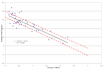
A further reduction in the data set must take place before a determination is made as to which teams over or underperformed against the model. One might argue that what a club’s management and supporters care most about is not a single season of great performance, but consistent performance. Measuring this means quantifying the variation of the team against the regression model over time – a minimum of three data points are required for this (much like Pay as You Play used in Chapter 2). Thus, the full list of 43 teams is reduced to the 33 teams who have played three or more seasons in the Premier League.
A final new concept must be introduced before an evaluation of the teams can be made. As we have the actual table position and predicted table position, the residuals can be calculated. In this case, residuals can be thought of as how much a team has over or underperformed vs. the regression equation. They are calculated by the following equation:
Thus, negative residuals indicate over performance versus the model and positive residuals indicate under performance. By calculating residuals for each team in each season a measure of variation in performance versus the model can be made via the standard deviation of the residuals (recall that standard deviation was also used in Chapter 4 of Pay As You Play). An evaluation of team performance versus the regression equation can now be made.
The table below lists those 33 teams and whether they over performed, under performed, or performed even (push) with the model. The table is first sorted by performance versus the model, then by the standard deviation of their residuals, and then by the average of their residuals. This is a nod to Six Sigma statistical philosophy, which emphasizes shrinking variation first and then shifting the average second. Essentially, teams who are consistent in their performance are the best (click table to enlarge).

What’s clear from the table is that the vast majority of the teams are performing as expected. Of this large group of teams, Manchester United, Liverpool, and West Ham United come the closest to moving into the over performing category. The two Sheffields – United and Wednesday – along with Manchester City come close to dropping out the other end and nearly being labeled under performers.
It should be noted that the vast majority of over performers sit below an MSq£ of 1.0, with Arsenal being the only one above the league average squad expenditure. Arsenal is also at the top of their over performing pile with the fourth overall lowest standard deviation of residuals in the league’s history. Of all 33 teams, only Liverpool, West Bromwich Albion, and Crystal Palace have been more consistent versus the model. To be sure, the Gunners would keep their three titles and consistent Champions League participation in lieu of the top overall spots in the standard deviation metric.
At the opposite end of the table, Newcastle and Chelsea are penalized for their large budgets and inconsistent performance. Chelsea should come as no surprise, given their lower budget, middle-table performance pre-Abramovich and consequent financial largess and three trophies since his purchase of the team. Newcastle suffered from a different problem – consistently spending way too much for the inconsistent results they achieved. The other three clubs in the under performance category represent a breed of team that routinely bounces in and out of the league over a given period of time. Each has had at least three different spells in the Premier League, with the variability in revenue and expenditures with repeated relegation and promotion undoubtedly wreaking havoc on the clubs’ abilities to achieve consistent results.
Given that club performance is understood, how did managers perform against the model? The results of such a study become a little less certain given the reduction in the number of data points that must take place.
The TPI database has 178 distinct manager combinations within it. The term “management combinations” is used because a number of teams experienced mid-year transitions in management (e.g. Roy Evans and Gerard Houllier both managed Liverpool in the 1998-99 season). Assigning responsibility for success or failure in a season where multiple managers were responsible becomes very tricky and time intensive. For the purposes of this study, the 84 such occurrences have been removed from the overall evaluation of manager performance.
The next reduction in data was the elimination of any managers with less than three full seasons of Premier League experience. This reduced the remaining data points by more than half, leaving only 40 managers with such a record. Only 18 of the 44 eliminated managers had two seasons of experience, leaving 26 with one full season of experience. Needless to say, those managers had too little time to implement their vision at the clubs based upon the financial resources available to them.
Finally, confounding of team resources, reputation, and management capability can’t be underestimated. A manager with a mediocre or un-established reputation who is given the aura and the budget of a Chelsea or Arsenal should certainly be able to attract better talent than a similar manager at a less storied and financially resourceful club. This can especially come into play when measuring consistency of performance versus the model, where more established clubs can be expected to have less of a boom/bust cycle in spending and provide greater stability in personnel and performance. Looking at how performance varies with MSq£ attempts to minimize the effects of these related factors, but it can’t eliminate them.
With the aforementioned caveats in mind, the table below summarizes the 40 managers’ performance versus the regression model. Just like the similar table of 33 teams, the table below has been sorted by over/under performance first, then by standard deviation of the manager’s residuals to the regression model, and then by the manager’s average residual to the regression model. The table exhibits results that are far more skewed to the “over performance” and “push” categories than the club-based study, which is likely a result of the confounding factors discussed above. Astute readers will compare this table to those found in chapter two of Pay As You Play, which uses the £XI metric for its comparisons (click table to enlarge).

First things first: a discussion of Evans, Houllier, and Benitez. Liverpool fans are sure to jump on the presence of their last three managers being in the top five and state, “It sure didn’t feel like they were over performing!” It must be kept in mind that this table is sorted by the consistency of performance once over/under performance is determined. Outside of the three-year stints of Chris Coleman and John Gregory, the three previous Liverpool managers provided the most consistent performance of any over performing manager in the history of the Premier League. They also represented some of the most consistent MSq£’s across multiple managers for a single club. Evans certainly should have performed a bit better given that he always had a squad cost that was equal to or better the champions each season, although his utilization rate was 90% or below versus the maximum utilization each season. Houllier and Benitez, for all their faults, performed as expected given that they were always outspent by at least two teams each season. During Houllier’s term, it was Arsenal and Manchester United who constantly won the championship by having MSq£’s of 2.0 or greater. By the time Rafael Benitez took over, Manchester United and Chelsea had begun trading the championship back and forth with MSq£’s that had gone well over 2.5 and 3.0, respectively. By the end of Benitez’s term he was being outspent by four teams, which only compounded the issues associated with low club morale and an uncertain financial future.
The two top managers on the list provide perhaps an instruction in setting realistic expectations of management.
Chris Coleman’s three full years at Fulham showed him prevailing against the financial odds. Coleman began his tenure in 2003-04 season with a squad that cost £76.8M (MSq£ of 0.77) and finished 9th. The team’s immediate drop in value in the next season to £48.9M (MSq£ of 0.53) via the departure of Steve Marlet is a bit misleading, given Marlet’s minimal contribution of one match in 2003-2004 before he was transferred to Olympique Marseille. While Fulham subsequently sold key players like Edwin van der Sar, Louis Saha, and Luis Boa Morte for tidy profits, the reinvestment in players did not translate into improved performance. Despite exceeding expectations and avoiding relegation as every Fulham manager must do, as well as consistently outperforming the budget he was given, Coleman was replaced by Lawrie Sanchez in late 2007 as Fulham battled relegation again and finished in the 16th position indicative of their squad transfer cost.
John Gregory’s term at Aston Villa from the 1998/99 through the 2001/02 season is a story similar to Chris Coleman’s. Gregory may also prove to be one of Pay as You Play’s cautionary tales of smaller club success stories not translating to bigger club Premiership success. Gregory’s expenditures were much bigger than Chris Coleman’s at Fulham, with Gregory bouncing between an MSq£ of 1.06 and 1.14. This was good enough to suggest a mid-table finish of 10th each year, while Gregory exceeded this expectation by finishing sixth twice and eighth once (in his final full year). Indeed, this is spot on with Aston Villa’s historical average for both spend and table position during their eighteen years in the Premier League. Nonetheless, high expectations were set in 1998/99 when Villa were top of the table at the mid way point of the season only to finish sixth. Further finishes in this region of the table, and a backslide by the 2001/02 season, sealed Gregory’s fate with an ownership group and supporters who may have had unrealistic expectations for the club given their expenditures.
Further down the list, Roy Hodgson and Harry Redknapp provide interesting studies given the clubs they have managed this year.
Hodgson essentially got his first break at a big club in the Premier League via Liverpool after brief stints at Blackburn a decade ago and Fulham the last few years. His stint at Blackburn saw him finish sixth the one full season he was their manager, with Rovers getting relegated the next season in which he shared management responsibilities with Brian Kidd after Hodgson was sacked for a horrible start. Poor form was simply too much to take for a squad which cost £190M (MSq£ of 1.9). Hodgson’s two other seasons came with Fulham, where he parlayed a meager budget in 2008-09 (£51.3M for an MSq£ of 0.46) into sixth place and Europa League qualification. His second year at Fulham was much worse in league position (12th with a cost of £54.4M/MSq£ of 0.51), but a strong Europa League run balanced out this poor showing in the eyes of the press. Hodgson’s departure for Liverpool was a disaster, with the club sinking to 12th in the table before he was sacked for underperformance against everyone's expectations.
Harry Redknapp’s checkered career is certainly a more successful one. He took two clubs that were perennial doormats – West Ham United and Portsmouth – and made them perennial mid-table teams under his tenure. Redknapp’s performance versus the regression model certainly has benefited from timely departures from these clubs, with West Ham being relegated two seasons after his departure in 2001 and Portsmouth’s administration and relegation one year after his departure. He inherited a costly club with Tottenham in 2008 – £215.4M for an MSq£ of 1.94 – that was under performing in the relegation zone and guided them to an eighth place finish. His first full season with Tottenham saw him trim the squad cost and put his own stamp on the personnel for a total cost of £178.9M and an MSq£ of 1.68. Redknapp’s managerial skills guided Spurs to their best finish in the Premier League era and a Champions League berth. Tottenham is now seen as one of the new members of the expanded Big Six.
Worth a brief mention is Sam Allardyce, often considered one of the best managers at exceeding the expectation of his clubs’ meager budgets. Much of his poor variation is due to his first two seasons at Bolton when he performed as financially expected and barely dodged relegation, as well as his one full season at Newcastle United where he failed to meet the expectations set by the squad cost for only the second time in his career. Thus, it’s his massive success in his later years at Bolton and single full season at Blackburn that created such wide variability in residual values. Truly strange was his sacking at Blackburn this season. He grossly exceeded expectations based upon squad cost by over five positions in 2009/10, and was doing so again in 2010/11 when sacked. It is befuddling what Blackburn’s management team expects given their meager financial resources.
In the end, this further exemplifies why the MSq£ regression model is a valuable addition to the metrics discussed in Pay As You Play. Much of the discussion in Pay As You Play centered on the order, or relative position, of squad and on-pitch costs between the teams. This helps explain who’s spending more or less than each other and what expectations such an order entails, but it doesn’t explain how much more or less is being spent nor the effect of such gaps in spending. This is analogous to the gap between first and second in the table explaining order of finish, but the point gap is what helps explain the true difference in quality between the two teams. Similarly, increases in transfer spending, especially on the order of multiples, on average create greater separation (both nominally and distribution wise) between expected team finishes. To be more assured of a higher spot, a team must spend much more than its rival clubs. Otherwise, history as quantified via the regression equation teaches us that lower multiples of the league average give us a lower average finish and greater uncertainty of a finish via the prediction intervals.
Take a look at a specific example to understand this point. Liverpool’s current fifth highest squad transfer cost in the league (1.35 MSq) translates to a nominal predicted finish of 8.62. The maximum and minimum values for the 50% PI given Liverpool’s current MSq£ are 10.45 and 6.69. Thus, the statistical model captures the fact that historical variation of teams with similar transfer cost advantages have met expectations by finishing between 10th and 7th (when rounded). If Liverpool wants to be more assured of a higher final table position, they must spend more money on transfers. The reality is that Liverpool has been overachieving for years given their squad cost, both in terms of transfers and wages. With more teams spending a greater multiple of the league average than Liverpool, and as Liverpool slides further back towards the pack in transfer spending, they lose certainty in their likely final table position.
On the other hand the model only explains 70% of the variation we see. The other 30% can be accounted for in managerial mistakes, injuries, youth policies, and the like. One need look no further than Chelsea and their performance this season. Their transfer cost is still the highest in the league, but down from their historical highs. Looking at such a trend via the regression equation helps one understand what they’re seeing on the pitch – a thinner squad, populated by older players, trying to rebuild via a youth policy. The result is a less dominant Chelsea that appears to be challenging for a Champions League qualifying position instead of the Premier League championship. At Liverpool, Hodgson demonstrated a manager often has difficulty doing the opposite – grossly overachieve given the tactics one brings to the club given the players that he has available to him. Kenny Dalglish, with virtually the same team, has been able to extract much better form, and thus many more points, than Hodgson was able to during his tenure. These are the type of insights a regression analysis can provide beyond a traditional rank order analysis, but each is critical to understanding the total picture.
Conclusions
Through this two post series a method for evaluating a club and/or manager’s use of their resources has been developed, and it respects the implicit variability in results that are expected when analyzing squad transfer cost and table position. A differentiation has been made between the £XI metric used in Pay as You Play and the Sq£ metric preferred in this series of posts. Finally, a few projections have been made as to the financial resources required of Liverpool, or any team for that matter, to improve their chances of qualifying for Champions League.
At the end of the day, the use of the Sq£ metric in analyzing the correlation between club expenditures and finish position is really about setting realistic expectations. The first is that one must not kid themselves that the Premier League will be dominated by the financially well off, of which there is an increasing number. The second is that lower level clubs should not kid themselves as to the superior performance their managers may be leveraging given the meager financial resources they are afforded. Spending the money on transfers is only an enabler, not a guarantee, of success. Translating those expenditures into playing time and on-pitch performance is the true guarantee of success, and is often found in the actual managerial skills of the man entrusted with the overall performance of the team. For that there may be no financial measure.
Final Note: None of this work would be possible without the outstanding Transfer Price Index database assembled by Paul Tomkins and Graeme Riley, as well as Paul's generosity in sharing it with me. If you've liked this series of posts, I highly encourage you pick up a copy of Paul and Graeme's Pay As You Play (available in both paperback and Kindle formats). Not only will it continue to enlighten you as to the business aspects of the Premier League, but all proceeds go to charity. Paul and Graeme also continue to extend the book's content at Paul's website, The Tomkins Times, and at the book's website, The Transfer Price Index. Thank you to Paul and Graeme for all of their help and generosity!
In my first post in this series, I explained how the statistical concept of prediction intervals (PIs) could be used to predict the likelihood of qualifying for Champions League based upon MSq£. The concept of PIs will now be used to explain how the MSq£ regression can be utilized to determine which clubs and managers have over and under performed against expectations versus squad transfer cost.
As previously mentioned, prediction intervals can be adjusted to different percentages depending on the attribute of interest. This means they can be used to define the boundaries of over performance (lower bound) and under performance (upper bound) of a defined percentage of teams. This provides a much more accurate accounting of over and underp erformance versus a system that only looks at which side of the regression line a data point falls on. The important question that must be answered is what percentage should be used for such a study?
A related statistical metric is used to study under and over performance – quartiles. The idea is that a distribution can be divided into an upper quartile (under performance in this case as higher numerical table position is worse), a lower quartile (under performance), and an interquartile range that represents the middle 50% of the data that could be considered noise around the regression equation. Thus, the 50% PI will be used to define the cutoff values for table position for the upper and lower quartile finish positions of any MSq£ value. A plot of the 50% PI lines against all teams’ average MSq£ and table position is shown below (click image to enlarge).
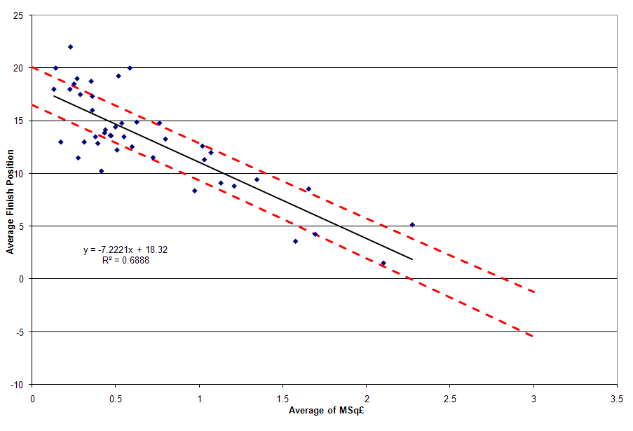
Comparing this plot to the one with the 95% PI lines in the first post in this series, one sees a greater number of data points outside of the dotted lines in the plot above. This is due to the narrowing of the lines versus the regression equation, and a greater number of teams over and under performing against the new metric.A further reduction in the data set must take place before a determination is made as to which teams over or underperformed against the model. One might argue that what a club’s management and supporters care most about is not a single season of great performance, but consistent performance. Measuring this means quantifying the variation of the team against the regression model over time – a minimum of three data points are required for this (much like Pay as You Play used in Chapter 2). Thus, the full list of 43 teams is reduced to the 33 teams who have played three or more seasons in the Premier League.
A final new concept must be introduced before an evaluation of the teams can be made. As we have the actual table position and predicted table position, the residuals can be calculated. In this case, residuals can be thought of as how much a team has over or underperformed vs. the regression equation. They are calculated by the following equation:
Residual = Actual Finish – Predicted Finish
Thus, negative residuals indicate over performance versus the model and positive residuals indicate under performance. By calculating residuals for each team in each season a measure of variation in performance versus the model can be made via the standard deviation of the residuals (recall that standard deviation was also used in Chapter 4 of Pay As You Play). An evaluation of team performance versus the regression equation can now be made.
The table below lists those 33 teams and whether they over performed, under performed, or performed even (push) with the model. The table is first sorted by performance versus the model, then by the standard deviation of their residuals, and then by the average of their residuals. This is a nod to Six Sigma statistical philosophy, which emphasizes shrinking variation first and then shifting the average second. Essentially, teams who are consistent in their performance are the best (click table to enlarge).

What’s clear from the table is that the vast majority of the teams are performing as expected. Of this large group of teams, Manchester United, Liverpool, and West Ham United come the closest to moving into the over performing category. The two Sheffields – United and Wednesday – along with Manchester City come close to dropping out the other end and nearly being labeled under performers.
It should be noted that the vast majority of over performers sit below an MSq£ of 1.0, with Arsenal being the only one above the league average squad expenditure. Arsenal is also at the top of their over performing pile with the fourth overall lowest standard deviation of residuals in the league’s history. Of all 33 teams, only Liverpool, West Bromwich Albion, and Crystal Palace have been more consistent versus the model. To be sure, the Gunners would keep their three titles and consistent Champions League participation in lieu of the top overall spots in the standard deviation metric.
At the opposite end of the table, Newcastle and Chelsea are penalized for their large budgets and inconsistent performance. Chelsea should come as no surprise, given their lower budget, middle-table performance pre-Abramovich and consequent financial largess and three trophies since his purchase of the team. Newcastle suffered from a different problem – consistently spending way too much for the inconsistent results they achieved. The other three clubs in the under performance category represent a breed of team that routinely bounces in and out of the league over a given period of time. Each has had at least three different spells in the Premier League, with the variability in revenue and expenditures with repeated relegation and promotion undoubtedly wreaking havoc on the clubs’ abilities to achieve consistent results.
Given that club performance is understood, how did managers perform against the model? The results of such a study become a little less certain given the reduction in the number of data points that must take place.
The TPI database has 178 distinct manager combinations within it. The term “management combinations” is used because a number of teams experienced mid-year transitions in management (e.g. Roy Evans and Gerard Houllier both managed Liverpool in the 1998-99 season). Assigning responsibility for success or failure in a season where multiple managers were responsible becomes very tricky and time intensive. For the purposes of this study, the 84 such occurrences have been removed from the overall evaluation of manager performance.
The next reduction in data was the elimination of any managers with less than three full seasons of Premier League experience. This reduced the remaining data points by more than half, leaving only 40 managers with such a record. Only 18 of the 44 eliminated managers had two seasons of experience, leaving 26 with one full season of experience. Needless to say, those managers had too little time to implement their vision at the clubs based upon the financial resources available to them.
Finally, confounding of team resources, reputation, and management capability can’t be underestimated. A manager with a mediocre or un-established reputation who is given the aura and the budget of a Chelsea or Arsenal should certainly be able to attract better talent than a similar manager at a less storied and financially resourceful club. This can especially come into play when measuring consistency of performance versus the model, where more established clubs can be expected to have less of a boom/bust cycle in spending and provide greater stability in personnel and performance. Looking at how performance varies with MSq£ attempts to minimize the effects of these related factors, but it can’t eliminate them.
With the aforementioned caveats in mind, the table below summarizes the 40 managers’ performance versus the regression model. Just like the similar table of 33 teams, the table below has been sorted by over/under performance first, then by standard deviation of the manager’s residuals to the regression model, and then by the manager’s average residual to the regression model. The table exhibits results that are far more skewed to the “over performance” and “push” categories than the club-based study, which is likely a result of the confounding factors discussed above. Astute readers will compare this table to those found in chapter two of Pay As You Play, which uses the £XI metric for its comparisons (click table to enlarge).

First things first: a discussion of Evans, Houllier, and Benitez. Liverpool fans are sure to jump on the presence of their last three managers being in the top five and state, “It sure didn’t feel like they were over performing!” It must be kept in mind that this table is sorted by the consistency of performance once over/under performance is determined. Outside of the three-year stints of Chris Coleman and John Gregory, the three previous Liverpool managers provided the most consistent performance of any over performing manager in the history of the Premier League. They also represented some of the most consistent MSq£’s across multiple managers for a single club. Evans certainly should have performed a bit better given that he always had a squad cost that was equal to or better the champions each season, although his utilization rate was 90% or below versus the maximum utilization each season. Houllier and Benitez, for all their faults, performed as expected given that they were always outspent by at least two teams each season. During Houllier’s term, it was Arsenal and Manchester United who constantly won the championship by having MSq£’s of 2.0 or greater. By the time Rafael Benitez took over, Manchester United and Chelsea had begun trading the championship back and forth with MSq£’s that had gone well over 2.5 and 3.0, respectively. By the end of Benitez’s term he was being outspent by four teams, which only compounded the issues associated with low club morale and an uncertain financial future.
The two top managers on the list provide perhaps an instruction in setting realistic expectations of management.
Chris Coleman’s three full years at Fulham showed him prevailing against the financial odds. Coleman began his tenure in 2003-04 season with a squad that cost £76.8M (MSq£ of 0.77) and finished 9th. The team’s immediate drop in value in the next season to £48.9M (MSq£ of 0.53) via the departure of Steve Marlet is a bit misleading, given Marlet’s minimal contribution of one match in 2003-2004 before he was transferred to Olympique Marseille. While Fulham subsequently sold key players like Edwin van der Sar, Louis Saha, and Luis Boa Morte for tidy profits, the reinvestment in players did not translate into improved performance. Despite exceeding expectations and avoiding relegation as every Fulham manager must do, as well as consistently outperforming the budget he was given, Coleman was replaced by Lawrie Sanchez in late 2007 as Fulham battled relegation again and finished in the 16th position indicative of their squad transfer cost.
John Gregory’s term at Aston Villa from the 1998/99 through the 2001/02 season is a story similar to Chris Coleman’s. Gregory may also prove to be one of Pay as You Play’s cautionary tales of smaller club success stories not translating to bigger club Premiership success. Gregory’s expenditures were much bigger than Chris Coleman’s at Fulham, with Gregory bouncing between an MSq£ of 1.06 and 1.14. This was good enough to suggest a mid-table finish of 10th each year, while Gregory exceeded this expectation by finishing sixth twice and eighth once (in his final full year). Indeed, this is spot on with Aston Villa’s historical average for both spend and table position during their eighteen years in the Premier League. Nonetheless, high expectations were set in 1998/99 when Villa were top of the table at the mid way point of the season only to finish sixth. Further finishes in this region of the table, and a backslide by the 2001/02 season, sealed Gregory’s fate with an ownership group and supporters who may have had unrealistic expectations for the club given their expenditures.
Further down the list, Roy Hodgson and Harry Redknapp provide interesting studies given the clubs they have managed this year.
Hodgson essentially got his first break at a big club in the Premier League via Liverpool after brief stints at Blackburn a decade ago and Fulham the last few years. His stint at Blackburn saw him finish sixth the one full season he was their manager, with Rovers getting relegated the next season in which he shared management responsibilities with Brian Kidd after Hodgson was sacked for a horrible start. Poor form was simply too much to take for a squad which cost £190M (MSq£ of 1.9). Hodgson’s two other seasons came with Fulham, where he parlayed a meager budget in 2008-09 (£51.3M for an MSq£ of 0.46) into sixth place and Europa League qualification. His second year at Fulham was much worse in league position (12th with a cost of £54.4M/MSq£ of 0.51), but a strong Europa League run balanced out this poor showing in the eyes of the press. Hodgson’s departure for Liverpool was a disaster, with the club sinking to 12th in the table before he was sacked for underperformance against everyone's expectations.
Harry Redknapp’s checkered career is certainly a more successful one. He took two clubs that were perennial doormats – West Ham United and Portsmouth – and made them perennial mid-table teams under his tenure. Redknapp’s performance versus the regression model certainly has benefited from timely departures from these clubs, with West Ham being relegated two seasons after his departure in 2001 and Portsmouth’s administration and relegation one year after his departure. He inherited a costly club with Tottenham in 2008 – £215.4M for an MSq£ of 1.94 – that was under performing in the relegation zone and guided them to an eighth place finish. His first full season with Tottenham saw him trim the squad cost and put his own stamp on the personnel for a total cost of £178.9M and an MSq£ of 1.68. Redknapp’s managerial skills guided Spurs to their best finish in the Premier League era and a Champions League berth. Tottenham is now seen as one of the new members of the expanded Big Six.
Worth a brief mention is Sam Allardyce, often considered one of the best managers at exceeding the expectation of his clubs’ meager budgets. Much of his poor variation is due to his first two seasons at Bolton when he performed as financially expected and barely dodged relegation, as well as his one full season at Newcastle United where he failed to meet the expectations set by the squad cost for only the second time in his career. Thus, it’s his massive success in his later years at Bolton and single full season at Blackburn that created such wide variability in residual values. Truly strange was his sacking at Blackburn this season. He grossly exceeded expectations based upon squad cost by over five positions in 2009/10, and was doing so again in 2010/11 when sacked. It is befuddling what Blackburn’s management team expects given their meager financial resources.
In the end, this further exemplifies why the MSq£ regression model is a valuable addition to the metrics discussed in Pay As You Play. Much of the discussion in Pay As You Play centered on the order, or relative position, of squad and on-pitch costs between the teams. This helps explain who’s spending more or less than each other and what expectations such an order entails, but it doesn’t explain how much more or less is being spent nor the effect of such gaps in spending. This is analogous to the gap between first and second in the table explaining order of finish, but the point gap is what helps explain the true difference in quality between the two teams. Similarly, increases in transfer spending, especially on the order of multiples, on average create greater separation (both nominally and distribution wise) between expected team finishes. To be more assured of a higher spot, a team must spend much more than its rival clubs. Otherwise, history as quantified via the regression equation teaches us that lower multiples of the league average give us a lower average finish and greater uncertainty of a finish via the prediction intervals.
Take a look at a specific example to understand this point. Liverpool’s current fifth highest squad transfer cost in the league (1.35 MSq) translates to a nominal predicted finish of 8.62. The maximum and minimum values for the 50% PI given Liverpool’s current MSq£ are 10.45 and 6.69. Thus, the statistical model captures the fact that historical variation of teams with similar transfer cost advantages have met expectations by finishing between 10th and 7th (when rounded). If Liverpool wants to be more assured of a higher final table position, they must spend more money on transfers. The reality is that Liverpool has been overachieving for years given their squad cost, both in terms of transfers and wages. With more teams spending a greater multiple of the league average than Liverpool, and as Liverpool slides further back towards the pack in transfer spending, they lose certainty in their likely final table position.
On the other hand the model only explains 70% of the variation we see. The other 30% can be accounted for in managerial mistakes, injuries, youth policies, and the like. One need look no further than Chelsea and their performance this season. Their transfer cost is still the highest in the league, but down from their historical highs. Looking at such a trend via the regression equation helps one understand what they’re seeing on the pitch – a thinner squad, populated by older players, trying to rebuild via a youth policy. The result is a less dominant Chelsea that appears to be challenging for a Champions League qualifying position instead of the Premier League championship. At Liverpool, Hodgson demonstrated a manager often has difficulty doing the opposite – grossly overachieve given the tactics one brings to the club given the players that he has available to him. Kenny Dalglish, with virtually the same team, has been able to extract much better form, and thus many more points, than Hodgson was able to during his tenure. These are the type of insights a regression analysis can provide beyond a traditional rank order analysis, but each is critical to understanding the total picture.
Conclusions
Through this two post series a method for evaluating a club and/or manager’s use of their resources has been developed, and it respects the implicit variability in results that are expected when analyzing squad transfer cost and table position. A differentiation has been made between the £XI metric used in Pay as You Play and the Sq£ metric preferred in this series of posts. Finally, a few projections have been made as to the financial resources required of Liverpool, or any team for that matter, to improve their chances of qualifying for Champions League.
At the end of the day, the use of the Sq£ metric in analyzing the correlation between club expenditures and finish position is really about setting realistic expectations. The first is that one must not kid themselves that the Premier League will be dominated by the financially well off, of which there is an increasing number. The second is that lower level clubs should not kid themselves as to the superior performance their managers may be leveraging given the meager financial resources they are afforded. Spending the money on transfers is only an enabler, not a guarantee, of success. Translating those expenditures into playing time and on-pitch performance is the true guarantee of success, and is often found in the actual managerial skills of the man entrusted with the overall performance of the team. For that there may be no financial measure.
Final Note: None of this work would be possible without the outstanding Transfer Price Index database assembled by Paul Tomkins and Graeme Riley, as well as Paul's generosity in sharing it with me. If you've liked this series of posts, I highly encourage you pick up a copy of Paul and Graeme's Pay As You Play (available in both paperback and Kindle formats). Not only will it continue to enlighten you as to the business aspects of the Premier League, but all proceeds go to charity. Paul and Graeme also continue to extend the book's content at Paul's website, The Tomkins Times, and at the book's website, The Transfer Price Index. Thank you to Paul and Graeme for all of their help and generosity!
Tuesday, February 8, 2011
Finishing in the Premier League Top 4: The Financial Commitment Required of a Spot in Champions League
Note: This is the first post in a two-part series that will extend the analysis of team and manager performance versus squad cost. This post originally appeared behind the paywall at The Tomkins Times.
In my post on the correlation between squad cost and table position a regression model was developed to quantify the relationship between the two. Since then, there have been many questions asked about the regression analysis.
The Easy Stuff: The Full Prediction Table and Why MSq£ Is Used
First, let’s address the answers to the easier questions before diving into the new concepts.
Why focus the original analysis on Sq£ rather than the £XI? As was stated in the original post, there were several factors that went into that decision:
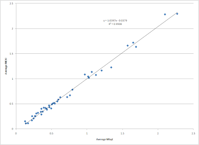
Any regression study of table position versus M£XI is going to be nearly identical to the MSq£ regression in the original study. While utilization rates over time may vary due to managerial issues, injuries, illness, etc. the average tendency is that spending more on the squad gives a club about the same advantage in the average cost of the talent that appears in any match in a season.
That’s not to say the spending on squad and the XI on the pitch is equal. In fact, the graph below indicates that in the eighteen years of the Premier League the disparity between the cost of the squad and the cost of the talent on the pitch has been growing (click image to enlarge).

As can be observed, the average Sq£ rose by about a £2.34M per season (Note: the rate of increase drops dramatically to £1.55M/season if the first three years of 22 teams per season are removed from the data set). At the same time the ratio of the season average £XI to average Sq£ has been dropping by about 1% every three years. This means that while one must spend multiples of the league average in Sq£ to compete for top table positions, an ever increasing amount of the squad expenditures will not see time on the pitch. This is yet another confirmation that financially rich clubs have an advantage over poorer ones.
Next, we consider what happens when the predicted table position from the MSq£ regression equation is not clipped at 1.0. The table below shows the unclipped and clipped values for predicted 2010/11 table position based upon each club’s 2010/11 MSq£ and sorted in ascending order of current table position. The table positions were taken as of January 18, 2011 from statto.com.

One can now begin to understand how out-of-the-norm Chelsea’s, Manchester City’s, and Manchester United’s 2010/11 spending is – they each have a predicted finish below zero. To be fair, this is a bit of an effect that Stefan Szymanski noticed in his own data set as well as the Transfer Price Index: the expenditures and table positions of such teams over time have led the regression models to modestly over predict the squad wage and transfer costs required for a top spot in the league.
The Advanced Stuff: Using Prediction Intervals to Predict the MSq£ Required for Champion’s League Qualification
One intrepid reader of my last blog post asked how one might calculate the Sq£ required for Liverpool to achieve fourth place given the regression equation, as well as the minimum amount required to have a reasonable chance at such a spot. Luckily, an advanced regression concept can help us answer those questions.
The regression equation predicts a club must spend 1.98 times the league average to achieve a fourth place position. Given Liverpool’s current MSq£ of 1.35 and the 2010-2011 average Sq£ of £115.7M, the Reds would have to increase their Sq£ by £73.6M to reach the magical MSq£ of 1.98. However, regression analysis, like all statistical theory, is really all about the underlying distribution of data upon which it is built. The regression equation we see in a graph is technically a “least squares” analysis, where the software constructs a mathematical equation that minimizes the square of the differences between the regression’s predicted values and the actual values in the data set (aka “minimizing the square of the residuals”). The resulting line and the equation describing it can be thought of as a 50/50 answer – the value of any single past or future observation has a 50% chance of being above the regression line or a 50% chance below it. We can think of the regression line as the likely average value.
Luckily, advanced statistical packages allow us to understand the distribution of the expected y-axis (or response) values (i.e. table position) for a given x-axis (or predictor) value (i.e. MSq£). These distributions are called prediction intervals (PI), and are used to understand the range of values (table position) that can be expected for an individual future observation (MSq£). Prediction intervals are communicated as percentages, and are centered on the regression line. Thus, a 50%PI represents the bounds of 50% of the expected finishing positions over time for a given MSq£, and is expressed as the maximum and minimum table position (the bounds) in that distribution. Those bounds are the data points that are 25% above and 25% below the original regression line. Prediction intervals can be calculated along the entire range of predictors (MSq£) to generate bounds around the regression line.
A common use of PI’s is to identify outliers in the data set. This is done by calculating the 95% PI lines for the distribution and then identifying which pieces of data from the overall data set fall outside the lines. Any point that falls outside of the lines represents 5% of the data, thus has a low chance of occurring. A plot of table position vs. MSq£ can be found below. The original regression equation is found with its 95% PI lines (dashed) (click image to enlarge).

Only two teams fall outside the 95% PI, and thus are considered outliers. Both fell above the upper line, indicating they grossly underperformed versus the regression equation. Both teams played in the 22 team era of the league, with both being relegated rather quickly.
The first, Swindon Town, spent only 0.25 times the average Sq£ in their one and only season in the Premier League (1993-1994). Combine that inexpensive squad with the fact that their manager departed for greener pastures as soon as promotion from the Championship was achieved, and it’s little wonder they set a standard of futility few have surpassed (including conceding 100 league goals).
The second, Oldham Athletic, were inaugural members of the Premier League and lasted two seasons before they were relegated. They spent an average of 0.55 times the average Sq£ during their two seasons, finishing 19th (1 spot above relegation) in 1993 and 21st (and relegated) in 1994. The average finish of 20th given their MSq£ represents the largest underachievement of any club in the Premier League’s history.
Analysis of how to improve one’s Champions League qualification chances can now be studied as there is a basic understanding of PI’s.
As previously discussed, the regression equation predicted a club with an MSq£ of 1.98 had a 50/50 chance of finishing fourth or better. How great of a squad cost is required to achieve a 75% chance (or 3-to-1) of qualifying for Champions League? If one thinks in terms of PI’s, the corresponding PI would be the one where the upper bound leaves 25% of the data outside of the distribution. If PI’s are equally distributed around the regression equation and one wants to find the PI with an upper bound that leaves 25% of the data outside of the distribution, the corresponding PI is the 50% PI. The MSq£ where the 25% upper bound from the PI equals 4.0 is 2.26. This means teams that spend 2.26 the average squad cost will have 3-to-1 odds of finishing fourth or better.
Using various PI’s, the following MSq£’s are required to achieve the corresponding odds of finishing fourth or better.
Looking at the historical record, these odds are achieved at much lower expenditure multiples. Since the 2001-02 season any team that has had an MSq£ of 2.12 or greater has qualified for the next season’s Champions League. In fact, only one team has had an MSq£ of 1.98 or greater and failed to qualify for Champions League - Manchester City in 2009-10 (Spurs’ and their 1.68 MSq£ nipped them for fourth). Everton owns the lowest MSq£ for a Champion’s League qualifier, with their fourth place finish in 2004-05 supported by an MSq£ of 0.74 (note: they subsequently failed to make it out of the Champions League third qualifying round). One must climb another thirty-seven positions in the MSq£ rankings since 2001-02 to find the next Champions League qualifier – Arsenal’s 2008-2009 squad with an MSq£ of 1.01. Odds improve to 50/50 around an MSq£ of 1.60 to 1.65. It seems as if this is the perfect example of the over prediction phenomenon that Stefan Szymanski wrote about. Keep this in mind when the financial improvement needed at Liverpool is discussed.
It is now becoming clear as to how much more Liverpool must spend to improve their odds of qualifying for Champions League in the 2010-2011. Based upon the regression model predictions, they must spend the following sums to achieve the given odds:
So now that the cost to compete for Champions League positions is understood, how should a team or manager be evaluated against those odds? What about the other sixteen teams in the league that do not qualify for such a competition - how should they and their managers be judged? A framework to aid such judgement will be discussed in the second post in this series, and it will also be applied to a number of managers to determine who has under and over performed the most given the financial resources expended by the club.
Editorial Note: Readers who had access to the original version of this post may notice a change in the second graph between the original post and this one. In that first post I mistakenly labeled the left-hand y-axis of the graph as "Average Sq£". It should have been labeled "Average £XI" as that was the data shown in the plot. The graph in this post, and the first sentence of commentary after it, has been corrected to plot the average Sq£ per the label on the left-hand y-axis. The core conclusion of that portion of the original post, that an increasing share of squad transfer costs are going unused during a season, is unchanged as that data was correctly plotted.
In my post on the correlation between squad cost and table position a regression model was developed to quantify the relationship between the two. Since then, there have been many questions asked about the regression analysis.
- How much would Liverpool have to spend to have a shot at qualifying for Champions League?
- Considering the model captures 70% of the variation between the two data sets, how much does Liverpool need to spend to “safely” have a shot at Champions League?
- What were the actual predicted, unclipped finish positions for 2010-2011?
- Why focus on the Sq£ metric rather than £XI?
The Easy Stuff: The Full Prediction Table and Why MSq£ Is Used
First, let’s address the answers to the easier questions before diving into the new concepts.
Why focus the original analysis on Sq£ rather than the £XI? As was stated in the original post, there were several factors that went into that decision:
- To determine the most basic relationship between financial expenditures and table position, analysis must follow the order of events. That is, a transfer must first take place, then a wage negotiated, then a player can put in time on the pitch and generate utilization statistics. Thus, the original analysis first looked at overall transfer expenditures to see if there was a relationship. If there is one, likely root cause correlation has been established.
- As £XI requires utilization before it is populated with a value, it cannot be used as a forward looking, predictive metric to gauge future performance.
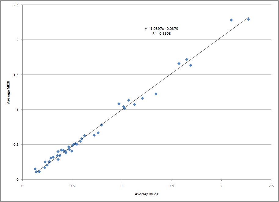
Any regression study of table position versus M£XI is going to be nearly identical to the MSq£ regression in the original study. While utilization rates over time may vary due to managerial issues, injuries, illness, etc. the average tendency is that spending more on the squad gives a club about the same advantage in the average cost of the talent that appears in any match in a season.
That’s not to say the spending on squad and the XI on the pitch is equal. In fact, the graph below indicates that in the eighteen years of the Premier League the disparity between the cost of the squad and the cost of the talent on the pitch has been growing (click image to enlarge).

As can be observed, the average Sq£ rose by about a £2.34M per season (Note: the rate of increase drops dramatically to £1.55M/season if the first three years of 22 teams per season are removed from the data set). At the same time the ratio of the season average £XI to average Sq£ has been dropping by about 1% every three years. This means that while one must spend multiples of the league average in Sq£ to compete for top table positions, an ever increasing amount of the squad expenditures will not see time on the pitch. This is yet another confirmation that financially rich clubs have an advantage over poorer ones.
Next, we consider what happens when the predicted table position from the MSq£ regression equation is not clipped at 1.0. The table below shows the unclipped and clipped values for predicted 2010/11 table position based upon each club’s 2010/11 MSq£ and sorted in ascending order of current table position. The table positions were taken as of January 18, 2011 from statto.com.

One can now begin to understand how out-of-the-norm Chelsea’s, Manchester City’s, and Manchester United’s 2010/11 spending is – they each have a predicted finish below zero. To be fair, this is a bit of an effect that Stefan Szymanski noticed in his own data set as well as the Transfer Price Index: the expenditures and table positions of such teams over time have led the regression models to modestly over predict the squad wage and transfer costs required for a top spot in the league.
The Advanced Stuff: Using Prediction Intervals to Predict the MSq£ Required for Champion’s League Qualification
One intrepid reader of my last blog post asked how one might calculate the Sq£ required for Liverpool to achieve fourth place given the regression equation, as well as the minimum amount required to have a reasonable chance at such a spot. Luckily, an advanced regression concept can help us answer those questions.
The regression equation predicts a club must spend 1.98 times the league average to achieve a fourth place position. Given Liverpool’s current MSq£ of 1.35 and the 2010-2011 average Sq£ of £115.7M, the Reds would have to increase their Sq£ by £73.6M to reach the magical MSq£ of 1.98. However, regression analysis, like all statistical theory, is really all about the underlying distribution of data upon which it is built. The regression equation we see in a graph is technically a “least squares” analysis, where the software constructs a mathematical equation that minimizes the square of the differences between the regression’s predicted values and the actual values in the data set (aka “minimizing the square of the residuals”). The resulting line and the equation describing it can be thought of as a 50/50 answer – the value of any single past or future observation has a 50% chance of being above the regression line or a 50% chance below it. We can think of the regression line as the likely average value.
Luckily, advanced statistical packages allow us to understand the distribution of the expected y-axis (or response) values (i.e. table position) for a given x-axis (or predictor) value (i.e. MSq£). These distributions are called prediction intervals (PI), and are used to understand the range of values (table position) that can be expected for an individual future observation (MSq£). Prediction intervals are communicated as percentages, and are centered on the regression line. Thus, a 50%PI represents the bounds of 50% of the expected finishing positions over time for a given MSq£, and is expressed as the maximum and minimum table position (the bounds) in that distribution. Those bounds are the data points that are 25% above and 25% below the original regression line. Prediction intervals can be calculated along the entire range of predictors (MSq£) to generate bounds around the regression line.
A common use of PI’s is to identify outliers in the data set. This is done by calculating the 95% PI lines for the distribution and then identifying which pieces of data from the overall data set fall outside the lines. Any point that falls outside of the lines represents 5% of the data, thus has a low chance of occurring. A plot of table position vs. MSq£ can be found below. The original regression equation is found with its 95% PI lines (dashed) (click image to enlarge).

Only two teams fall outside the 95% PI, and thus are considered outliers. Both fell above the upper line, indicating they grossly underperformed versus the regression equation. Both teams played in the 22 team era of the league, with both being relegated rather quickly.
The first, Swindon Town, spent only 0.25 times the average Sq£ in their one and only season in the Premier League (1993-1994). Combine that inexpensive squad with the fact that their manager departed for greener pastures as soon as promotion from the Championship was achieved, and it’s little wonder they set a standard of futility few have surpassed (including conceding 100 league goals).
The second, Oldham Athletic, were inaugural members of the Premier League and lasted two seasons before they were relegated. They spent an average of 0.55 times the average Sq£ during their two seasons, finishing 19th (1 spot above relegation) in 1993 and 21st (and relegated) in 1994. The average finish of 20th given their MSq£ represents the largest underachievement of any club in the Premier League’s history.
Analysis of how to improve one’s Champions League qualification chances can now be studied as there is a basic understanding of PI’s.
As previously discussed, the regression equation predicted a club with an MSq£ of 1.98 had a 50/50 chance of finishing fourth or better. How great of a squad cost is required to achieve a 75% chance (or 3-to-1) of qualifying for Champions League? If one thinks in terms of PI’s, the corresponding PI would be the one where the upper bound leaves 25% of the data outside of the distribution. If PI’s are equally distributed around the regression equation and one wants to find the PI with an upper bound that leaves 25% of the data outside of the distribution, the corresponding PI is the 50% PI. The MSq£ where the 25% upper bound from the PI equals 4.0 is 2.26. This means teams that spend 2.26 the average squad cost will have 3-to-1 odds of finishing fourth or better.
Using various PI’s, the following MSq£’s are required to achieve the corresponding odds of finishing fourth or better.
- 3-to-1 odds for: MSq£=2.26
- 5-to-1 odds for: MSq£=2.38
- 10-to-1 odds for: MSq£=2.55
Looking at the historical record, these odds are achieved at much lower expenditure multiples. Since the 2001-02 season any team that has had an MSq£ of 2.12 or greater has qualified for the next season’s Champions League. In fact, only one team has had an MSq£ of 1.98 or greater and failed to qualify for Champions League - Manchester City in 2009-10 (Spurs’ and their 1.68 MSq£ nipped them for fourth). Everton owns the lowest MSq£ for a Champion’s League qualifier, with their fourth place finish in 2004-05 supported by an MSq£ of 0.74 (note: they subsequently failed to make it out of the Champions League third qualifying round). One must climb another thirty-seven positions in the MSq£ rankings since 2001-02 to find the next Champions League qualifier – Arsenal’s 2008-2009 squad with an MSq£ of 1.01. Odds improve to 50/50 around an MSq£ of 1.60 to 1.65. It seems as if this is the perfect example of the over prediction phenomenon that Stefan Szymanski wrote about. Keep this in mind when the financial improvement needed at Liverpool is discussed.
It is now becoming clear as to how much more Liverpool must spend to improve their odds of qualifying for Champions League in the 2010-2011. Based upon the regression model predictions, they must spend the following sums to achieve the given odds:
- Even odds: £73.6M
- 3-to-1 odds for: £105.3M
- 5-to-1 odds for: £119.2M
- 10-to-1 odds for: £138.8M
So now that the cost to compete for Champions League positions is understood, how should a team or manager be evaluated against those odds? What about the other sixteen teams in the league that do not qualify for such a competition - how should they and their managers be judged? A framework to aid such judgement will be discussed in the second post in this series, and it will also be applied to a number of managers to determine who has under and over performed the most given the financial resources expended by the club.
Editorial Note: Readers who had access to the original version of this post may notice a change in the second graph between the original post and this one. In that first post I mistakenly labeled the left-hand y-axis of the graph as "Average Sq£". It should have been labeled "Average £XI" as that was the data shown in the plot. The graph in this post, and the first sentence of commentary after it, has been corrected to plot the average Sq£ per the label on the left-hand y-axis. The core conclusion of that portion of the original post, that an increasing share of squad transfer costs are going unused during a season, is unchanged as that data was correctly plotted.
Subscribe to:
Posts (Atom)
 |
 |
 |
 |
 |
 |
 |
 |
 |
 |
 |
 |
 |
 |
 |
 |


LinkWithin
