Showing posts with label Transfer Price Index. Show all posts

Tuesday, August 16, 2011

Farewell, El Capitan

All We're Left With Is Memories and Dreams of What-Might-Have-Been

When I went to bed Sunday night I was planning on spending this evening writing about the 2011-12 EPL season outlook using my input to the Transfer Price Index's season predictions.  I thought I had come to terms with the departure of of Cesc Fabregas over the summer, and certainly in the last week as it became abundantly clear that Barcelona were going to have their man no matter what.  All of that changed on Monday morning, as I woke to the inevitable news of his sale and for some strange reason I felt emotional loss.  It's odd for me, as I've only been following the Gunners for 2+ seasons now.  I certainly have come to love them because of their beautiful play, rich history, and their intention to not buy championships but build teams from the (relative) ground up to win them as a club and not a rich man's toy.  But I've never seen them in person, and certainly have avoided buying any player's jersey in anticipation of the inevitable transfer they will leave upon.  I've intentionally avoided making any emotional attachments knowing the brutal business realities within which a club must work.

At the same time, I've probably never typed "I <3..." for any other player except Cesc.  Those unfortunate enough to listen to my Twitter feed during a match certainly saw that phrase on occasion the last two seasons.  For some reason I was magnetically attracted to Cesc, and loved him for what he embodied and what he stood for the last 5-6 years.  It was the realization Monday morning - the fact that I will likely NEVER type "I <3 Cesc" ever again - that made me think about why such a forgone conclusion seemed to affect me so much.  This blog post is an attempt to explain the thoughts I've had in the last 24 hours.

The Emotional: Breaking Up Is Hard To Do

During the drive in to work on Monday I had a flood of emotions come over me.  Cesc's departure was the first big loss by the club in my brief fandom, so I wondered why this one seemed to bother me so much.  Sure, losing a captain is never easy for club, especially when it seems as if he just might be coming in to his prime.  But as I thought about those emotions, I concluded it was something deeper.  I finally realized what was bothering me- these are some of the same emotions I felt when I went through my divorce from my first wife.  Certainly this was nowhere near as personal, nowhere near as intense, but the feelings were similar nonetheless.
  • Betrayal of promises of a commitment to the club and its goals.  

  • The finality of it all after such a long transfer process.

  • Even the issue of seeing someone you considered committed to you (or your club) kiss the suitor to which you lost them.  

And that's how I choose to view Cesc's departure: a divorce, or at least an end to a long-term relationship where the two involved in the relationship made life-altering plans around each other.

Marriage Counseling, Arsene Style

Most relationships fail because those involved in them mistakenly believe love is all they need.  Marriages don't survive on love alone - they survive because that love allows for the couple in the marriage to become more than the sum of their parts.  Different marriages judge that sum by different measures - some desire money, some desire possessions, others desire spiritual growth, others find a higher purpose for their marriage in the rearing of their children.  There are a millions of motivations for being married, but the most durable marriages rely on the concept of a "sum is greater than its parts" and then utilize love to realize that sum.

In the case of Cesc and Arsenal, that's where the relationship broke down.  It wasn't about the money - he's paying €1M a year to Arsenal for five years for the privilege of going to Barcelona.  It wasn't about the love - he reiterated his love for the club and its supporters even as he was introduced at Camp Nou.  It wasn't really about going home, that was just a side benefit.  Does anyone really think he would return to Barcelona if they weren't a more prestigious club than Arsenal at the moment?  It was about the sum not being greater than its parts.  In being introduced at the Camp Nou, Cesc said of his reason for the departure:
"It wasn't really the losing, it was the routine. Year after year, it was always the same story.  Fighting until the end only to see we didn't have the energy, in the semifinals, the finals, to arrive in the final sprint."
Cesc knows he's a great player.  What he was looking for in departing for Arsenal eight years ago was a chance to contribute to a world class club's already rich history.  He could have done that at Barcelona, but he chose to take his talents to London and attempt to build upon what Henry, Bergkamp, and others had already started under Arsene Wenger.  He soon found himself being the centerpiece the team was built around, both tactically and leadership-wise.  Yet season after season, he saw his own club falter in the business end of the season while his former club became one of the best club sides of all time.  He was brought in to a great club that was winning championships, was told the entire team was being (re-)built around him, and the rebuilding project had yet to bear fruit over six seasons of its implementation.  Cesc had enough of the promises of something better that went continuously

None of this makes Cesc's departure any easier - not for him, not for the club, and not its supporters.  No matter how rational the move might seem, we supporters felt he was our captain.  During a particularly challenging time in the club's history, we were looking to him to lead rather than leave.  We wanted him to recommit to the club, just as we wanted the club to recommit itself to spend the funds to build the championship team he deserved.  In some ways, we entered "counseling" last summer and agreed to work on things - compete strongly in 2010/11, win a cup or two, and perhaps we could patch things up after five years of nothing.  That clearly wasn't the case, and Wenger saw the writing on the wall.  The counseling failed, and the divorce proceeded with Wenger reluctantly granting his captain the divorce he desired.

But did it make logical sense from Cesc's perspective, or was he making a decision as emotional as the supporters' reactions to it?

The Analytical: Cesc is Justified in Leaving

Let's look at what Cesc arrived to and what he left behind, and judge his decision in the totality of the data.  As you know, I've spent much digital ink demonstrating that championship caliber teams are built upon transfers via my work in the Transfer Price Index (TPI) database.  It is that outlook I carry over in to the analysis below.

Note: All transfer figures are in 2011 TPI numbers
  • Player Purchases: After spending big money on players like Dennis Bergkamp (£25.1M), Thierry Henry (£29.9M), Marc Overmars (£21.5M), and Sylvain Wiltord (£29.5M) during the championship years, Arsenal would only buy two players during the trophyless years for more than £20M - Alexander Hleb (£26M) and Theo Walcott (£27.9M).

  • Squad Cost: The total squad cost (Sq£) was £252M in 2003-04, but by the end of the 2010-11 season it had been reduced to £155M (a 38% reduction). This has led Arsenal to fall from a solid third position within the Big Six (and nearly on par with Manchester United in 2nd position) in 2003-04 to a clear sixth position in squad cost by 2010-11 (click on graph below to enlarge).

  • Starting XI Cost: When Fabregas arrived at the start of the 2003-2004 season, Arsenal had an average starting XI cost (£XI) of £120M.  By the time of his final season at Arsenal, the average £XI had fallen to £71.5M (a 40% reduction). Arsenal's slide in the £XI metric versus the other Big Six clubs is similar to that seen for the Sq£ metric (click on graphic to enlarge).


  • Performance vs. Transfer Expectations: During the Invincibles run, Arsenal earned an astonishing 0.96 PPG above what was predicted by the m£XIR model.  That had decreased to a more pedestrian 0.38 PPG by last season, with each of the last four seasons seeing a steady erosion from 0.63 PPG over performance in 2007/08 to the 0.38 PPG experienced last season.  This suggests that Wenger's youth project that has focused on reducing squad costs and preserving performance clearly is not working, even given the reduced transfer costs of the assembled team.  Especially troubling to Cesc must have been the championship caliber performances over the first half of the last two seasons (0.69 PPG in 2009-10, 0.53 PPG in 2010-11) that was followed up with poor second halves both years (regression to a season long average of 0.50 and 0.38 PPG, respectively).

  • Trophies:  In Cesc's first three seasons with Arsenal, the club won the Premiership (2004), the FA Cup (2005), and made it to the Champions League final in 2006 where they lost to Barcelona.  After that run, they featured in two League Cup Finals (2007, 2011), and were otherwise knocked out in semi-final or earlier rounds of every other competition in the five years.

  • Premier League Table: After finishing first in 2003-04 and second a year later, Arsenal averaged a table position of 3.67 and never finished higher than third in the final six years Cesc was at the club.

Conclusions

It's clear that while Arsene's management of the team finances has prevented the club from going into debt like other clubs, it has also put a glass ceiling on the club's table position and trophy case.  Cesc's observation relating to "the routine" of late season failure was spot on.  Frustrated with a lack of investment and results that were progressively worse, especially when he gave the club one final chance in 2010-11, he decided it was time to end the relationship.  I can't blame him for doing so - six years of rebuilding is certainly long enough to judge a team and its level of commitment to its world class captain.

We Gooners can only hope that Arsene and the club take the lessons from the divorce and apply them to making the club better - invest the funds wisely, and sign a big name player or two.  Much like the well wishes one might have for an ex that ended a relationship amicably, I hope that Cesc also gains from this breakup.  He certainly seems to have made a tough decision, and faces an even tougher task of breaking in to Barcelona's crowded starting XI.  I just hope his continued development doesn't come at our expense in Champions League - if we even make it that far in the next few seasons.

One of my Twitter followers, who is an LFC fan, made the following observation regarding how Fernando Torres' time at Anfield and his departure played out in the press and wider public.  There is some coarse language in the quote, but I've chosen to preserve it to communicate the emotion.
"It's really weird, but I always say that Torres with LFC was that partner who everyone around you said "how the hell did you land him/her?", making the suggestion that the person was too good for us. Then the papers would continually link Torres away from us trying to fuck it up, and fans kept saying to themselves "it's not true, it's not true". Then, when we least expected it, Torres requested to leave for that one club everyone kept linking him to, but that we all fucking hated with a passion. I'll be honest, fans were prepared for Torres to leave, but the surrounding circumstances (timing, destination, hours after we brought in Suarez, team was winning, etc.) was just the perfect storm in the creation of the shit sandwich that was."
Cesc's departure was more drawn out and less sudden.  Perhaps that made it worse than Torres' move to Chelsea, perhaps better given we Gunners won't be seeing Cesc winning games on a weekly basis at a league rival.  What does sting more about Cesc's departure is that no one ever questioned how we got him.  He came in to a team that was just embarking on its most successful season of league football in the history of England's top flight.  We got him on the cheap, and he represented the finest example of Wenger's forthcoming youth policy.  He was the embodiment of the Arsenal-of-the-future, and a team was built around him.  The reality in him leaving is that our club, at least in its current vision, has failed and the experiment is over.  We're no longer the attractive young man or woman that has others fawning all over us.  We're now that club that will be greeted with raised eyebrows when we land that "great catch" with which we have no business being seen.

How the club in general, and Wenger specifically, react to this departure over the season will say a lot.  Arsenal is facing the real possibility of rebuilding after a failed rebuilding project, and struggling to maintain their Champions League spot in seasons to come (and the important revenue and prestige that comes with it).  They may not be a selling club yet, but they certainly are in trouble.  Youth Policy 1.0 is effectively dead with Cesc's departure.  It's tombstone will read, "Consistently 4th, but highly profitable".  Where the club goes from here is any one's guess, but I can guarantee it will be a bumpier ride than in season's past.

Thursday, August 11, 2011

The 2011 Update to the MSq£ Model

My latest post using the TPI data is up at their blog.  Utilizing the 2010-11 table and transfer data, the MSq£ model is updated to reflect the continually increasing correlation between transfer expenditures and table position.  The fit of the regression model increased again, where the MSq£ of a club predicts 71% of the team's table position.  A few clubs moved in to the over performance category, and the biggest over performer all time rejoins a very different Premier League than the last time they were in it.  Head on over to the TPI blog and check it out, especially since it serves as the foundation for our forthcoming 2011-12 season predictions.

Friday, July 15, 2011

The Declining Fortunes of David Moyes (An m£XIR Analysis)

Last week was a crazy one for me - good friends got married, I had a couple of big things to take care of around my house, etc.  Hence, no post at the TPI blog last week.

This week the schedule was a more open, and I've returned with a piece on David Moyes' declining performance versus the m£XIR model.  Moyes, the third longest tenured manager in the Premier League, has certainly earned a degree of management success while at Everton.  He's solidly outperformed the model in four of his first six years at the club.  However, he's seen a steady decline in the club's fortunes the last three years despite significant investment from the club in the first two years of that run.  Moyes may be facing his toughest campaign yet given the expectations he's set and what appears to be a steady long-term downward trend.

Read on at the link above, and let me know what you think.

Tuesday, June 28, 2011

Using the Transfer Price Index to Set Expectations at Aston Villa

My latest post at the Transfer Price Index blog is up, and is a must read for any Aston Villa fan.  The post also dissects some of the differences between the long term (M£XI) and short term (m£XIR) transfer models, and identifies when it is appropriate to use one versus the other.  Again, it will be some time before I cross post the material here due to the desire to keep things over at that blog given the proprietary nature of the data.  Please head on over to the TPI blog and check it out!

Monday, June 20, 2011

Taking Requests for m£XIR Analyses

Response to my post analyzing the effects of starting XI transfer cost on match outcome at the Transfer Price Index has been wonderful.  Thank you to everyone for your feedback!

One of the re-occurring requests has been one of additional manager or team analyses using the m£XIR model.  Some people are looking to pick on their least favorite managers, while others are looking to see how their favorites stack up.  This is certainly why the model was created - to analyze club and manager performance!

I've set up a Google Spreadsheet to capture such requests.  Please take a look at what's been requested so far, and if you don't see your request in the list feel free to leave a comment here or send me a tweet.  I'll certainly add it to the list.

A few caveats are to be made.  First, I will have to see how I can fit such requests into my crowded summer schedule.  Second, posting will also be subject to approval at the Transfer Price Index blog.  I am not the only contributor at their site, and the requests must be balanced against the wider blog material there.  Perhaps a few of the posts end up here instead - who knows?  We'll have to play this as it goes.  In summary, it may take a bit longer to get through the requests than some of you may desire, but I will work through them.

Let's do some crowdsourcing - send me your ideas, and I will blog about them!

The Effect of £XI on Match Outcome

I know I haven't posted much over the last two weeks, but that's not because I have been sitting idle. Rather, I have been creating a post over at the Transfer Price Index blog that creates a model that links the likelihood of match outcome (win, tie, loss) to venue (home, away) and the transfer cost ratios of the starting XI (m£XIR) of the two teams. It's 13 pages long when printed, and serves as the third leg in the three foundational models I have created for the Transfer Price Index (match outcome vs. venue and m£XIR, table position vs. average £XI, and table position vs. average Sq£).

I highly recommend jumping over to the post and having a read - it will be a while before I post it here as the data it is based upon is exclusive to the TPI. I will, however, use the m£XIR model extensively in posts at my own blog, so a good understanding of the foundational document is recommended.

Yet again I must express my extreme gratitude to Paul Tomkins for allowing me to use the data, and to Graeme Riley for his updating of the data set with the 2010/11 season and transfer data. Especially important was Graeme's meticulous reconstruction of the starting XI of every match in the history of the Premier League and the 2011 CTPP costs for each player in the starting XI. He's got the tough, time intensive job compared to the tens of hours I take in analysis and writing I partake in once he's done the heavy lifting. There aren't enough pints in the world for me to repay him and Paul for the data they provide.

Monday, March 21, 2011

Assessing Premier League Club and Manager Performance Against Their Starting XI Transfer Cost

Note: This is the third and final post in a series examining the effects of the of the transfer cost of a club’s starting XI on finish position in the English Premier League.

In the first two posts in this series, I was able to demonstrate the following:
  • Utilization rate, as measured by a team’s average cost of their starting XI divided by the average cost of their squad, is declining by about 1% every three years.
  • A regression model can be used to correlate a team’s average finish within the league with their average multiple of the league average starting XI cost.
  • The prediction intervals (PI) from such a model can be used to predict the odds of finishing in a certain table position based upon a team’s costs (both squad and starting XI).
In this final post in the series, the 50% prediction interval will be used to identify teams that have over and under performed versus their financial expenditures (similar to this post on squad costs).

Under and Over Performance of Clubs

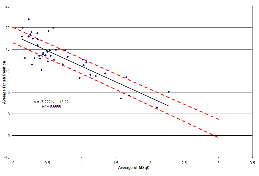
Recall the graph below from my most recent post on teams' M£XI.


Note that the upper and lower bounds of the 50% PI are denoted by dashed red and green lines, respectively. Teams that fall above the red line represent a team that has, on average, finished in the lower 25% in terms of table position of teams that would have had similar expenditures. This represents under performance. On the other end, teams that finish below the green line have, on average, finished in the upper 25% in terms of table position of teams that would have had similar expenditures. This represents over performance. The teams that fall on or between these lines represent the expected 50% of teams that scatter around but close to the regression line. They are considered pushes.

Just like the similar MSq£ analysis, it’s not just good enough to have an above average finish. Consistency is what matters – in this case, consistency is measured via the team’s standard deviation of their residual to the regression model.

The table below represents just such a ranking (click on the table to enlarge). It is sorted first in order of performance against the model (over performance, push, under performance), then by standard deviation of residuals in decreasing order within each group, and then by the average residual. The table also shows the change in each team’s position (a negative score indicates improvement, while a positive score indicates degradation) from a similar table that looked at performance versus the MSq£ model. Just like the similar MSq£ analysis, only the 33 teams that have played three or more seasons in the Premier League have been included in this analysis.


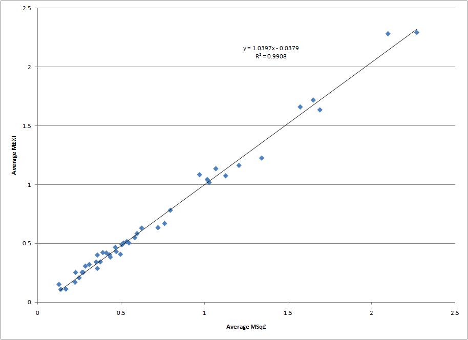
It turns out the average absolute movement in the table is 1.76 positions, and the median value is 1. Nearly 85% of the teams moved two or fewer positions between the MSq£ and the M£XI tables. This should come as no surprise given the correlation between the MSq£ and M£XI metrics that was noted in an earlier post. Of the three teams who moved four or more positions, here is an explanation why each of them moved.

Liverpool’s movement into the top spot is due to their eking out a position in the over performance group that they just missed when looking at their performance vs. the MSq£ model. In the MSq£ model, Liverpool actually finished in the top spot of teams in the push category which consigned them to 8th position in that table. They have a nearly identical M£XI (1.64) as MSq£ (1.69), but because of the difference in slope terms in the two models (noted here) we know that multiples of the league average don’t go as far in the starting XI as they do in the squad. Thus, Liverpool ends up moving from a push to an outperform when looking at the cost of talent that made it on to the pitch and their second lowest standard deviation of residuals to the M£XI model (only the top under performer, West Bromwich Albion, “outperforms” them) carries them to the top spot in the rankings. Clearly no one gets more consistent over performance versus the financial expectations on the pitch than Liverpool. Supporters’ expectations are another matter…

The overall biggest improvement over their MSq£ performance is West Ham United. West Ham’s utilization rate has been extremely low – an average of 45.7% to rank them in the bottom sixth of all 43 teams that had competed in the Premier League through the 2009-2010 season. The teams that have ranked lower than them – Bradford, Derby, Hull, Reading, Southampton, Stoke, and Watford – spent an average of four seasons in the league. The fact that West Ham has spent 14 seasons in the league – missing only the inaugural campaign and two seasons of relegation from 2003 to 2005 – is a testament to their ability to squeeze a good bit out of a meager transfer budget that has a lower than normal utilization rate. West Ham has averaged a 5% lower utilization rate than the league average each season, with only three of their fourteen seasons seeing above league average utilization. See the graph below for the details of West Ham’s utilization rate each season versus the league average. Such a low utilization rate translates into an M£XI that is 12.5% lower than their MSq£, thus leading West Ham to move out of the push category and into the over performance category with a nearly identical standard deviation in residuals to the two models.


With the addition of West Ham and Liverpool to the over perform category, and none of the seven teams that fell into the same category in the MSq£ category falling out in the M£XI analysis, the overall number of teams over performing on an M£XI basis has increased to nine.

At the other end of the table we find the team with the next largest movement – Nottingham Forest. During their five seasons in the league between the 1992/93 and 1998/99 seasons they averaged a 15th place finish when their M£XI costs would indicate an expectation of averaging a 14th place finish. This places them within the 50% prediction interval for their starting XI costs, which moves them from the bottom of the under performance category to the bottom of the push category. Like West Ham, this is due to the fact that their average difference to the league average utilization rate was -5.9%. This led to a 12% lower M£XI compared to their MSq£. Ironically, the club had its second best performance in terms of utilization their last year in the league, but it wasn’t enough to save the club from relegation.

Under and Over Performance of Managers

If movement amongst the clubs in the M£XI is minimal, what about the managers? How much do they move when one takes into account the talent they can get on the pitch and not just the players they can buy and sell for their squad, and which managers over and under perform the most when compared to the financial expectations of the players on the pitch? The table below summarizes just such managerial performance versus the M£XI for the 40 managers who have presided over at least three full seasons of Premier League play (click on table to enlarge). As in the similar table for team performance versus the M£XI model, the column on the far right shows a manager’s change in ranking from the MSq£ table, with a positive change indicating a backwards slide while a negative rating means the manager ranks higher in this table than the MSq£ table.


Unlike the club table, there is a fair bit more movement on the managerial side. The average absolute movement in the managerial table is 3.2 positions, while the median movement is two positions. Nearly 77% of the managers experienced a movement of three positions or less versus their MSq£ rankings. Let's dig into the details of a few of the managers that sit atop the table, and a few others that experienced some of the biggest movement.

Similar to the MSq£ rankings, Chris Coleman sits atop the M£XI table benefiting from an M£XI that is 4% lower than his MSq£. However, John Gregory has fallen seven positions to the ninth spot in the table. A comparison of MSq£ and M£XI explains why - Gregory spent an average of 1.11 times the league average on squad transfer cost, but his starting XI average cost was 1.24. This was due to an above average utilization cost the three years he was at Aston Villa, while his third year at the club saw a phenomenal 70.3% utilization rate (M£XI = 1.57, CTTP = £75.5M). In fact, no one put a greater proportion of their talent on the pitch that year. What’s more telling is the fact that six teams (Manchester United, Arsenal, Liverpool, Chelsea, Aston Villa, and Newcastle United) fielded average starting XI’s that we more costly that season. Aston Villa’s eighth place finish was behind all but one of those clubs (Newcastle finished eleventh), and finished behind Leeds United, Ipswich Town, and Sunderland sides that fielded average starting XI’s that cost less to various degrees - £73.9M, £21.9M, and £31.9M respectively. While Gregory still outperformed the model on average, it could be said that his last full season at Villa was one where he had the most tools at his disposal on the pitch. It should be noted that the model only predicts a marginally better seventh place finish for the squad in that season, indicating that perhaps Aston Villa management’s expectations were still a bit too high given the financial resources they were willing to commit. No matter the reason, Gregory’s steadily increasing utilization rates over his three year term – 48.4%, 52%, 70.3% - contributes to an increasing M£XI and increased variability versus the model that shows up in Gregory’s standard deviation of residuals. This is ultimately what lowers his ranking by seven positions – putting more talent cost-wise on the pitch each passing season and seeing a relatively consistent sixth to eight place finish.

Rafael Benitez and Martin O’Neill leapfrog Evans and Houllier in the M£XI rankings for one main reason – extremely consistent M£XI, utilization, and table position statistics.

In fact, if Benitez hadn’t had such a poor last season at Liverpool he would have outranked Chris Coleman in terms of standard deviation of the residual to the M£XI model. Then again, if he hadn't had such a poor 2009/10 he might also still be managing there this year. Recall from the first post in this series that Liverpool has hovered around 50% utilization from the 2005/06 to 2009/10 seasons – indeed, Benitez’s lowest utilization was his first year (2004/05) at 41.8%. He consistently beat his squad’s M£XI expectations by at least two table positions, and twice nearly beat it by four table positions. Only in his final year did he fail to meet M£XI expectations, finishing 0.6 positions off the expected pace. Say what you like about Rafa, but he made the most of the talent he had on the pitch.

Along with being one of the most consistent over performers, Martin O’Neill also has one of the highest average over performances versus the M£XI model – only Sam Allardyce (-5.9) and Gerry Francis (-4.6) outperformed him (but with much less consistency). O'Neill's first stint in the Premier League was with Leicester City, where he averaged six places better than his meager transfer budget would have predicted (average MSq£ = 0.44, average M£XI = 0.46) and guided them to three League Cup finals (winning two of them) over a four year period. After departing for Celtic for several years, O'Neill returned to the Premier League via Aston Villa before the 2006/07 season. Over his four seasons at Villa, he guided them from an initial 11th place finish to a sixth place finish each of the following three years. He averaged nearly three places better than his M£XI suggested. While his cup success at Leicester didn't translate to similar success at Aston Villa, O'Neill did put Villa back in the top third of the table and was consistently threating for European play. Ironically, it is widely understood that O'Neill left Aston Villa after the 2009/10 season because of his disagreement with Villa's ownership over his desire to spend more money to improve their chances of finishing higher in the table. Perhaps Martin O'Neill and John Gregory should have a discussion about how such Villa transfer budget limitations, and the unrealistic expectations that are attached to them, can wreck an over performing team.

Further down the list we find the two managers who fell the most from their MSq£ rankings - Peter Reid (13 positions from low overperform to low push) and Claudio Ranieri (14 positions from high push to under perform).

Reid spent one year at Manchester City in the league's inaugural year, and then spent over four years at Sunderland - one full year in 1996/97 and three straight from 1999/00 to 2001/02. Sunderland's MSq£ and M£XI numbers were relatively consistent during Reid's tenure, but their finishes were not as the first and last years saw 18th place finishes that led to relegation while the middle two saw them finish 7th. That variability produced huge swings in his residuals, meaning that Reid's standard deviation in residuals is only surpassed by 10% of the managers in the table. Combine this with Reid's high utilization rates that boosted his M£XI by 15% versus his MSq£, and it is clear why he shifted from over performance to a push.

Ranieri's three years in the league saw him average a fourth place finish when club expenditures indicated that he should have averaged a second place finish. Even before Abramovich bought the team, Ranieri was seeing huge advantages in terms of the cost of the talent he could put on the pitch (2001/02 M£XI = 1.89, 2002/03 M£XI = 2.02). With Abramovich's purchase of the team and infusion of transfers in 2003/04 Chelsea became the fist team to break the 3.0 barrier on the M£XI metric, but were unable to win the Premiership due to Arsenal's Invincibles' run of perfection. Ranieri's three year run put his average M£XI nearly 10% higher than the average MSq£, and has happened so frequently in the table this greatly lowered Ranieri's ranking from one category (push) to the next lowest (under perform). Regardless of the metric, Roman Abramovich felt Renieri was under performing and replaced him with Jose Mourinho who brought them two Premier League Championships in three years.

Conclusions

A clear connection can be drawn between the cost of the talent a club can put on the pitch in the English Premier League and the likely table position that team can expect. The model doesn't explain every team's position, but it does explain nearly 70% of the variation in average team finish position and average transfer expenditure on the pitch. The other 30% is random noise due to factors that aren't quantified in the model. The model doesn't also explain match-to-match variation, where squad and starting XI transfer cost is likely far less deterministic.

What the model does do is set clear expectations for long-term success and failure. While a number of the concepts in this series are a bit advanced, they illustrate a key point for supporters and management: set your expectations for a manager's long-term average table position based upon how much they're allowed to spend in the transfer market.

While no hard and fast rules can be drawn, here are a few concepts one could apply based upon the MSq£ and M£XI analyses:
  • If a club wants to know how much money it must spend to avoid relegation year-in and year-out, they must spend at least the league average in terms of squad transfer costs. For 2010/11, this was nearly £116M.
  • Managers who can't achieve at least a 50% or better utilization are likely going to under perform. Managers lower in the table in terms of squad transfer costs need to coax a larger utilization percentage out of their playing staff to remain competitive.
  • Don't judge a manager on less than three years performance, and certainly don't sack him unless it's an emergency move to avoid relegation. Managers need time and money to succeed, and at least three years are needed to build a team that reflects the priorities and tactics of the current manager and not the last one.
  • Along those lines, don't expect a single, expensive transfer to move a team out of mid-table mediocrity into European qualification in one season. Soccer relies on eleven starters, several substitutes, and a number of back up players for a team to be successful. Those players require a system to play within, and the manager needs time to get players to instinctively play within the system. Soccernomics was right in one regard - transfer purchases made in one window show little correlation to success or failure in the current or next season. Building a team via transfers is a long-term investment that requires patience - on the part of supporters and management.
  • Pay attention to why a manager's utilization rate may be under 50%. If it's due to poor investments that didn't work out on the pitch, clearly the only option is to move on. But if it's one year of bad luck with key injuries to costly players, the manager should be given the benefit of the doubt.
  • If the goal is a Premier League championship, be prepared to spend big. Recall this table from my last post on the M£XI topic, which shows a club must be willing to spend at least 2.40 times the league average in squad and starting XI transfer cost to have even odds at winning the Premier League title. Such certainty will likely decrease in coming years, as the Big Six and a few other teams continue to flood the transfer market with pounds. This will drive the cost of a championship higher, while at the same time dilute the power of a single team being able to "buy a championship".
  • Recognizing the reality of the spending required of a championship, perhaps management and supporters should set more realistic expectations and aspire for European qualification as their ultimate goal. Some are already advocating this approach for at least one of the more financially limited clubs amongst the Big Six. More clubs should adopt this approach to keep finances manageable and expectations achievable.
  • Finally, if Liverpool are in the market for a new manager after Kenny Dalglish's care taker term runs out, I would think they would seriously consider Marin O'Neill for the job. Clearly the previous ownership group made a massive mistake in going with Roy Hodgson over O'Neill last summer. I don't pretend to know the thoughts of senior Fenway Sports Group managers, but I do know they're smart and use analytics to help guide their decisions. If O'Neill's tactics and transfer strategies are right for the club, I could think of few managers who would likely over achieve to a greater degree given Liverpool's storied history yet somewhat limited financial means.
With that I will be taking a break from posting about Premier League economic matters. The two series on the MSq£ and M£XI have built upon the excellent foundation laid by Pay As You Play, and they now provide a direct method for evaluating club and manager performance versus financial expenditures. I am deeply grateful that Paul Tomkins and Graeme Riley shared the data with me, and served as regular editors and sounding boards for ideas I had. I hope that readers have derived as much insight and enjoyment from the two series as I have.

I already know what my next financial posts will focus on once the current Premier League season wraps up and the mood to write about transfer markets strikes me again - a detailed dissection of Arsene Wenger's moves in the transfer market. Yes, I am a bit biased, but the data clearly shows that Wenger is the longest serving over achiever in the English Premier League. For Gooners like me, reconciling this over performance with the lack of trophies the last six seasons is the ultimate test of what I preach: setting realistic table position expectations based upon transfer expenditures. In doing such a detailed study, I hope to provide a better understanding of his successes, failures, and what types of expenditures might put him over the top yet allow Arsenal to win a much less expensive trophy. As they say in the investment industry, "can I eat my own home cooking?"

Thursday, March 10, 2011

Using M£XI To Predict Premier League Table Position Odds

Note: This is the second post in a series examining the effects of the transfer cost of a squad's starting XI in the English Premier League.

In the first post in this series on the rising cost of a squad's starting XI was quantified, the decreasing utilization rate amongst teams was explored, and the behavior of the Big Six clubs when it came to starting XI transfer costs was presented.  But what about a more general model, one that uses linear regression and prediction intervals to quantify expected table position based upon a squad's starting XI cost?  How could such a model be translated into predictions for the odds of finishing in various positions in the Premier League table based upon starting XI cost?  Those topics are explored in this post, with special attention paid to the clubs that represent outliers.

A Regression Model for Table Position vs. Starting XI Cost

Similar to this post on squad transfer cost, a linear regression model with various prediction intervals can be constructed for average table position and average starting XI cost.  Such a regression provides a good indication of how much the talent on the pitch should cost over the long-term to provide long-term success in table position.

There is a slight difference in the M£XI graph below compared to the one in the MSq£ post: the regression line, 50th percentile, and 95th percentile prediction interval lines all appear on one graph.  This consolidates what was multiple graphs into a single graph where the full range of under and over performance can be viewed.

The dashed black lines - representing the bounds of the 95th percentile prediction intervals - indicate the bounds of reasonably expected individual values.  Data points that fall outside of these lines indicate gross under performance (above the upper line) or outstanding over performance (below the lower line) versus the expected finish position given the average cost of the starting XI the team put on the pitch.

The dashed red line represents the upper limit of the 50th percentile prediction interval.  Falling above this line indicates under performance versus the model.  Conversely, the dashed green line represents the lower limit of the the 50th percentile prediction interval.  Falling below this line indicates over performance versus the model.

Click on the graph to enlarge it.


It's interesting to note the similarities and differences between the graph above and a similar regression plot for MSq£ from this post.

  • The constant term in each regression equation - M£XI = 18.04 while MSq£ = 18.32 - indicates teams with relatively low multiples of the league average starting XI and squad transfer costs will be at similar risk for relegation.
  • The difference in the slope terms - M£XI = -6.9195 while MSq£ = -7.2221 - indicates an advantage in finishing position for increased multiples of squad expenditures of 0.30 versus their multiple of the league average starting XI cost.
  • However, the reality is that paying for talent that actually makes it on to the pitch is still the best way to improve one's chances of finishing top of the table (quite intuitive, isn't it?).  Even though the slope of the MSq£ regression equation indicates a 4.4% advantage in table position improvement vs. the M£XI equation when increasing multiples of the league averages are utilized, the fact remains that the average squad cost is more than double the average starting XI cost (2.12:1 to be exact).  Thus, signing talent and making sure they play all 38 games in a Premier League season is nearly twice as effective at increasing one's multiple to the league average £XI compared to simply breaking the bank and trying to increase one's squad transfer cost versus the league average Sq£.
  • The bounds on the 95th percentile and 50th percentile lines in both regressions are relatively close.  What has changed is several individual team's proximity to those lines.

A detailed discussion of over and under performance vs. the M£XI model will come in the next post, but a few words should be spent on the data points outside of, or close to, the 95th percentile lines.

The two teams outside of the upper 95th percentile line - Swindown Town and Odham Athletic - were previously discussed in this post.  The only other team close to the line is Crystal Palace, who spent three campaigns in the EPL between the 1992-93 and 1997-98 seasons and was relegated after each single season they spent in the league.  Since that last season in the Premier League the club has gone through several owners and has bounced between The Championship and League One.

On the other end of the 95th percentile distribution stands three teams that have out performed all other teams when adjusting for their financial resources - Queens Park Rangers, Reading, and Stoke City - although two of the three are likely not examples other Premier League teams would ultimately like to follow.

QPR, as an inaugural member of the Premier League, finished fifth their first season in the league.  Mid-table finishes the next two seasons were followed up with a 19th place finish in 1995-96 that saw them relegated to the Championship.  Their average M£XI of 0.42 was simply too small to avoid such a fate.  They eventually were relegated further to League One, and subsequently saw them pass into administration.  A reconstituted QPR has found itself a mid-level team in the Championship in recent years.

Reading made a brief two season appearance in the Premier League from 2006 to 2008, and their average M£XI of 0.11 ranks as the second lowest in the history of the Premier League (Watford's 0.10 barely beats them).  Good form in the 2006-07 season, which saw them finish eighth, was followed by a season with a disastrous second half and relegation back the Championship.  The team nearly regained their spot in the Premier League the following season, but lost in the Championship's promotion playoff.

Stoke City's one and only year in the league (2009-10) saw them finish twelfth with an M£XI of 0.25.  As of this writing, Stoke is on track for another 12th place finish, but is at risk for relegation with only three points separating them from the drop at 18th position in the table .  Surviving for a third year would mark a milestone few teams with such a meager transfer budget on the pitch attain. Only one other club (Birmingham) has spent as little on transfers and remained in the Premier League more than two years.

Ultimately, that's what this analysis and the one related to MSq£ prove - gross under and over performance is only found at very low multiples of the league starting XI and squad transfer costs.  In both cases, such under and over performing teams don't seem to last long in the Premier League as their meager transfer budgets are no match for the teams spending more than them.  There are only six teams in the Premier League who can spend the money to compete for a Champions League position each year, and only twelve teams in the history of the Premier League have managed to spend the league average or better (seven of which are the teams never relegated).  The interplay with the teams in the Championship looking for promotion the subsequent season can't be underestimated either.  While these lower spending teams certainly outperformed expectations in the Premier League, they often occupy the middling of teams that could just as easily find their transfer expenditures (and subsequent place) in the upper half of the Championship.

The Impact of M£XI On The Odds of Various Table Positions in Premier League

If the odds seemed to be stacked against such spendthrift teams, what about those who choose to spend more?  How are their odds impacted by greater expenditures, and how do they know they've spent enough to  have a good chance at their goal - a spot in UEFA competitions or the Premier League title?  Luckily, ever expending prediction intervals can quantify such odds.  The following series of tables do just that, quantifying the squad and starting XI transfer costs and multiples required to achieve such odds per the regression model.

A reference point for average values must first be defined before translating the predicted multiples into absolute values.  The average Sq£ at the beginning of the 2010-11 season was £115.7M, while the projected £XI for 2010-11 is £54.7M (based upon the average from 2009-10 and projected growth of £585.5k per year via the regression model) .

The table below shows the squad and starting XI expenditures required to realize various odds of finishing top of the table in the Premier League.  The regression model is pretty accurate for the lower odds based upon the expenditures witnessed over the years.  Of the thirteen teams who had an M£XI of 2.46 or more six have won the Premiership, and a similar outcome is seen for teams with an MSq£ of 2.40 or greater.  The accuracy of the model starts to break down just a bit the higher one goes in the odds - history shows that four of the ten teams who have had an M£XI of 3.05 or more four winning the Premiership.


Arsenal fans should take special note: Arsene Wenger is trying to do what appears to be impossible.  All but three of the Premier League's champions have had an M£XI of 1.85 or more (corresponding MSq£ of 1.72 or more), and the Premier League champion with the lowest transfer expenditures ever (Manchester United's 1996-97 squad) still had an M£XI of 1.26 (MSq£ of 1.34).  After letting their M£XI drop to 1.05 in the 2008-09 season, Arsenal saw a slight rebound last year to 1.20.  However, as of this writing they had regressed to a 2010-11 M£XI of 0.96.  Arsenal being in second place in the Premier League table may be a testament to Arsene Wenger's ability to get more out his meager transfer expenditures than any other manager could, but it may be too much to ask of him to expect perennial championship contention with such a historically low transfer multiple.

What about the required expenditures to improve a club's odds for making the Champions League given the Premier League's four spots?  The table below summarizes those odds.


This is really where the model's effects of over predicting the financial resources required of clubs comes into play.  Of the 25 teams who have had an M£XI of 2.03 or more, only 3 have failed to finish fourth or better.  Manchester City's 2009-10 and Newcastle United's 2003-04 campaigns saw both finish fifth, while Newcastle set a new standard for under achievement with a 11th place finish with an M£XI of 2.41 in 1999-2000.  Ninety-five percent of teams that finished fourth or better have had an M£XI of 1.05 or better, with Arsenal's annual over achievement versus their transfer expenditures adding to the low M£XI totals.

Conclusions


A regression model that predicts table position based upon a club's multiple of the league average starting XI transfer cost has been constructed, and its resultant prediction intervals have been used to identify gross under and over performers.  Those under and over performers seem to be concentrated at the low end of the M£XI distribution.  Additionally, odds of finishing in the upper 20% of the league have been identified, with various accuracies to historical data being realized.

An analysis of team and club under and overperformance versus the 50th percentile prediction interval, similar to the one conducted for MSq£, can now be conducted.  That topic will be the subject of the third-and-final post in this series.

Monday, March 7, 2011

The Rising Cost of the Starting XI in the English Premier League

Somewhere in there is the most expensive starting XI, in terms of M£XI, in the history of the Premier League - Chelsea's 2006-2007 squad.  Too bad they finished second to Manchester United who were a full 1.5x lower than them on the M£XI metric.

In my recent series of posts on the correlation between squad transfer costs and table position in the English Premier League, it was shown that:
  1. Transfers are an ever increasing source of a team's players, with trainees constituting less than 20% of a team's squad
  2. Such squad transfer costs continue to escalate, with the average increase at £1.55M per year (or ~1.4% per year at the current average squade cost).  The actual average transfer cost inflation rate via the TPI database is often in the double digits percentage-wise. The average squad cost has now eclipsed more than £110M. 
  3. Squad transfer costs are highly correlated to squad wage costs, begging the question whether its really wages or transfers that is driving the high correlation between financially rich clubs and finishing in the top quarter of the table.
  4. A model was created to identify over and under performers, and was applied to teams and managers.
It's clear that if English soccer were an arms race, the result has been that those with the biggest budgets have won the war of championships and berths into UEFA competitions.

However, this explains the average behavior over the long term.  In the short term, players and managers have off years, players get injured, and in general things don't go according to plan.  Ultimately, this impacts who the manager can put on the pitch, which is quantified in Pay As You Play with the £XI metric.  This metric measures the cost of the starting XI on the pitch at a match.  If squad cost (Sq£) is a measure of cost of the weapons in a manager's arsenal (pun totally intended...), then the related £XI can be thought of the cost of the weapons he was able to bring to the battle.  Concurently, if MSq£ measures the relative cost of a manager's weapons against the league average's, a similar metric in M£XI can be used to measure the relative costs of a manager's talent on the pitch to the league average.

It's this metric - M£XI - that is best correlated to table position in the short term, and it will be the subject of several forthcoming posts.  Combined with the MSq£ this will provide a powerful forward- and backward-looking model at the impacts of squad transfer costs in the English Premier League.  After all, one must first have the tools at their disposal, and then deploy as many of them as possible on the pitch, to have a chance at success.

Note: In the interest of keeping this series of posts a bit shorter than the MSq£ posts, I will not be repeating my detailed explanation of the statistical theory that is being reused.  Newer readers, or those wishing a deeper discussion on the statistical theory, can see this post for a discussion of regression theory, this post for a discussion of prediction intervals, and this post for a discussion of ranking methdology based upon identifying over and under performance and then "shrinking variation before shifting the mean."

The Escalating Cost of Talent on English Premier League Pitches

While the average squad cost in terms of transfer expenditures has been going up over time, so too has the cost of the average starting XI that make it on to the pitch.  The table below shows how this cost has escalated over time.  Readers familiar with a similar graph in one of the MSq£ posts will notice a slight difference, as the graph below does not include the first three years of Premier League data.  This was done to eliminate the bias introduced in the data from those three seasons when the average squad and starting XI costs were diluted by the presence of two additional teams (click image to enlarge).


The elimination of the first three years actually worsens the fit of the regression lines compared to those for MSq£, but the coefficient in front of the x-term that indicates the typical annual rise in starting XI cost is far more accurate than the similar term found in the MSq£ graph.  Ultimately, the coefficient in the graph above is compared to the rise in MSq£ recounted at the outset of this post - £1.55M per year or 1.4% compared to 2010-11 squad costs.  In the case of M£XI, it is rising at a rate of £585.5k (or £0.5855M) per year, which in 2009-2010 £XI costs equates to a 1.1% increase.  While not statistically significant, this is lower than the rate of increase on the squad cost front.

Part of the explanation comes in the lower half of the graph, which re-plots the average utilization rate discussed in earlier posts.  With the removal of the first three seasons of data, the rate of decline in utilization is 0.33% per year, or approximately 1% every three seasons.  This declining utilization means a lower percentage of the average Premier League's cost, in terms of the Sq£ measure, is making it on to the pitch each passing year.  Thus while an increasing amount of money is spent on squad costs every year, a lower percentage of that squad cost shows up on the pitch and thus the growth in squad costs is higher than the starting XI cost.

Note: To the statistically inclined, the relationship between the average utilization rate and season is indeed statistically significant.  For the fourteen samples shown in the graph, an R-squared value of 0.4575 or higher would indicate statistical significance.

The Impact on Utilization on Starting XI Cost for the Big Six

While the first graph in this post explains what the league average has done over time, of greatest importance is to observe what the most successful clubs have done over the last several years.  Just like the MSq£ series, I have focused on the Big Six clubs in the post-Abramovich era - Arsenal, Chelsea, Liverpool, Manchester City, Manchester United, and Tottenham Hotspur.  The graph below shows their utilization rate by season (click on graph to enlarge)


Closely related to this graph is one that plots the difference between each squad's utilization rate and the season's average utilization rate.  This gives us an idea of how effectively the team used their purchased talent versus the average club.  Click on the graph below to enlarge.


There are a few things to take away from trends shown in the graphs above:
  • Manchester United is the only club that has a statistically significant higher utilization rate than the average team each season.  They finished with an average of 6.25% greater utilization than the league average each season, and only had two season out of seven that were below the average - the first (-0.5%) and last (-0.7%) in the series.  The first year of there latest championship three-peat saw them reach a peak of +15.8% vs. the league average.  During the seven season run, Manchester United has not finished lower than second amongst the big six in utilization, and hold the top three spots in the Big Six for utilization versus the league average over all seven seasons.  Say what you like about Alex Ferguson, but he not only knows how to buy talent he also knows how to get more of it on the pitch.
  • At the other end of the spectrum is Tottenham Hotspur.  They have finished to the positive side of the league average utilization only once - +5.9% in 2006-2007.  All other seasons they have been on the negative side, and while just barely not statistically significant they have averaged -3.2% over the seven seasons.
  • Arsenal, Chelsea, and Manchester City all have been on a general downward trend in terms of utilization since the 2005-2006 season.
  • Liverpool has generally bounced around the league average for utilization rate, but have been on a general upward trend since their nadir in the 2004-2005 season. Ironically, they reached their peak over the seven seasons in Rafael Benitez's final season as manager.
The graphs above confirm the general trend that teams who spend a good bit on transfer budgets for their squad get the talent on the pitch.  Besides being concerned about purchased championships, another side effect of huge spending is a "hoarding effect" - one where teams buy up players but where they don't see significant playing time due to limited space on the pitch.  While not the most economically efficient manner to win, it could nonetheless be a useful strategy to keep good players from signing with competitors.  This concern arises out of the general trend in the first graph, where over time transfer budgets have gone up by less of the costly talent shows up on the pitch.

Luckily, the statistics don't bear such a strategy out.  If one tests each season's utilization rates vs. MSq£'s, one will find that only four out of the seventeen seasons in the Premier League have had Pearson correlation coefficients that are significant - 94/95, 96/97, 99/00, and 05/06.  Each time, the coefficient was positive and the slope of the linear relationship was at least 3.5%, which means rather than horde talent the teams with higher squad transfer costs were putting more of it on the pitch.  The other 13 seasons showed no relationship between the two variables.  For the time being the main concern should remain focused on the ability of teams to buy better talent at higher costs and thus put more expensive talent on the pitch.

So what does all of this translate to in terms of an advantage in starting XI cost for the Big Six?  In general, their advantage versus the rest of the league has grown when compared to the similar advantages they enjoyed in MSq£.  See the graph below for a plot of the Big Six's M£XI for the last seven seasons (click on graph to enlarge).

Recall this graph that was part of my original post in the MSq£ series.  While most of the shapes of the lines are the same between the two graphs, the magnitude of the absolute values is certainly greater on the graph above.  Notice that Chelsea's M£XI reached a peak of 4.77 in the 2006/2007 season - this is a full 0.25 multiple above their similar peak in the MSq£ metric.  A similar shift is seen in Manchester United's M£XI data, but notice they actually close the gap to less than 0.25 with Chelsea's drop in utilization rate in the last few seasons.  Overall the order of the bottom four teams does not change much from their MSq£ order, although Tottenham's anemic utilization rate leads them to switch positions with Liverpool.  Thus, increasing one's squad costs relative to the competition seems to pay even greater dividends when it comes to starting XI transfer cost advantages.

Conclusions

The cost of talent on the pitch is certainly going up each year, although at a slower rate than the overall cost of the squad.  This is due to the steadily decreasing utilization rate, which is dropping by about 1% every three years.  While many of the same trends observed in the Big Six's MSq£ were maintained when looking at M£XI, the disparity was a bit larger and utilization rates provided a few subtle differences.

In the end, how does M£XI impact team performance in the table?  And if a relationship does exist, how can it be used to evaluate how well managers and teams have done given the cost of the players they could get on to the pitch?  These topics will be discussed in the second and third posts in this series.

Monday, February 28, 2011

If You're Going to Trash Talk At Least Get Your Facts Straight

"Everyone is entitled to his own opinion, but not his own facts"
Daniel Patrick Moynihan
My Twitter timeline turned into a trash talk fest between Arsenal and Manchester United fans in the immediate aftermath of Arsenal's loss in the Carling Cup.  The two teams may not have been rivals for a Premier League championship for over half a decade, but the animosity from earlier clashes hasn't died down.  I've generally tried to stay above the fray because it often sounds like sore loser syndrome when one tries to defend the indefensibly poor play of their team - even if it was poor play for only a few seconds.  There is, however, a point where I reach my limit, and it is when opinions try to be passed off as facts.

I reached that point when I saw this tweet come across my timeline:
In 6yrs, Arsenal spent £107.9m on 30 players (0 Cups). United spent £123.7m on 21 Players (over 10 Cups)!
This is a patently false assertion, the expenditures listed are incorrect, and the goal really is to excuse Manchester United's position as consistently being in the Top 2 when it comes to transfer expenditures, year-in and year-out.  Let's review the actual expenditures by each team from the 05/06 season through the 10/11 season (all data is taken from the Transfer Price Index):
  • Arsenal: £130.2M at time of purchase for 24 players (£167M in 2010-2011 GBP per the TPI)
  • Manchester United: £196.9M at time of purchase for 24 players (£223.8M in 2010-2011 GBP per the TPI)
But that's not the real measure in disparity between what resources the two clubs have available to them.  The real difference is measured in their Sq£, which takes into account the cumulative costs of all transfers currently on the squad (like Wayne Rooney's 04/05 transfer that would cost £49.1M if executed today).  The average Sq£ (in 10/11 GBP per the TPI) for the two teams from 05/06 to 10/11 is shown below.
  • Arsenal 10/11 Sq£: £140.9M
  • Manchester United 10/11 Sq£: £284.1M
Over those years, Manchester United has had a more than two to one advantage in the terms of the cost of players it can put on the pitch.  Compare that to the suppossed 14% advantage that United enjoyed in the tweet, and you see that the estimates aren't even close.  As was demonstrated in this series of posts, it is that ever increasing amount expended on transfer fees that has allowed Manchester United (and to a certain degree Chelsea) to maintain their high finish position in the league.  Frankly, what Arsene Wenger has been able to do with such a meager budget - average finish of 2nd when his financial resources should have put him 6th - is nothing short of amazing.  In recent years it's become even more magical, where his 10/11 expenditures have him finishing 10th when in reality he's challenging for the Premier League title.  I'd like to see how well Alex Ferguson would do if he were actually constrained by such a budget that refuses to take on debt.

Yes, Manchester United fans should rightfully crow about their cups.  They won them, and Arsenal hasn't over the last six years.  However, no one should kid themselves that the clubs have two different expectations based upon their financial commitment in the transfer market.  To compare the two as equals is a bit absurd - whether its a Manchester United or an Arsenal fan doing the comparisons.

One could also argue that Chelsea's, Manchester United's, and Manchester City's of buying players at any cost to win championships is EXACTLY why the EPL has the highest debt load of any UEFA league and why UEFA is having to institute financial fair play rules.  But that's a discussion for another time...

Thursday, February 24, 2011

Comparing Econometric Models of the English Premier League: Reconciling the TPI and Soccernomics Data Sets

Note: This is a re-post from analysis I did back in January 2011 for the Transfer Price Index blog. I am posting it here to complete my series of posts on squad transfer costs, and to set up a forthcoming series of posts on the impact of starting XI transfer costs on table position

I’ve participated in many discussions since my original post on the relationship between a squad’s current transfer cost and their table position. Much of it has been centered on the debate over the predictive power of Soccernomics wage data versus my analysis using current transfer costs. Many readers on The Tomkins Times have come to the same general conclusions as me: each analysis has its valid points and different uses, and the two are not necessarily in conflict with each other.

I’ve also had the pleasure of discussing the two studies with none other than Stefan Szymanski. I plan on keeping much of our conversation private, but you can get a sense of his respect for the overall Transfer Price Index approach and the differences in the two data sets via his review of Pay As You Play. Stefan’s review is a positive one, summarized best in the following observation.

“[I]n a fascinating new book Paul Tomkins, Graeme Riley and Gary Fulcher have developed a method of converting transfer fee data into a squad valuation… With every squad member given a value, this can then be used to compare spending to performance in the league. It is a true labour of love, collecting all the transfer fee values for Premier League clubs going back to the beginning of the 1990s.”
Szymanski closes out his review with this glowing recommendation:

“The book is a treasure trove of interesting financial facts and would make a great gift for any football statto…”
What’s interesting is how much correlation there is between the Soccernomics wage data and the TPI’s cost of the starting XI. Stefan’s metrics in the column are both relative measures (RW for wages and R£XI for relative starting squad cost), and he observes they show 90% correlation to each other. Unfortunately, the Evening Standard did not include the very compelling graph Stefan generated as part of his review of Pay As You Play. Luckily, Stefan has supplied us with that graph and it is reproduced below.


The graph clearly demonstrates the correlation between the two metrics, the weakness of the models at either end of the table, and the strength of the model in the middle of the table. Stefan’s observation of over predicting the resources needed for top table positions has been invaluable in explaining the discrepancy between regression predictions and historical data related to Champions League qualification that will be discussed in an upcoming post.

Stefan’s review rightfully points out the reliability of the publicly audited wage data versus the TPI’s privately compiled transfer data. At the same time, I would stand by the TPI as the most comprehensive and meticulously compiled set of transfer data within the English Premier League era. It was indeed a “labour of love” for the authors, a labour that continues to pay dividends in our financial understanding of the league.

Beyond the quality of the data and its impact on any resultant statistical analysis, Stefan’s data set has a bit of an advantage over the TPI. The Soccernomics wage data looks at overall team wages, thus taking into account the total cost of operating the squad in current British pounds. Combine this with the fact that wages are a dynamic measure adjusted over time by team and player, while the TPI is a static inflation of a one-time transfer fee, and we see why wages may be a better predictor of actual team success. It’s also no surprise that the £XI metric correlates very well with that wage data, as it takes into account all the players who have made it on the pitch and how much time they spent on it. There’s no dead weight contributing nothing to the team’s performance on the pitch, good or bad.

Indeed, analysis by Graeme Riley and me has proven this point statistically. Graeme looked at the squad and XI transfer cost order versus table position, while I looked at the multiple of the average squad and XI transfer costs. Both Graeme and I calculated these for each team, and then quantified the correlation of each metric to finish position for each individual season via the square of the Pearson product moment correlation coefficient (the commonly seen R² value in a regression plot). In Graeme’s analysis, the order of £XI had a higher R² value than the order of Sq£ in 16 out of the 18 seasons. In my analysis, M£XI had a higher R² value than MSq£ in 14 out of the 18 seasons. In the final comparison, I looked at the average and standard deviation of the R² values for each metric – order of £XI, order of Sq£, M£XI, and MSq£ – to determine which provides the best, most consistent prediction of table position over the 18 seasons. The M£XI had the lowest overall standard deviation (14.7%) and highest overall average (45.4%), indicating it provided the best fit versus table position (although it is far lower than the R² values in the long-term analysis in my original post and Soccernomics). Ultimately, this confirms my preference for relative measures, especially multiples of averages, and why I prefer to look at long term averages rather than individual seasons.

On the other hand, the TPI data I used in my original analysis only considered the impact of the total cost of transfers on team performance, and neglected those of the free variety as well as trainees. It also doesn’t look to utilization rate. It essentially looks at a reduced data set from the full squad or starting XI, and the graph below quantifies how much of a reduced data set non-free transfers represent over the history of the Premier League.


The graph above shows the cumulative percentage of three types of players within the league each year as categorized within the TPI – trainees, free transfers, and the rest of the players. The vast majority of this final category consists of transfers with confirmed fees, while the rest of it consists of a small number of players whose transfer fees couldn’t be confirmed. The graph is cumulative, so to understand the percentage of free transfers for any single year one must identify the free transfer value on the graph and then subtract the corresponding trainee value from it. As an example, the cumulative percentage (represented by the upper value of the red zone) in 2001-02 is approximately 30% while the league share of trainees is about 20%. This means that free transfers made up about 10% of the league in 2001-02.

What is clearly seen via the graph is that transfers have consistently accounted for nearly 70% of the Premier League’s players since its inception. That’s not to say 70% of the players transfer teams each year, but rather that at some point in their past they were purchased by the team they played for that season. What has changed over the league’s eighteen years is the number of trainees within it. This number has plummeted from nearly 30% of league player classifications in 1992/93 to below 20% by last season. Much of this change has happened due to an increasing number of free transfers, which were given official UEFA sanction with 1995's Bosman ruling. Free transfers have gone from only 2% of league player classification in 1995 to nearly 10% last season. Overall, transfers of any variety came to represent 80% of league players by the 2009/2010 season. In many regards, the Premier League is a microcosm of the increasingly globalized world it operates within: greater international ownership and investment, greater employee mobility, fewer employees staying with a single firm from “graduation” to retirement, and increased dominance by a few brands within the marketplace.

What this all means is that any analysis of league performance on a squad basis that uses the TPI is going to miss nearly 30% of the players in the league. Given that fact and the reasonably good R-squared value my regression analysis achieved, I would consider the relationship to be a reasonably strong one. Ultimately a study by Stefan Szymanski, similar to this one where he statistically examined the causality of the wage/performance correlation, would be fascinating. We might then determine whether it was transfer fees, wages, or table position that drove the relationship with the other two. That is a very advanced analysis best left to a statistician of Stefan’s caliber.

At the end of the day, what Stefan’s analysis, my analysis, and the overall TPI database prove is that one must pay, and pay big, to compete for the top few spots in the Premier League. One must pay dearly for the right to even negotiate wages with 70% of their players that end up on their squad, and then they must be willing to pay dearly again to keep the talent to challenge for a top spot. Each metric, whether it’s based upon £XI or MSq£, has its use in quantifying the roll of ever increasing transfer budgets in a club’s success. Generally, I concur with Paul Tomkins’ assessment that “Sq£ is the only predictive tool, but £XI is surely the better retrospective analyzer.”

To a certain degree this all makes sense, as we want a somewhat meritocratic system where excellence is financially rewarded. It all gives us pause, however, when the same teams can dominate everyone else each year by outspending their rivals, sometimes even with money that had no origination in the soccer world in which each team operates.

Wednesday, February 23, 2011

Soccernomics Was Wrong: Why Transfer Expenditures Matter, and How They Can Predict Table Position

Note: This is a re-post from analysis I did back in December 2010 for The Tomkins Times.  I am posting it here to complete my series of posts on squad transfer costs, and to set up a forthcoming series of posts on the impact of starting XI transfer costs on table position.
“In fact, the amount that almost any club spends on transfer fees bears little relation to where it finishes in the league. We studied the spending of forty English clubs between 1978 and 1997, and found that their outlay on transfers explained only 16 percent of their total variation in league position. By contrast, their spending on salaries explained a massive 92 percent of that variation. In the 1998-2007 period, spending on salaries by clubs in the Premier League and the Championship… still explained 89 percent of the variation in league position. It seems that high wages help a club much more than do spectacular transfers.”
So begins Chapter 3 of the wonderful book Soccernomics, where authors Simon Kuper and Stefan Szymanski use the above analysis to launch into an explanation of:
  • Why the transfer market is inefficient.
  • The unique approach Brian Clough took to building his Nottingham Forest teams through good bargains in the transfer market.
  • How most clubs spend little money helping such prized individuals adapt to their new team and culture.How Olympique Lyon make money buying low and selling high.
Each of these examples of individual success and failure in the transfer market makes for a compelling case. However, suppose that’s what they were – good examples of individual successes and failures. What if the authors were wrong in their initial analysis, and that on average spending more in the transfer market is a key enabler of league success?

I loved Soccernomics, and thought it was full of many thought-provoking analyses. I loved it so much that it has spurred my exploration of soccer statistics and fueled the material on my own blog. But no matter how much I liked the book the authors’ claim at the outset of Chapter 3 never sat right with me. It didn’t make sense to me after seeing the performance of Chelsea and Manchester United over the last half decade, but I never had the data to prove it. Luckily, the Transfer Price Index provides such data, and my analysis of the data suggests that large expenditures in the transfer market are a pre-requisite to building a team that can consistently compete for the Premier League title.

Do Wages or Transfer Expenditures Help Predict Table Position?

One of the reasons that the Soccernomics analysis never sounded exactly correct was the qualifier they gave to their transfer expenditure analysis:
“In short, the more you pay your players in wages, the higher you will finish; but what you pay for them in transfer fees doesn’t seem to make much difference.”
Combined with the opening quote, I suspect the authors looked at what each team spent on transfers in a year, attempted to correlate the expenditures to the next season’s performance, and found little correlation. That would make sense, as the few players a team brings in over a single year may not be able to have that big of an impact on a squad of eleven. That’s even assuming each transfer moves immediately into the match day squad, which isn’t often the case.

That exact thought – who plays on the pitch most of the time: transfers or home grown players? – was answered via the data assembled for Pay As You Play. The authors assembled data on the average number of homegrown players in each game for each team over each season, and I have plotted that relationship below for each of the eighteen Premier League seasons. For comparison I have also plotted the same data for the Big Four clubs on a second axis on the right side of the graph (click on graph to enlarge).


The data shows that the Premier League averaged only 2.6 homegrown players per match (24% of the players on the pitch) in its inaugural season. Since then, it has been on a steady erosion of about a tenth of a player per game per season to the point of being under a player per game (8% of players on the pitch) by the 2009-2010 season. By comparison, the average percentage of a squad composition of youth players bounced between 15% and 20% the last ten seasons, meaning that homegrown players are getting very few shots at playing time. In fact, the difference is considered “extremely statistically significant” when the proper statistical tests are performed, which is a rarity in the sports statistics world.

The Big Four have been on similar declines since the beginning of the Premier League, although they seemed to have essentially bottomed out since season nine (Manchester’s inevitable decline after unusual homegrown success is the one exception). Transfers must play a key roll in the team’s success if anywhere from 8.5 to 10 players on any side of a match are not homegrown.

Pay As You Play also provides the other key data set in helping determine if wages or transfer expenditures help predict league success. Its current transfer purchase price (CTPP©) database provides a way to compare the cost to assemble the squad versus the Soccernomics wage data, and the conclusions are interesting. For this analysis, I will be using the CTTP’s Sq£, which denotes the total costs of transfers within the squad, inflated to current values using TPI.

Some might question why a squad metric is used instead of a utilization metric, like £XI (the average cost of the XI over the course of a season, with inflation taken into account). The reason is twofold. The first is that the data must be viewed in the order of events as they actually occur, and not how one might view it in hindsight. A transfer must take place before a player and team can negotiate wages and before they can play a game for the new team. Thus, if a relationship does exist between squad transfer cost and performance, it would be the more important predictor of future success than a later event that is dependent upon the transfer occurring in the first place. The second reason is that because a measurement like £XI is dependent upon a player’s utilization, it is not effective at predicting pre-season performance and setting realistic expectations. The £XI may be very good at understanding why a team is under- or over performing once a reasonable amount of play has transpired, but not necessarily in judging how team’s transfer expenditures will contribute to future success.

There’s also a reason to look at a model based on transfer fees rather than wages – transparency. The world of soccer finance is murky any way you cut it, but it gets murkier once the financial transactions are contained within a single team. In conversations related to this post Graeme Riley explained his philosophy regarding transfers and wages, which is a common one:
“[W]ages show how a one-sided relationship values a player and so is less representative than transfers. Firstly the details are likely to be confidential and therefore less easily identified. Secondly the wages can be varied almost by the day (e.g. play bonus, win bonus, …there even used to be share of attendance bonus!), whereas the transfer price is “relatively” fixed (even allowing for appearance add-ons etc).”
If the quality of the data is variable, the outcome of the model is less trustworthy. We have no idea the quality of the data used for the Soccernomics model, but in general wages are a murky matter. The CTPP database is clearly constructed, attributed, and transparent and the quality of the data is superb.*

A little background must be provided before diving into the analysis. In their study, the authors of Soccernomics compared average league finishing position to the average of each club’s wage expenditure relative to the league average wage expenditure. To complete a comparison to the CTPP data, a similar metric was created that looked at the Sq£ data for each club versus that season’s average Sq£ value. This figure is denoted by MSq£ for “multiple of average Sq£”. Thus, the metric is not measuring how much a squad costs, but how much more (or less) it costs versus the average squad that season. This corresponds with the finish position against which variable wages and costs were compared. Finish position is only measuring how well one team performed against their competition, and is not an absolute measure like points.

In addition to creating the wage and table position data, the authors of Soccernomics had to transform the data sets using a natural logarithm to satisfy the pre-requisites for regression analysis. I won’t bore the casual reader with any more details on this process, but more statistically inclined readers can see this blog post for more detail. I provide this bit of background only to speak to the power of the CTPP data later in this post.

Finally, the CTPP had to be isolated to the years 1997-2008 given that the Soccernomics data was only plotted over a similar time period. Given that the Soccernomics data contains Championship and Premier League data while the CTPP only contains Premier League data, the CTPP was further trimmed to clubs that had missed only two seasons or less of Premier League play during that time period. This ensured the effects of budget cuts due to relegation or large transfer outlays due to recent promotion would be minimized yet keep the sample size large enough. Ultimately, that left thirteen clubs for the wage data vs. CTPP analysis – Arsenal, Aston Villa, Blackburn, Charlton, Chelsea, Everton, Liverpool, Manchester United, Middlesbrough, Newcastle, Southampton, Tottenham Hotspur, and West Ham United. A plot of the data is shown below (click on graph to enlarge).


Clearly there is a strong relationship between the current wages of a squad and the current cost in transfer fees paid to assemble it – 94% of the relationship is explained by the regression model. This is intuitive, but until the CTPP database we didn’t have the data to prove it. Perhaps the authors of Soccernomics weren’t demonstrating a relationship between wages and finish position, but rather confounding it with the actual relationship between the MSq£ and finish position. Combined with the youth player data, it would appear there is enough evidence to indicate transfers costs are key to assembling a team. Now the relationship between MSq£ and finishing position can be explored.

The Effect of MSq£ on Finishing Position

Given that it seems wages and MSq£ are highly correlated, a study of MSq£ vs. table position was undertaken. Data from all eighteen seasons of the Premier League was used for the analysis. Interestingly, unlike the Soccernomics data sets, both the table position data and the MSq£ data satisfied the requirements for regression analysis without the need for transformations. Standard statistical tests indicate the data is undoubtedly correlated, and the need to not transform the data provides a much more direct equation for explaining the relationship between the two. A plot of the regression study’s analysis is shown below (click on graph to enlarge).


The regression plot demonstrates that nearly 70% of the variability (quite a good value given the sample size) between finish position and squad cost is explained by the relationship:

Average Finish Position = -7.2221*(MSq£) + 18.32

Points that fall below the line show that, on average, a team has outperformed the model and finishes better than their average MSq£ would indicate. Teams above the line fair worse than projected. The implications of the equation are:
  • Teams that are built with a league average Sq£ (MSq£ = 1.0) have typically finished in 11th place.
  • If a club wants a good chance staying away from relegation, they typically need to have a Sq£ of at least 20% of the average Sq£ for that season.
  • If a club wants a good chance at a Champions League spot, they typically need to have a Sq£ of at least 1.98 times the average Sq£ for that season.
  • To finish fifth and qualify automatically for the Europa League, a club typically need to have a Sq£ of at least 1.85 times the average Sq£ for that season.
Spending money certainly doesn’t mean success, and single seasons may present under- or over-performance versus the historical average. Part of that may have to do with how much of the squad’s cost makes it onto the field of play, but one must undoubtedly spend the money in the first place to have a shot at getting them on the field. The regression analysis above should leave no doubt that not only does it pay to spend, it pays to spend big relative to your competition.

Looking at teams that spent the league average or more over time leads to some interesting observations. The image below focuses on those clubs.


The following observations can be made:
  • Only twelve teams out of forty-four in the history of the Premier League have averaged an MSq£ greater than 1.0.
  • All seven of the teams that have never been relegated from the Premier League – Everton, Aston Villa, Tottenham Hotspur, Liverpool, Arsenal, Chelsea, and Manchester United – have an average MSq£ of 1.0 or better. Five of the seven have an average MSq£ of 1.3 or better.
  • Aston Villa and Arsenal are the biggest overachievers, as represented by each of them having the biggest gap to the lower side of the regression line. Each has performed about six places better than their MSq£ would suggest.
  • Chelsea and Newcastle are the biggest underachievers. Chelsea suffers from a lower average finish due their performance in the league’s first decade and their consequent spend explosion in spending the second half.
There is also one common denominator of the top five spenders: DEBT. Much has been made of the Big Four’s debt woes via UEFA’s own reports and resultant fair play rules. I’ve done my own analysis using the annual Forbes rankings, using their 2006 through 2010 data to look at revenue-to-debt and profit margins before taxes for the Big Four (Newcastle have their own debt problems) to understand their ability to manage such debt. Each of them has different challenges before them:
  • While Arsenal has a healthy profit margin that has grown over each of the last four years, they carry the heaviest revenue-to-debt burden due to the recent construction of Emirates Stadium. Good debt indeed, but debt that must be serviced nonetheless.
  • Chelsea, through a forgiveness of debt by Roman Abramovich, has the best revenue-to-debt ratio of the four. However, they have yet to show a profit since 2006 and will be challenged by the fair play rules.
  • Liverpool may be the most challenged of the four. Their revenue-to-debt ratio and profit margins have been heading in the wrong direction since 2006. NESV’s purchase and effective dismissal of debt will undoubtedly help, but the ownership group’s cautious approach and the continued need for a new stadium will weigh heavily on the team’s ability to increase their MSq£.
  • Manchester United is a mixed bag like Arsenal, although likely not in as good a position. The Glazer debt is suffocating, providing them with the lowest revenue-to-debt ratio of the four even though they outstrip the next closest club’s revenue (Arsenal) by nearly 25%. However, they are the most profitable club at a 30% margin (before taxes).
All of this suggests that the Big Four, in attempting to maintain their dominance, have embarked on an unsustainable path. Each has taken different paths towards large debt loads – whether it is in players, stadiums, or overseas marketing. Whatever they have spent their (or others’) money on, it appears that such spending and the associated annual placement in the top four table positions is unsustainable given the debt load they carry today. Perhaps what we have witnessed over the last decade will be viewed years hence as not the natural order of things, but an aberration where funny money ruled the decade and led to the long term fiscal sickness of several clubs.

Indeed, the financial dominance of the Big Four has waned since its peak mid-decade. The plot below shows the MSq£ in the post-Abramovich era for the Big Four plus Tottenham and Manchester City (click on graph to enlarge).


By 2006 Tottenham had passed their rivals Arsenal in MSq£, while that year also represented the peak of Chelsea’s MSq£ advantage. Since then, Tottenham has steadied themselves around an MSq£ of 1.7 while Manchester City has increased their squad cost to the second highest MSq£ in the 2010-2011 season. Aston Villa’s sixth place finish last season notwithstanding, these are the six teams that battled over the four Champions League spots. What was a domination of four teams in 2003-2004 (no one was closer to them than Tottenham’s 57% of Liverpool’s MSq£) is now a six team race with two of the former Big Four relegated to the 5th and 6th positions. This is just further evidence that perhaps a decade or so of dominance by four teams is likely at an end, and also means risky bets of debt-loaded operations that count on continual Champions League income are not such a safe bet anymore.

The Usefulness of the MSq£ Regression Equation: A Case Study of Liverpool FC

In Pay as You Play, the authors pay close attention to each team’s rank in £XI and their associated finish, using the metric to understand the variability in pay-for-performance from season to season. With the creation of the MSq£ regression equation there is now an explicit numeric relationship between the relative cost to assemble a squad and their likely performance. Combining the two approaches allows us to understand whether a team or a manager under- or over performed versus the cost of their squad.

There are two ways to determine if a team has over- or underperformed versus expectations:
  • How they have finished versus their MSq£ rank. If the MSq£ rank is numerically higher than the table finish, they have overperformed. If the MSq£ rank is numerically lower than table finish, they have underperformed. The MSq£ rank will be the same as Pay as You Play’s Sq£ rank.
  • Translating their MSq£ value to a predicted finish, and comparing that predicted finish to the actual table finish. If the predicted finish is less than the actual table finish, the team has over performed. If the predicted finish is greater than the actual table finish, the team has underperformed.
The added benefit of using the regression equation is that it shows what teams with similar expenditures have achieved in the past. If several teams end up spending a similar MSq£, a close cluster of predicted finishes will be predicted and we will get a much clearer perspective of which teams have over- and underperformed than a traditional ranking of expenditures. Applying both metrics also gives us the ability to make a better determination of the team’s performance versus its expenditures. If both the rank and predicted place metrics break the same way, a more definite declaration that the team has exceeded or failed to meet expectations can be made. If a discrepancy exists between the two methods, a push is declared (also known as a tie to the non-gambling reader).

The first table below shows how Liverpool’s Premier League managers have fared against the rank and regression metrics. The “Total” column contains the average MSq£ of each manager, followed by the average number of teams that had a squad more costly then them. The fourth column of data shows how the manager’s average finish compared to the regression prediction from their average MSq£ – a negative score indicates better-than-predicted placement (over-performance), while a positive score indicates less-than-predicted placement (under-performance). The fifth column is self explanatory, while the final column combines the regression and rank performance to an overall judgment on the manager’s performance.

The second table displays the total count of season-by-season manager performance versus both metrics (click on tables to enlarge).


As was pointed out in Pay as You Play, Graeme Souness’ record at Liverpool was one of underachievement versus the financial resources expended. He had a MSq£ well into the twos for the one full season he was in the Premier League, while only being able to pull a sixth place finish in the table. His replacement, Roy Evans, had mixed results. He did well versus the regression predictions, but on average only a single team had a higher Sq£ only one team on average throughout his career at Liverpool. The strain of underachievement of the squad led him to quit the partnership with Gerard Houllier during the 1998-1999 season.

What becomes clear is that Gerard Houllier’s years seem to be the only managerial term where the team consistently outperformed expenditures. Houllier’s term also coincides with Liverpool’s Premier League era peak for youth players – see years six (’98-99) through eight (’00-’01) in the youth player chart earlier in this post. At that point Liverpool were running nearly double the league average with almost four homegrown players per match. Houllier leveraged players like Jamie Carragher, Steven Gerrard, Robbie Fowler, Michael Owen, David Thompson, Dominic Matteo and Steve McManaman to outperform the MSq£ regression model (although some would point out Houllier inherited all of the homegrown talent). The later years of Houlier’s term represented a movement in the wrong direction both in terms of youth players and MSq£ – while still over performing versus expenditures, the club’s backwards slide in the table was not satisfying ownership or supporters’ expectations. Enter Rafael Benítez.

Rafa Benítez’s record is mixed. Overall, it’s a push with three seasons of over-performance, two as pushes, and one under-performance. The under-performance came in the first season, but the two pushes came in Rafa’s final three seasons with the club. Benítez didn’t inherit as many quality homegrown players and continued the steady downward trend in this metric, relying mainly on Carragher and Gerrard. This meant more of his team would be built on transfers, making success more challenging given Liverpool’s modest resources versus the competition (especially after a leveraged buyout).

His best over-performance was clearly the 2008-2009 campaign where Liverpool finished with 86 points. That year’s MSq£ was fourth highest, while the regression equation would have predicted a finish position of 6.62. Sadly, poor performance and low team morale resulted in the predicted seventh place finish in 2010. Rafa, who averaged 7 points a season more than Houllier (and who did far better in Europe) left soon afterward. [The analysis in Pay As You Play clearly shows how much better Benítez's spending was in comparison with Houllier, particularly in terms of how their respective signings increased in value.]

Overall, Liverpool’s years in the Premier League have been a push. They have underperformed versus the MSq£ rank, but outperformed the regression equation. Until the ’06-’07 season they were also had the second highest utilization of youth players within the Big Four, nearly double Chelsea and Arsenal. These points are key, as history establishes realistic expectations going forward. While Liverpool has ranked high in MSq£ rank, they have consistently been number four within the Big Four.

They also seem to have occupied an interesting position in the Big Four. Chelsea has spent absurd amounts of money to compensate for the manager carousel they’ve experienced. Manchester United has been able to combine both high expenditures and management stability to set the standard for championships in the Premier League. Arsenal has relied on the genius of Arsene Wenger to keep them competitive with a modest MSq£. Liverpool seems to have had the worst of both worlds – a high turnover in managers and a very modest MSq£ compared to the big spenders they were chasing.

Liverpool’s MSq£ has steadily fallen by about 0.1 each season since 2003-2004, and is now the second lowest of the top six in the league (Arsenal is the only team with a lower MSq£). Liverpool has regressed to an MSq£ of 1.3 for the 2010-2011 season, leading to a predicted finish of 8.64. In the near term, Liverpool looks to be an upper mid-table club if they can get the right management and spend modest money. Longer term, they face a rebuilding task that needs a vision, a budget, and a manager to execute it.

The 2010-2011 Season So Far

So what does this all mean for this season?

The chart below summarizes each team’s performance to date versus their rank of MSq£ and the regression equation’s predicted finish. Chelsea’s, Manchester United’s, and Manchester City’s predicted finish from the regression equation had to be clipped to 1.0 as their MSq£ for 2010-2011 was so high that it lead to projected finishes of less than zero. Negative values versus the regression indicate over-performance, while positive values indicate under-performance (click on table to enlarge).


Clearly, the two biggest over performers are Bolton and West Bromwich Albion – both of which are placing nearly nine spots higher than the regression would predict and 10 spots higher than their place in the MSq£ rankings. Arsenal, Blackburn, and Blackpool also deserve special mention – each is at least five places higher than both the regression analysis and MSq£ rankings would indicate.

Chelsea and Manchester City are penalized due to their large spend (ranking 1-2 in MSq£), while dropping points and expected table position. Nothing short of a top finish for either will match the expectations set by their expenditures. Spurs and Manchester United are right where they should be. All of this makes for a congested top six in the table, where at least two of the current Champions League participants have a real chance of not being able to find a seat when the music stops playing at the end of the season.

At the bottom end of the table, perennial Premier League members Aston Villa are disappointing their management given the cash they’ve outlayed for them. They are 10 spots below their MSq£ rank and more than four positions below their regression equation prediction. The biggest underperformer of all is West Ham United, whose mid-table MSq£ outlay has resulted in a disappointing run at the bottom and six places lower than the regression equation predicts. Fulham and Wigan are punching five spots below their MSq£ rank, but only two to three spots below what the regression equation predicts.

It’s a long season, and a lot can change between now and May 2011. As Graeme Riley has pointed out, this season has been far less predictable than those past. Perhaps we’re witnessing the beginning of a new age when money matters less, or maybe it’s just one where the disparity in squad cost, and resultant performance, is far less. Either way, it may leave some big spenders disappointed, some frugal clubs pleasantly surprised, and others just happy to not be relegated.

Conclusions

The quote at the outset of this post noted that the Soccernomics wage model accounted for 89% of the variation between wages and finish position, while the MSq£ model accounts for nearly 70% of the variation between MSq£ and finish position. A stronger relationship to wages makes sense. Players’ contracts can be renegotiated or extended to account for improvement or degradation in play since they initially arrived, while the CTPP data used to generate the MSq£ data is a static value that only changes based on overall transfer market conditions and not an individual player’s performance after the transfer. Nonetheless, a transfer must take place before anyone can negotiate wages or play a game for the new team and begin to generate data for “relative contribution” metrics. Paying for transfers is a pre-requisite for getting the talent a team hopes contributes to superior finishes on match day. Combine this with the uncertainty in obtaining reliable wage data versus more public transactions in the transfer market, and a compelling case can be made to look at transfers first and conclude they are the price-of-entry to having a shot at Premier League success. Once a player has been purchased, wages or utilization metrics are better suited to diagnosing actual performance versus expectations.

Understanding who’s spending money on transfers and how much more they are spending than the other teams in the league is critical to understanding their ability to compete for top finishing positions. At any moment in the 2010-2011 season, the average Premier League team is fielding a squad of ten transfers and one home grown player. The quality of those transfers as indicated by their current transfer purchase price and the team’s likely finish position seem to be highly correlated.

To understand a team’s relative expenditures is to begin to understand their potential table position. Doing so helps set realistic expectations for the squad, the team’s management, and its supporters. Ignoring this reality can lead to unrealistic expectations which in the end create a desire for quick solutions that can cause more organization and financial turmoil, setting the team further back from its goals for table finish.

*[Since the original publication of this blog entry I have been contacted by Soccernomics author Stefan Szymanski and this is what he had to say about the wage data used within Soccernomics:
“You question the quality of the wage data but I’m not sure that’s right- this is audited data from the company accounts published annually - not a guess like you see in Forbes. Its one weakness is that it is total payroll data, not just players- but players account for 90% plus of payroll normally. It must be much better quality than transfer fee data which is not audited and represents figures mentioned in the newspapers- the clubs never reveal the actual transaction value, and I’m told there are a lot of inaccuracies. Without getting confirmation directly from the clubs, there is no way to check this.”
Indeed, it appears the wage data used in Soccernomics is of the highest quality. I retract my earlier comment questioning its quality. At the same time, I would stand by the CTPP database being the most accurate of its kind for transfers. Stefan was quite complimentary of the overall post and its predecessor deconstructing his work at my blog, for which I am very grateful. Ultimately, he and I would agree on the wage data being a better predictor given its higher R-squared value for the same reasons I gave at the conclusion of my post. I hope that Paul and I can engage Stefan in future analysis of the CTPP database and continue to shed light on the impact of finances on the result on the pitch.]

LinkWithin

Related Posts Plugin for WordPress, Blogger...